I am standing in a light-filled room, one that is almost silent. The walls are white, the ceiling is high. Across the middle of the space, a huge diagonal tapestry floats, seemingly hovering, swaying slightly. It is made of the lightest of materials, silk panels hang there, lightly stitched together, suspended.
I am in a gallery for the first time in months, in a town I don’t know well. I’m looking at Emma Talbot’s Ghost Calls, created specifically for the main exhibition space at Dundee Contemporary Arts. It feels really good to be back.
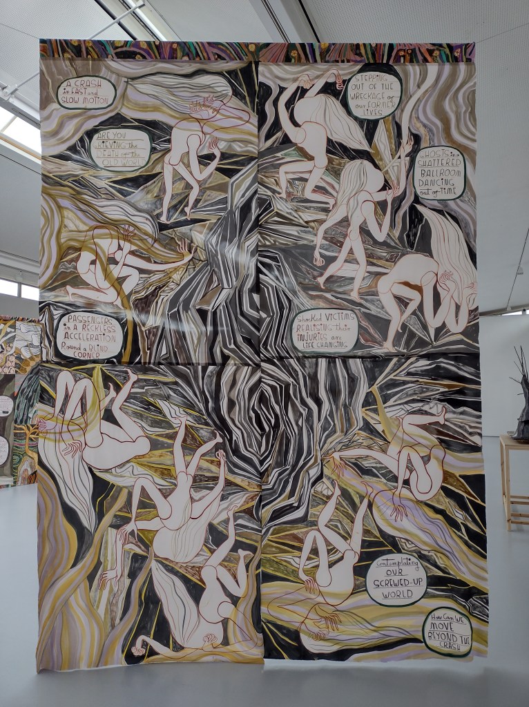
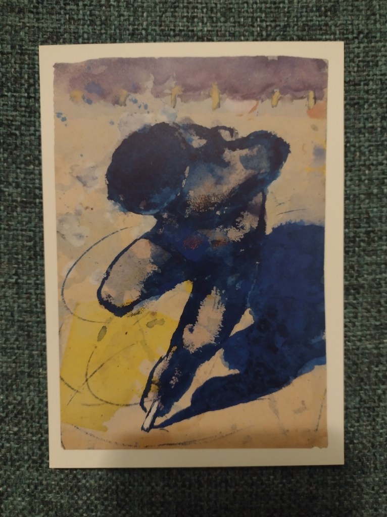
‘A Crash in Fast And Slow Motion’, 2020
The thing I notice first about this display is the colour palette: greens, ochre, rusty red, greys and creamy white. The repeated tones help to conjure the feeling that we have entered a specific world. There is a narrative here: the first work you encounter, also a large silk tapestry, depicts an unnamed disaster that has shattered the earth and turned it upside down. There are ghostly white bodies everywhere, positioned at strange angles and holding their heads in their hands. Scattered speech bubbles tell us more: ‘passengers in a reckless acceleration round a blind corner’; ‘a crash in fast and slow motion’.
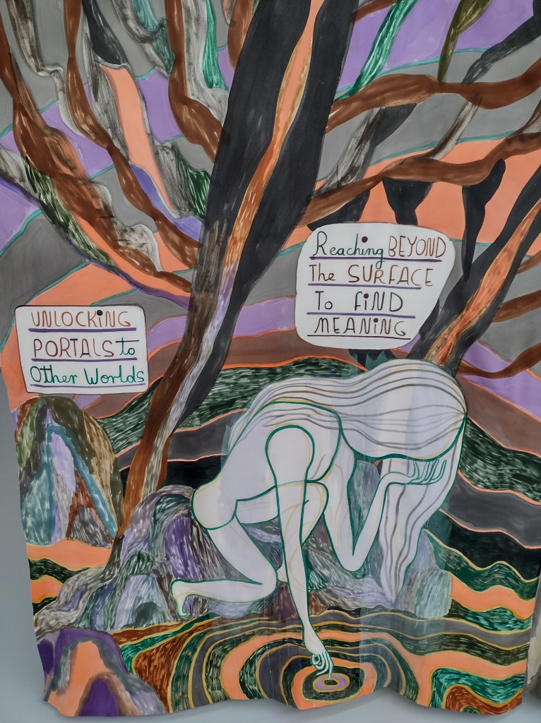
The centrepiece, a large tapestry that bisects the room, tells the story of what happens after the cataclysmic crash. Text in the first panel both questions and explains: ‘Do you hear ghost calls? A teary lament for human existence. A shout out to the living to take more care of themselves, of the world, of each other.’ I like these little ghostly souls with their long, wavy hair. The way they journey through an unknown landscape, little disembodied heads blowing long trumpets – or are these trees lying on their sides?
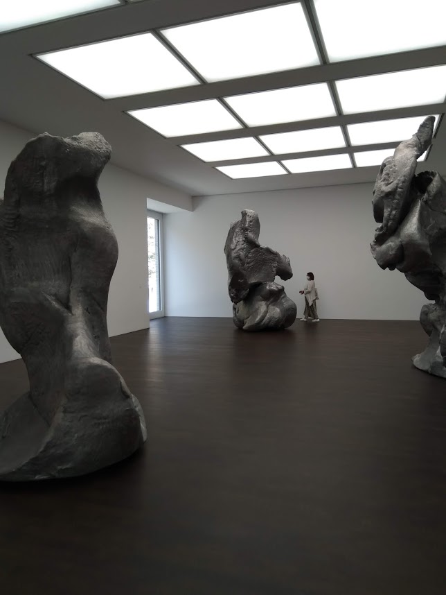
A section from ‘Ghost Calls‘, 2020
Though the story is about processing collective trauma, looking around me, I feel surrounded by a complete sense of calm and serenity, like a blanket has settled over the entire room. Something in the fragility of these artworks makes engaging with them a very tender encounter. Even calling the largest works ‘tapestries’ feels wrong, because that conjures up images of heavily-embroidered, thick wall hangings, decorating old castles and torchlit halls. Here, there is a palpable lightness.
The drawings are my favourite. Small-scale and pinned to the wall, they exist almost completely without ceremony: these are pages from sketchbooks. There is no glazing, there are no frames. Everything feels very immediate, right in front of me and so utterly delicate – the papers are handmade.
‘Celtic Birds’, 2020
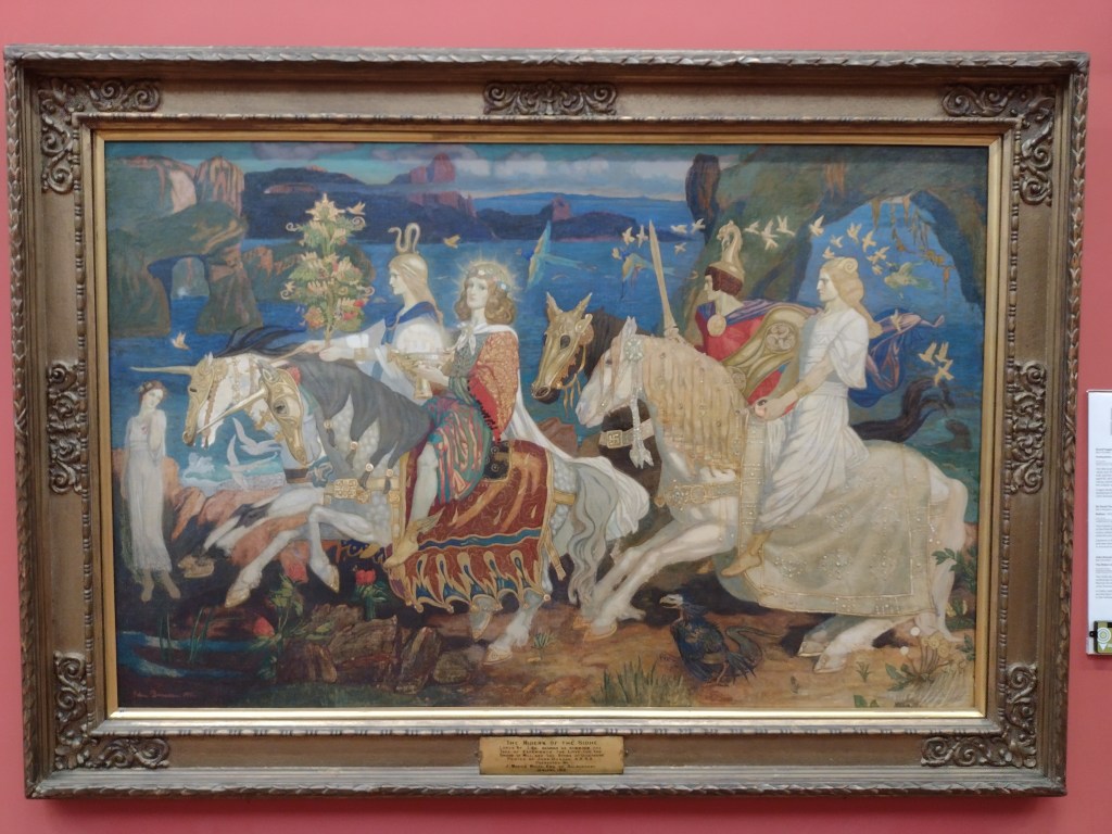
When researching for this exhibition, Talbot came to Dundee and was struck by the paintings at the local museum, the McManus. You can see here her fascination with The Riders of the Sidhe by John Duncan, one of the collection’s most famous paintings, a work thick with symbolism and arcane magic, and of great importance in the Celtic Revival movement. I had just been to the McManus and was admiring it too, so the connections felt particularly present in Talbot’s fine drawings of mythical beasts, a connection that was reinforced by the sense that her tapestries represent a linear journey, one with a similarly ambiguous destination.
John Duncan, ‘The Riders of the Sidhe’, 1911
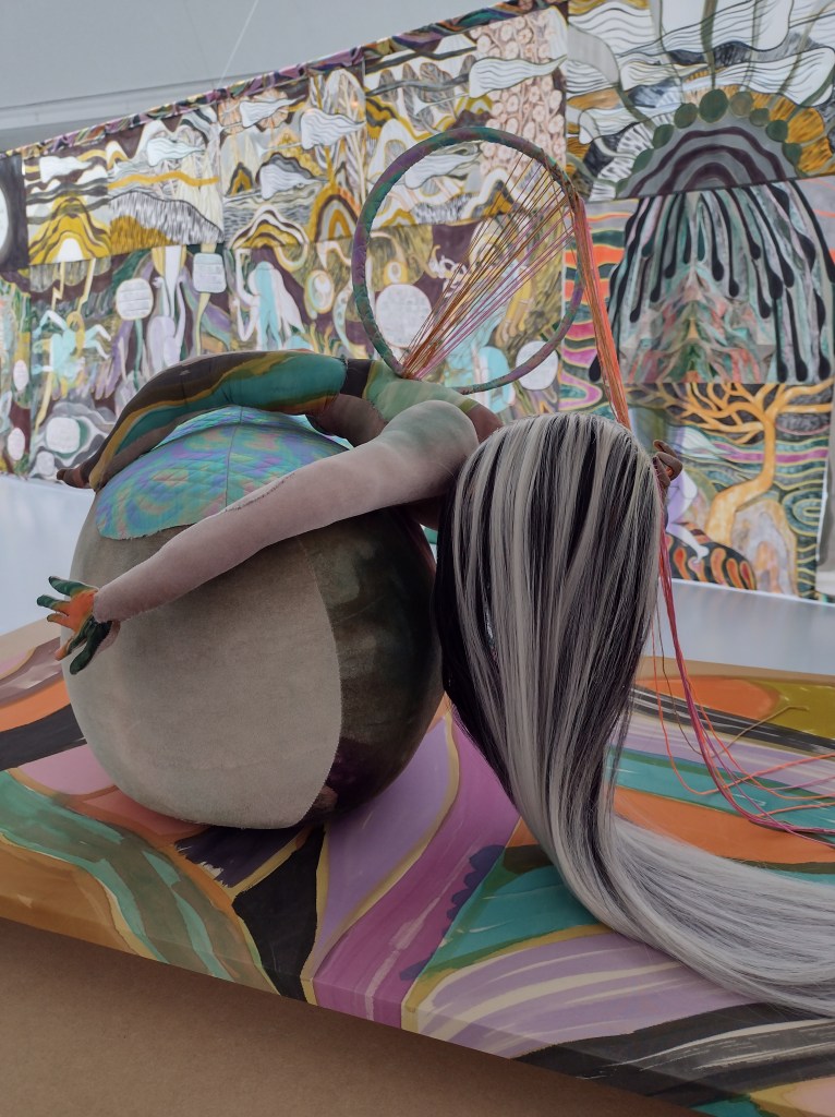
There were five sculptures dotted around the exhibition, but these struck me as out-of-place, needless add-ons to the main body of work. The stuffed figurines were 3D versions of the ghost characters, made from a kind of velour material, with crudely kirby-gripped wigs and random accessories (a dream catcher, a willow tree). To me, they looked clumsy and jarred displeasingly with everything else, which was so finely drawn and meticulously put together.
A much more successful use of a different medium was the animated 14-minute filmKeening Songs, where figures of women move through a landscape, meeting animals and spirits, enacting a ‘keening,’ a mourning ritual associated with old Gaelic communities in Scotland and Ireland. These stories were enchanting, layered with poetry and intrigue, and the exhibition as a whole suggested that we will have to enact our own keening, as we journey beyond the global trauma of the pandemic. Perhaps art can be a tool in that process?
I was visiting my second gallery of the day, for the first time in over a year, and my stamina was wavering. Yet despite the inevitable ‘museum back’, I was here at last, looking at new art in all its freshness. I felt so much gratitude for this place, these artworks, that they existed right here in front of me, without the intermediary of a screen. There is an undeniable physicality to the experience of looking, and looking carefully, one that can make the viewer feel truly present, truly awake and alive for the first time in a long time.
After months of closed doors and darkened rooms, museums and galleries are set to begin opening in Scotland from Monday 26 April. Unsurprisingly, I’m excited about the prospect of returning to experiencing art ‘in the flesh’, though lockdown has proven that art can be found everywhere and anywhere, and isn’t confined to the walls of a hushed gallery space.
Over the past year, I’ve had to be more imaginative about what to look at and write about: seeking out artists to highlight each week on Instagram, exploring virtual viewing rooms and reading more art criticism. This unwanted pause on what had seemed a never-ending cycle of exhibitions has, I hope, made the blog less of a diary of exhibition reviews, and more a set of broad suggestions of how we can engage with art.
The more I think about it, the more I realise we’ll have to reacquaint ourselves with how to look at art in person, as the world around us becomes available again in all its glory. How will we prioritise our time? Can we pace ourselves? Will we be overwhelmed, underwhelmed, or just ‘whelmed’? Will our stamina for standing and wandering around galleries be a shadow of its former self?
Contrary to what some might suggest, Edinburgh is alive and buzzing with art all year, so here’s a round-up of some things I’m most looking forward to visiting in person this spring and summer.
Jonathan Owen at Ingleby Gallery: 29 May-17 July
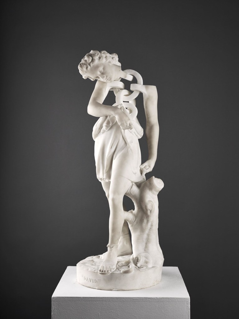
Regular readers will know that I love the Old Masters. That’s where my art journey started (as a child I loved The National Gallery card game). But I also love it when contemporary artists reinterpret traditional forms to say something new e.g. Meekyoung Shin’s slowly eroding soap sculpture of the Duke of Cumberland in Cavendish Square. Jonathan Owen is such an artist. His work uses erasure and interventions to alter found materials, including marble statues. This show at Ingleby Gallery, one of my favourite places to see art in Edinburgh, will feature these altered statues, and will also include the unveiling of a new life-size work about empire and exploitation. I’m sure this exhibition will go straight into the heart of the monument debate and I can’t wait to see these sculptural works in 3D. For me, sculpture is something you have to see in person. The screen just doesn’t cut it.
Jonathan Owen, ‘David’, (2013), nineteenth century marble figure with further carving
A very interesting rehang at the Scottish National Gallery: Open Thursday-Saturday from 6 May
When I was studying art history at ECA, we were incredibly lucky to get to visit the Scottish National Gallery before opening hours. I remember asking our host, Frances Fowle, Senior Curator of French Art, why some of the most famous paintings are kind of… hard to find in the Gallery. While some people love the fact that you go up a narrow set of stairs and suddenly you’re surprised to be in the company of Van Gogh’s Olive Trees, Monet’s Haystacks and Gaugin’s Vision of the Sermon, apparently lots of folk agreed that they seemed needlessly buried. The latest Friends newsletter explains:
You spoke, we listened. For the re-opening of the Scottish National Gallery we have moved seven of the much-requested Post-Impressionist paintings to a display on the ground floor.
While I doubt this will be a permanent change (the rooms upstairs are probably a much better scale for these works), it will be really wonderful to see these incredible paintings placed front and centre, and I’m fascinated to see how the team at the Galleries will take on this re-hang.
Vincent Van Gogh, ‘Olive Trees’, 1889. Excuse my wonky camerawork.
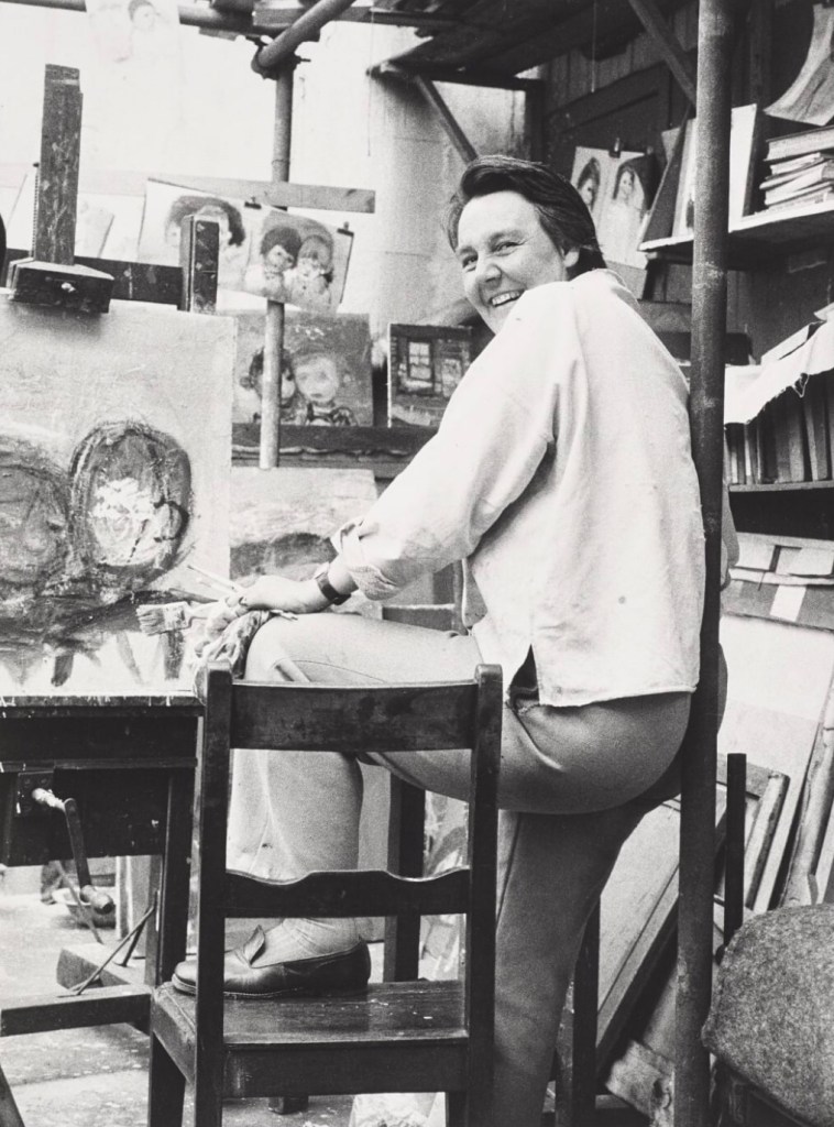
Fine Art Society Edinburgh, Joan Eardley 6-29 May
I’ve written about the forthcoming #Eardley100 celebrations before, and am hoping to write about her again several times this year. While the centenary celebrations are happening across Scotland (especially at Paisley Art Museum and the Hunterian in Glasgow), this exhibition at the Fine Art Society on Dundas Street in Edinburgh pairs works by Eardley with photographs of her in her studio. I’ve long been interested in our obsession with artists’ studios (the weird preserved Paolozzi studio at Modern Two is a great example), so I’m really curious to see this combination. It also ticks off a major ambition for me, which is to visit more of the galleries on Dundas Street. From the outside, they aren’t the most welcoming, but to learn more about Eardley, one of the best artists I’ve encountered since moving to Scotland, I’ll brave it.
Oscar Marzaroli ‘Joan Eardley in her Townhead studio’, 1942
Restless Worlds for MANIPULATE Festival: Lyceum, 22 April-2 May
This is why everyone should go to their local art school’s degree show (happening online this year, watch this space). At the ECA Degree Show in 2019, I came across an artist called Chell Young, who works to create miniature worlds that make you feel like you’ve had one of Alice’s EAT ME cupcakes. I’ve followed Chell’s work since, and that’s how I came across Restless Worlds. MANIPULATE Festival has commissioned eight Scottish artists to create kinetic sculptural works, displayed in windows, alongside a short story or soundscape that you download to your phone. While I’m especially looking forward to seeing what Chell has created, the whole project sounds fascinating. In Edinburgh, it is happening in the windows of the Lyceum foyer but there are projects planned for Glasgow and Aberdeen too. More info and tickets here.
Chell Young, ‘Fragile Realities’, part of installation at ECA Degree Show, 2019
Christian Newby at Collective: 13 May-29 August
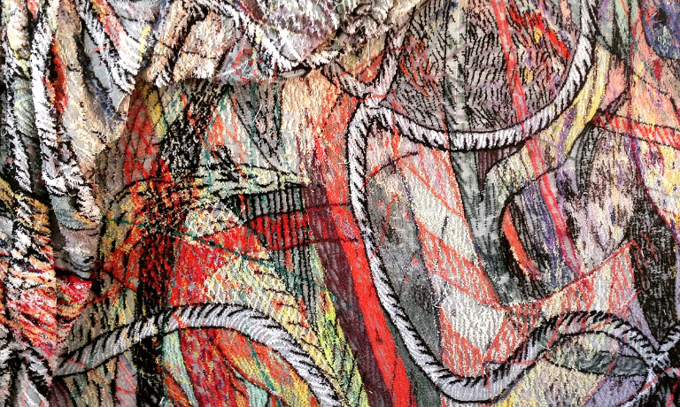
I’m sure lots of Edinburgh residents have braved the climb up Calton Hill for a lockdown walk, just to feel *something*. Well, from early May we will be rewarded with an open-for-business Collective Gallery at the summit. The exhibition they’re emerging from lockdown with is by Christian Newby, and features a large-scale textile called Flower-Necklace-Cargo-Net. This tapestry, made with industrial carpet tufting techniques responds to the building, which originally housed an astronomical telescope. Christian’s work explores ideas of craftsmanship, labour and the use of machinery in the fine and applied arts. I am intrigued by the description and I really want it to be absolutely massive. We all love a large scale work.
Christian Newby, ‘Flower-Necklace-Cargo-Net’ (detail), 2020
There will be so, so much more to talk about and explore, so please consider this an initial scanning of the Edinburgh art horizon. Other things I want to explore further are the Fruitmarket Gallery reopening after its refurbishment, The Normal exhibition at the Talbot Rice Gallery which explores the pandemic, the ECA Degree Show and the Art Festival. I’ll keep my ear to the ground and post more recommendations as and when.
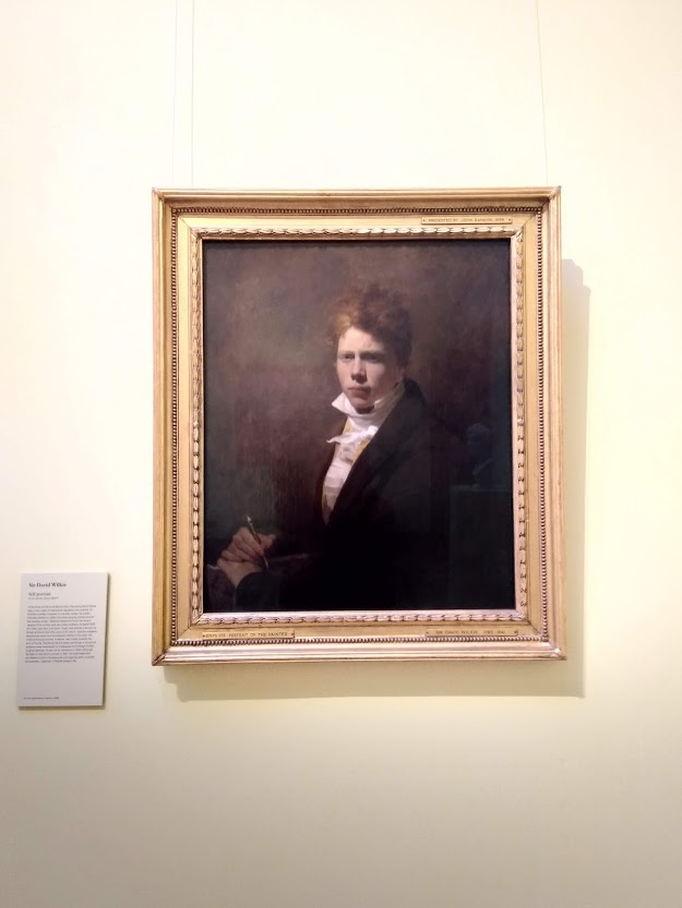
Alongside all that, we can never forget our old favourites. One of my first tasks when the Scottish National Portrait Gallery opens on 30th April is to go and visit my old pals, David Wilkie and Duncan Grant, to check they’ve been OK over the past year.
Inspired by Ben Street’s recent article in Apollo magazine about the meaning of art postcards, I’ve decided to have a root around in my own collection, and share five of them with you.
How art postcards collections come into being is a curious matter. We buy them as mementos from favourite exhibitions, or while visiting new places on holiday (remember those?). Some, we are sent by friends and family, not all of which we would’ve chosen ourselves. When I was looking through my own stash, I came across blank postcards of artworks I have zero memory of seeing in real life, which I don’t even like that much. Where do they come from? They seem to spawn independently in shoeboxes and desk draws.
Splitting by Gordon Matta-Clark, 1974
I often end up sending my favourite art postcards to people who I know will appreciate them. But I’ve never wanted to part with this one, I love this postcard a lot. I think I bought it at an exhibition at the Barbican in 2011, long before I started writing about art. I only really remember Matta-Clark from that show. His art hovered at the edges of architecture and performance, and this documents one of his most famous works, where he bisected an entire New Jersey house. It’s unlike anything I’d seen before, an artwork on such a huge scale. Cutting up a house like that makes it useless, which makes me wonder, what’s the point of this act? Why turn something useful, valuable, a place of shelter and memories into something broken and strange? I’m still drawn to it though. It’s an arresting image, the sunshine beaming down, a big wedge missing from the house’s shadow like a slice of cake. It stops you in your tracks, makes you curious, makes you a little confused. It’s like a beautiful, surreal cartoon and for that moment you see something as simple as a house in a different way. Sometimes certain artworks chime with us and we don’t really know why. Perhaps that’s the reason I’ve held on to this postcard for so long: I’m still trying to figure it out.
Gordon Matta-Clark, ‘Splitting’, 1974
From Roof to Roof by Gabriel Orozco, 1993
The artist Gabriel Orozco notices things. His eagle eye can spot a fleeting moment of enchantment from afar the way a shark can sense a drop of blood in an ocean. I recently wrote about how visiting his retrospective exhibition at Tate Modern changed the way I saw art and the world, and it resonated with lots of other people. Why? Why does this rectangle of water captured on a flat rooftop, reflecting light, sky and trees, pinpointing a passing breeze in its ripples, make such captivating art? I think it’s because it’s about seeing the magic, or the possibility of magic, in the mundane, which is something we all can do, a radical choice we can all make. It’s empowering, to be able to take a moment and see beauty, chance, luck, favour where we might otherwise just have seen a dilapidated outhouse with a flat roof.
Gabriel Orozco, ‘From Roof to Roof’, 1993
Interior of the Great Hall in Lindegaarden by Vilhelm Hammershøi, 1909
I am pretty sure I have loved every work I’ve seen by Hammershøi, though I don’t know many of them well. I think I first encountered his work at the National Gallery’s most modern rooms, and remember how the greys, and the stripped back aesthetic of his Interior, (1899) contrasted so shockingly with the bright colours of paintings by Manet and Seurat. This postcard is from a trip to Ordrupgaard, a gallery outside of Copenhagen I visited with a dear friend. The atmosphere of this ghostly, grand, empty room is so convincing, you feel like you are looking through a keyhole in a haunted house, not at a tiny postcard of a painting. I have so many questions about this room that I know will never be answered, and I’m ok with that.
Vilhelm Hammershøi, ‘Interior of the Great Hall in Lindegaarden’, 1909.
Skater by Emil Nolde, 1938-45
The reason I’ve picked this is that it’s simply one of the most beautiful prints I’ve seen. Some artworks really translate to postcards (in the same way that some really translate to Instagram) and this is just perfect. I remember buying two copies, and sending one to my sister just saying “look how beautiful this is”. The yellows and blues, the blurred splodges contrasting with the precise curved lines on the ice, the movement of the skater crouching forward, propelling into our space. I picked this postcard up at National Galleries of Scotland’s Emil Nolde: Colour is Life in 2018. Sometimes colour IS life. Looking at this picture lifts my mood in a big way. Thanks Emil.
Emil Nolde, ‘Skater’, 1938-45
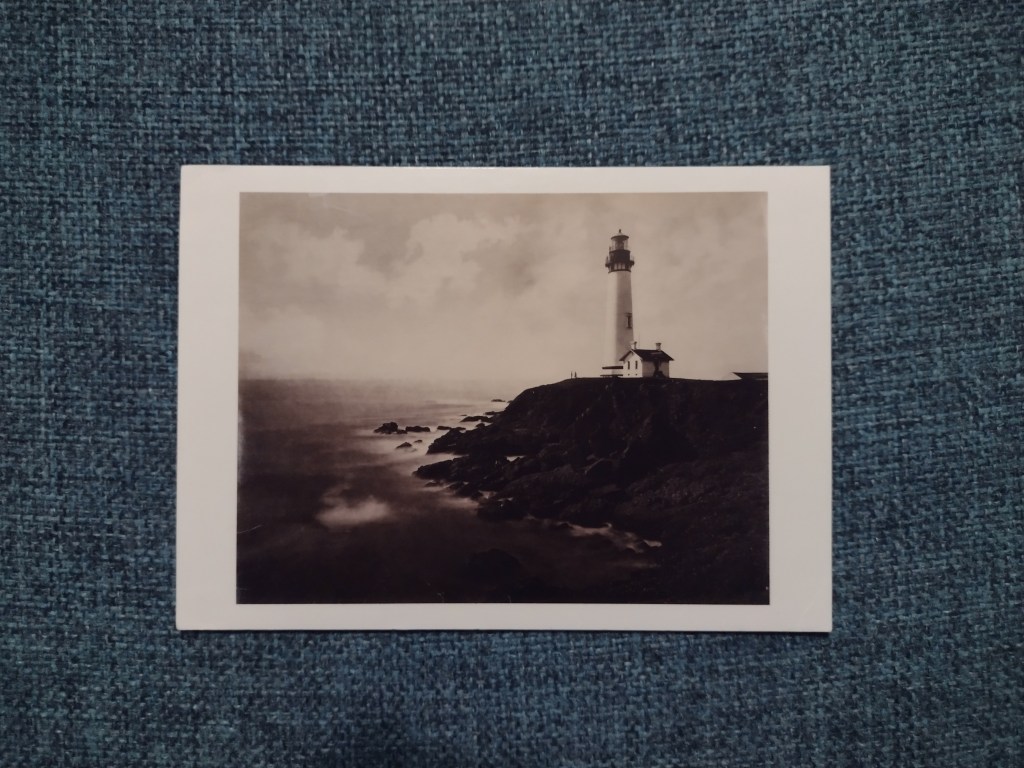
Pigeon Point Lighthouse by Eadweard Muybridge, 1873
My final choice from my collection of many, many art postcards is this one, bought at the Muybridge exhibition at Tate Britain in 2010. Lining up the dates, I must have seen this picture when I first moved to London. I would’ve been 18 or 19. I love photography, I think it has always tied into my fascination with the past – I studied history before I studied art. But I think photography might also have been a route in to contemporary art for me: it straddles past, present and future. Muybridge changed the medium of photography, the fields of art and filmmaking and with that, the way people saw the world. I look at this now and remember a visit in 2019 to a lighthouse on the most northerly point of the Isle of Lewis, where it was so windy we could barely open the car doors. That’s what’s special about these images. They are scraps of memory that live with us, they gather meanings as well as dust. They remind us of what we love about art, and sometimes tell us what we used to treasure that now doesn’t hold so much weight.
Eadweard Muybridge, ‘Pigeon Point Lighthouse’, 1873
Thank you Ben for inspiring me to look through this old collection of images. I’ll be doing it more often from now on.
If you collect art postcards, I would love to know which artworks they reproduce and what they mean for you. Head to the Contact page to get in touch, or DM me on Instagram.
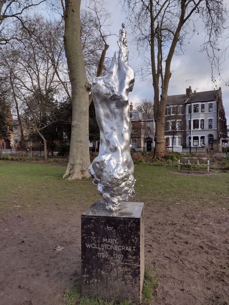
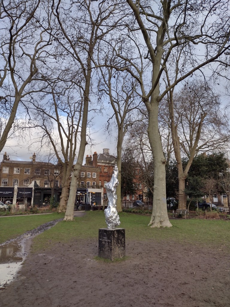
I’m currently locked down in London, so what better activity than to go to Newington Green and look at what the Guardian yesterday called ‘one of 2020’s most polarising artworks’. It is Maggi Hambling’s A Sculpture for Mary Wollstonecraft. If you missed out on the social media furore about this sculpture, the main issue was that people were very, very angry that what was supposedly honouring and commemorating one of the founders of feminism had a naked woman at the top of it. In principle I agreed and plus, visually it didn’t seem that interesting. More figurative art? Still?
As I trudged up, I hoped that I might see some protest performance going on (it has been covered up at various points), but there was nothing except a LOT of mud on and around the plinth, which reads “For Mary Wollstonecraft”, i.e. it’s for her, not of her, which is important to remember.
The statue on a muddy Newington Green
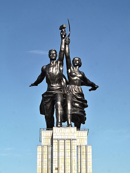
Firstly though, some perspective. The figurine that caused such a stir is TINY. She appears at the top of a much bigger silver blob, and though I was standing right up close, the height of the sculpture means she’s far away. On twitter and in the media, all the photos I’d seen were deceptive: closely cropped and zoomed in on the female figure, emphasising the defined abs, perky boobs and a full, rather prominent bush. Some were cross that the female body had been idealised in this way, but in the context of the full sculpture, that critique strikes me as odd. For me, this muscular figure brought to mind soviet-era sculptures, in particular, Vera Mukhina’s Worker and Kolkhoz Woman. Made in stainless steel, 24 metres high and created for the 1937 Paris World’s Fair, it is one of the most badass monuments ever. The diminutive size of the figure in Hambling’s sculpture works against this reading, but it still is a visual connection I find helpful when trying to place the work.
Vera Mukhina, ‘Worker and Kolkhoz Woman’, 1937
To me the figure does not read as sexual in any way. But, maybe, because of our understanding of the nude, it’s not possible to see a naked woman without this idea being drawn into this debate. As Heather Parry explained on twitter at the time:
I can't help but feel that the fuss over the Wollstonecraft statue is based in the shame placed on the female body by patriarchal systems and a misunderstanding of the naked form in art. I can't recall people saying the Anthony Gormleys should be covered up.
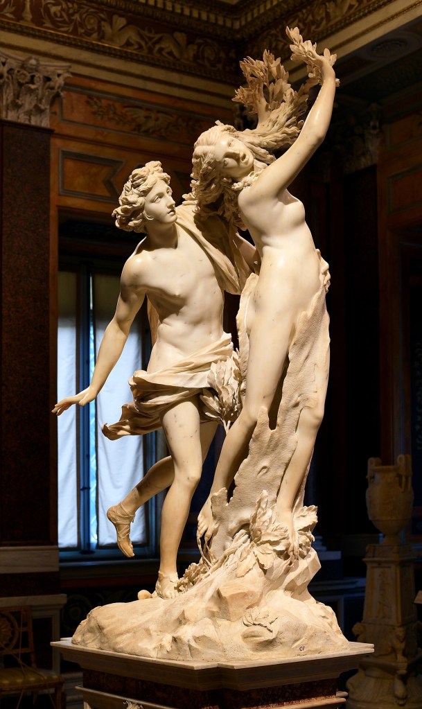
The woman emerges from a swirling mass, which calls to mind another transformation, Bernini’s Apollo and Daphne, the marble sculpture in the Galleria Borghese in Rome, made in 1622-25. It is based on the tale in Ovid’s Metamorphosis. Apollo has been struck by Cupid’s arrow, and is lusting after Daphne, chasing her. Daphne cries out for her beauty to be destroyed, or for her body to be changed to save her from the impending rape, and is transformed into a tree. Bernini’s sculpture captures the exact moment when flesh begins to become bark. Her outstretched fingers transform into leaves, she is swallowed up as the natural form encases her living body.
Bernini, ‘Apollo and Daphne’, 1622-25
It feels strange to compare those works, because the Bernini is one of my favourite sculptures of all time, and the Hambling is certainly not. But perhaps we can see the Hambling sculpture as this metamorphosis process in reverse. Here, rather than being engulfed, the female figure emerges from the shapeless forms and looks powerful. The aesthetic of the shiny silvered bronze also acts as a reversal of the natural elements in Ovid’a tale. The sheer artificiality makes it look futuristic and alien and that is my favourite thing about it.
In its almost mirror state, it jars pleasingly with the muted, natural winter browns and greens of the mud and bark in its surrounding park. There’s no missing this sculpture, it is a beacon that demands attention and has definitely received it. Wollstonecraft has too, and that’s not a bad thing.
The take home for me is that artworks may be polarising, but art is not Marmite. You can simultaneously love and hate different things about it, you can sit with it and feel differently about it on different days. It’s a reminder that especially at the moment, when we’re consuming art on a screen and from afar, context is everything. It’s good to know if we’re getting a detail or the whole picture.
This year, it is needless to say that we’ve not had the art experiences we might have been hoping for. With travel restrictions, exhibitions cancelled, rescheduled and put online, the art world landscape has changed significantly, perhaps forever. I have just had pre-Christmas visits to see Artemisia and Titian’s Poesie at the National Gallery cancelled, as London crashes into Tier Three. I’ve been longing to see these once-in-a-lifetime exhibitions for years, since I first heard they were going ahead. So I began writing this with a sad heart.
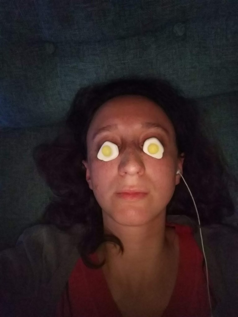
Yet despite and because of what 2020 has thrown at us, the need for art and culture is stronger than ever, as a way to escape, to heal, to reflect on what is happening. Many people have used 2020 to have a go at making art themselves, with countless organisations sending out art packs for people to unleash creativity at home. What I’m now calling Self Portrait with Haribo was born of boredom and childishness (yes I’m 29 and I still buy Haribo), but looking back at it now, it captures a particularly cabin fever-ridden moment of lockdown. Marking moments like this is a good way of acknowledging time passing, in a year that has felt interminable but with very little to show for it.
‘Self portrait with Haribo’
You’ll be relieved to hear, this blog post isn’t about my own personal creative output. Rather, it’s a moment of reflection and reassurance, to look back at 2020 and realise it hasn’t been a total creative wasteland. As by now you may have guessed, my concept of what art is is very broad, and that attitude has helped me this year. It helps me notice my surroundings, and to not feel culturally deprived, even when museums and galleries have been largely closed.
Art hasn’t gone away this year, we’ve just experienced it differently. So consider this an invitation for you to get out your phone, scroll through 2020’s photos and consider the past twelve months in a new light: there will be evidence of things you’ve seen that connect us, that have made life more interesting, that have enabled you to see or understand something differently. To me, that is the purpose of art.
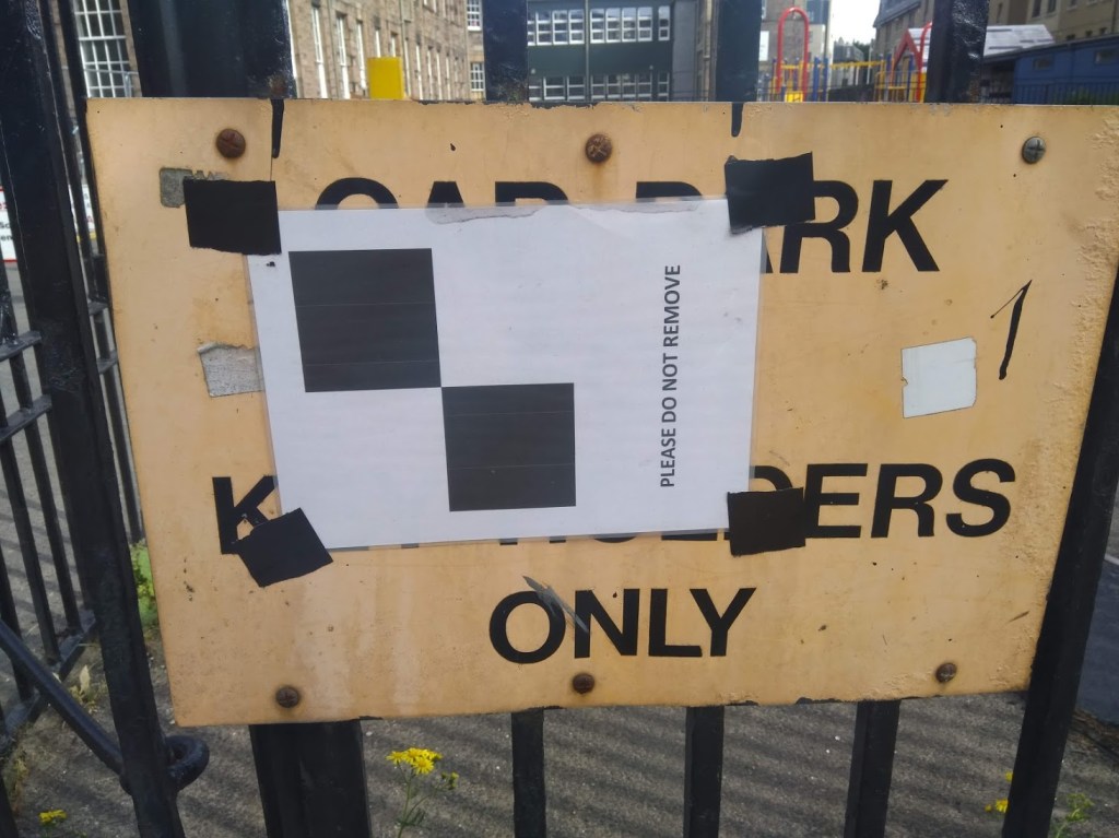
10) “Please do not remove” sign, Fountainbridge
This comes under the category of ‘weird things I take photos of in the streets of Edinburgh’. I first noticed this sign in Fountainbridge in January. It was still there in June. I love random signs, posters and stickers that are woven into the fabric of our cities. Once you start noticing them, you’ll never be able to stop: there are whole debates played out on bus stops, sign posts, bins and streetlights. I like this one because it shows how people did what the sign said by leaving it there. Either the people Edinburgh are very law abiding, or, possibly more likely, it went unnoticed.
‘Please do not remove’, Fountainbridge, June 2020
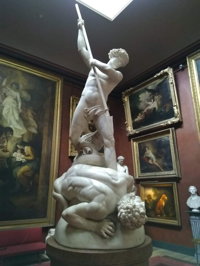
9) A visit to Petworth House
When infection rates were low, I visited Petworth House for the first time this year. I’d known that the house had lots of art connections, having seen it in the film Mr Turner, but I hadn’t realised how many treasures are packed into just a few rooms. The National Trust’s webpage says that it is one of the finest art collections in their care. It includes The Adoration of the Magi by Hieronymous Bosch, a bust of Aphrodite attributed to Praxiteles which is over 2,300 years old, and The Molyneux Globe, the earliest English-made globe in existence, made in 1592. My favourite moment was seeing the beautiful marble sculpture of Saint Michael overcoming Satan by Jonathan Flaxman, created 1817-1826. When I was studying at UCL, the full-scale plaster model that Flaxman made in preparation for this piece was on display in the main library, so seeing the final result felt like the artwork had come full circle for me.
‘Saint Michael overcoming Satan’, Jonathan Flaxman
8) Apple’s iPhone X advert at The Hermitage
Ah, who knew an advert would play such an important part in my year. I actually am one of those people who enjoy TV adverts: the ludicrous fantasies of high-end perfume, the terrible, expensive sofas at DFS. An oven chip advert about family made me cry once. Yet this advert was not your usual one. It was five hours long, a slow-paced art house film with minimal dialogue, all shot on iPhone X, filmed in The Hermitage in St Petersburg. Each Tuesday in the spring, my friend Jane and I sat down, started a phone call and pressed play on YouTube together as we watched an installment. We discussed the paintings, the dancers, the architecture, the narratives, and sometimes, we just talked over the film about life. It was as close as I came to the real experience of trawling through a major museum while on holiday and I looked forward to it every Tuesday for over a month. I’ve written a longer piece which has a link to the advert here.
7) A specific frame in The Wallace Collection
From my trip to The Wallace Collection in the summer, one object is thoroughly wedged in my mind: the frame of Ary Scheffer’s Francesca da Rimini (1835). The painting itself is very dramatic, it depicts a scene from Dante’s Inferno, with the tragic figures of Francesca and her lover Paolo condemned with the souls of the lustful to the second circle of hell. The frame completely wowed me, I think it’s one of the largest frames I’ve ever seen. You can see a book in the bottom right corner, there are doves, chains, oak leaves and a scroll which incorporates elements of Dante’s text. It was created by a certain Félicie de Faveau for the painting’s third owner, Anatole Demidoff, Prince of San Donato, who owned the painting from 1853-70.
Ary Scheffer’s ‘Francesca da Rimini’ in the Wallace Collection
6) Graveyards of Edinburgh
Edinburgh is one of the greenest cities in the UK and I recognise my privilege in experiencing lockdown here for that very reason. Exploring the city’s open spaces has led me to encounter several of Edinburgh’s old graveyards for the first time this year. Being a fan of the Romantics, the more dilapidated and ivy-covered the angels, skulls and crossbones and shrouded urns, the better. Perhaps it seems morbid, but I’ve always found these places peaceful and interesting, and as someone who doesn’t believe in life after death, seeing nature flourish in these places has always been reassuring. Warriston Cemetery, Greyfriars Kirkyard, Dean Cemetery and Dalry Cemetery are some places I’ve found solace this year, as well a place to appreciate the art and symbolism in the carvings, sculptures and iconography.
A grave with ivy, Warriston Cemetery
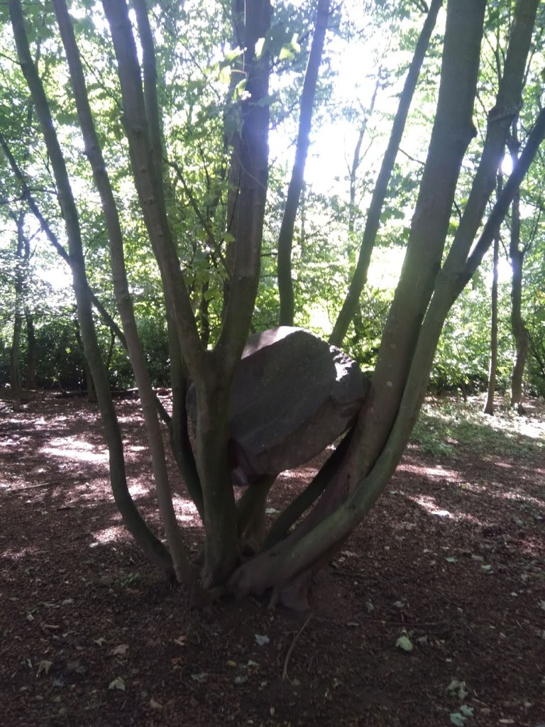
5) Andy Goldsworthy’s Stone Coppice at Jupiter Artland
Jupiter Artland – I visited at last! Cycling with my sister out to Wilkieston on the canal path, this was one of the most perfect art afternoons of the year. We walked around the whole thing slowly, soaking it all up, and got a seat in the café just as the rain came down. I love so many of the artworks here, but my top one for this list is Stone Coppice by Andy Goldsworthy. You stumble upon this artwork in one of the more unkempt pockets of the sculpture park, you might not even know it was there at first. It’s the perfect balancing act: the way the trees delicately hold the rocks, how some seem composed in a tender embrace, how others seem crushed by the branches or vice versa. The artist’s positioning of the natural matter, which is then left to its own devices to grow and unfold over the years, is poetic.
‘Stone Coppice’, by Andy Goldsworthy, at Jupiter Artland
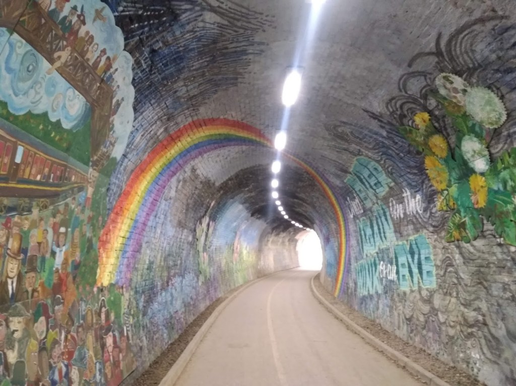
4) Rainbows – Colinton Tunnel
The cynical among you will perhaps raise your eyebrows at this… rainbows in windows everywhere were sweet at first, but as the grim reality and longevity of the pandemic set in, they started creating a backlash, with one of my favourite tweets of the year capturing a perfect counterpoint – a sign in Glasgow that simply said “This is shite”. But this huge rainbow, arching over me as I cycled through Colinton Tunnel stopped me in my tracks. Street art and bike rides have both helped me through the year.
Colinton Tunnel
3) Rediscovering Black Portraiture by Peter Brathwaite
Peter Brathwaite has taught me so much this year. His project to recreate artworks at home was born out of a light-hearted DIY art challenge started by the Getty Art Museum. But Peter’s project took on huge significance as he made it his mission to shine a light on Black portraiture specifically, and used objects in his home to explore his own ancestry and past. In the context of the Black Lives Matter protest movement this year, this exercise in sharing these portraits of Black people with the world was so important, reminding us that these figures do exist in art and history, we just haven’t seen them, we haven’t named then. The whole project showed how the personal is political. How art is a mirror that reflects history and society, flaws and all, and critical engagement with it can help us understand the world and ourselves. Scroll through Peter’s Instagram to have your mind expanded, or take a deep dive into five of his recreations as part of The Essay on Radio 3 – highly recommended listening.
Though I was a fan of Ru Paul’s Drag Race before 2020, the antics of the queens, their talent, their silliness, their mental strength and their artistry has meant the show has been my constant companion through lockdown. Yes, one of the reasons I love the show is that it satisfies my craving for gossip and drama, which has been so utterly lacking in real life this year. But despite its highly formulaic reality TV structure, the show has done so much to expose mainstream heterosexual audiences like me to the art of drag. And what an art it is! It’s difficult for me to pinpoint an exact moment, but I think we can all appreciate that the two-in-one catwalk outfit Violet Chachki burst on the scene with, in the very first mini-challenge of season 7, is the most delicious balance between high fashion and performance art.
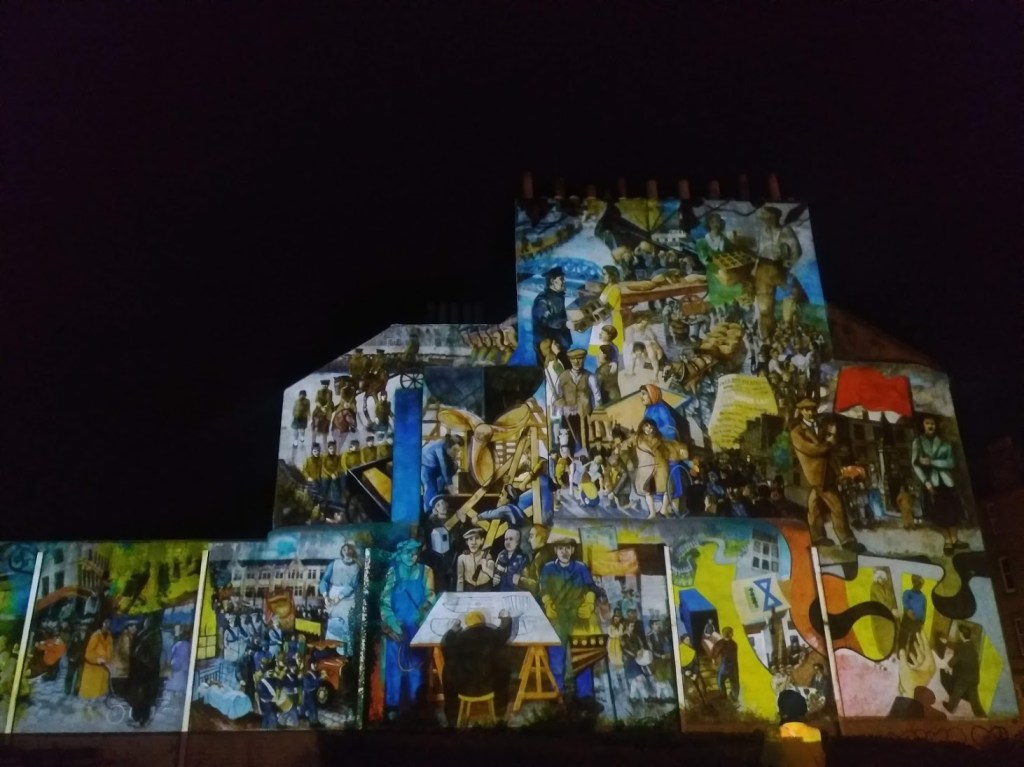
There are some artworks that seem a little like magic and this is one of those. If you’ve ever seen Leith’s historic mural near Leith Theatre, you’ll know it’s not in the best state of repair. The colours have faded, the edges are eroding, it’s difficult to decipher. I wouldn’t necessarily want to change that, fading is part of a mural’s cycle of existence. Plus I’ve heard that the artists Paul Grime and Tim Chalk, who created the mural in collaboration with local residents in 1985-6, have resisted suggestions of the mural being restored. This decision then, to use projections, sound effects and music to bring different parts of the mural to life, is inspired. With the projection focusing on particular characters and animating different parts, we see a ship’s rudder gently rotating, children playing and soldiers marching. We notice the mural’s complex layers, and the installation restores what is a special piece of street art and local history in the city’s collective memory.
There you have it, my top ten art moments of 2020 so far. What have yours been? I would love to hear from you, so feel free to leave me a comment or DM me on Instagram or Twitter.
Over the last six months, I’ve missed a certain feeling that being in a gallery or museum gives me. Before lockdown, I knew that looking at art made me feel calm and curious, slowed me down, gave me space. But my return to visiting a couple of places which house art (in London – Scotland’s major galleries are still closed for business) has made me realise what I particularly like about it. Experiencing art makes me remember I am part of something bigger than me.
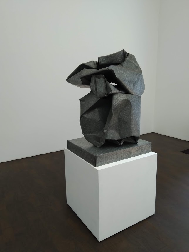
This realisation hit home most clearly when I went to Gagosian Grosvenor Hill to see Crushed, Cast, Constructed, a show with a wholly grey palette, featuring only five works. These are sculptures made in metal by John Chamberlain, Urs Fischer and Charles Ray. The three works by Fischer dominated the show: they started out as lumps of clay moulded by the artist’s hand, and then were scanned, enlarged so each model was over 3 metres high, and cast in aluminium. It’s like they are the product of a kindergarten for giants, that have been dipped in a vast vat of bubbling of metal and then returned to our world as serious, grown up objects. They are alien, they are too big, the Guardian’s critic Adrian Searle found them overbearing.
Installation view showing the vast scale of Urs Fischer’s aluminium sculptures
But that feeling of being overbourne (not a word) is actually pleasant after being the biggest thing in your same four walls night and day for six months. It’s the same reason I like big skies, mountaintop views, the sea.
Even the mechanisms and processes that created these objects and made them possible as art – the ideas, the funding, the training, the supplies, the gallerists, the agents, the transportation, the curation and a million steps in between are too big and complex for me to get my head around – especially after being separated from this ecosystem for such a long while. We, the viewers, are the very end point, the final cog in the machinery of the art world. Sometimes it’s actually nice to feel like a cog, while at the same time knowing you are the privileged recipient of all the cumulative hard work of others. It takes you out of the mundane minutiae or dramatic highs and lows of your personal existence and allows you to just be, for a brief moment, an uncommitted observer. You don’t even have to like the art you’re looking at to get this feeling.
In an era where we’ve all had so much time to sit with ourselves, in our sometimes messy, sometimes directionless lives, it was somehow restorative to spend time in this clean box of a gallery. With its white walls and dark, smooth floors, architecturally it is the polar opposite of a home, where each object is imbued with personal meanings or tasks yet to be completed (laundry, cards to respond to, bikes needing a service). To be an anonymous person in this quiet room, looking at these weird objects, is to abdicate responsibility. I owe nothing to them, they owe nothing to me.
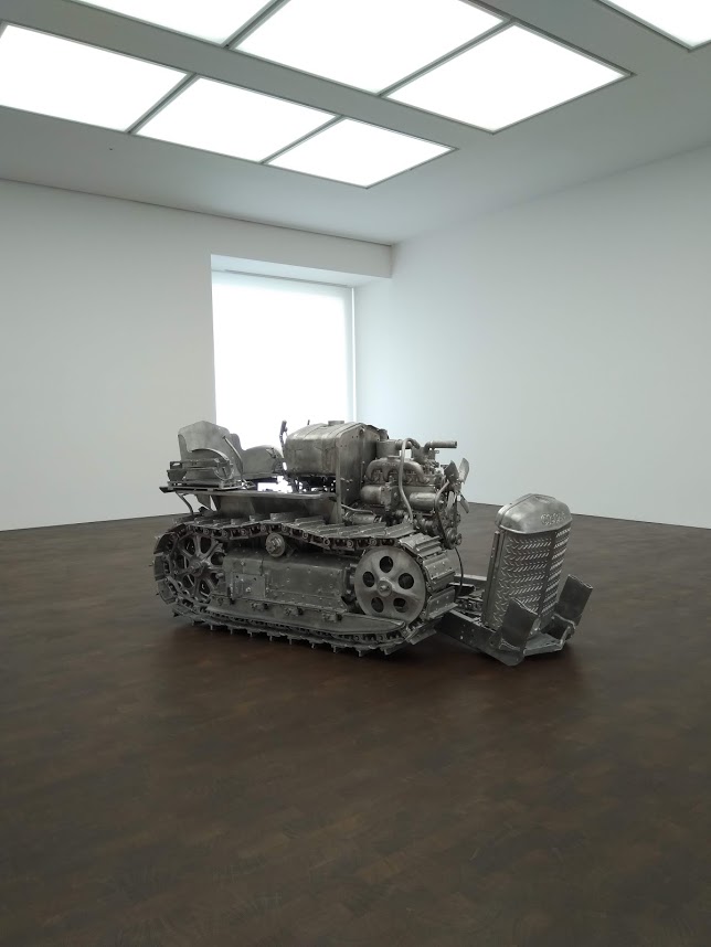
Charles Ray, Tractor, (2003-4)
They are weird objects. Alongside Fischer’s gigantic clay-as-metal lumps, there is a crushed box cast in galvanised steel and zinc by John Chamberlain and an old tractor that was painstakingly taken apart by Charles Ray and each piece cast in aluminium before being put back together.
Some might say this kind of art is pointless: it’s difficult to imagine who might even collect such objects, once perhaps useful and functional, now rendered inept by their recreation. But here, in their very pointlessness, in their mere taking up of space for our perusal, they signify everything we’ve been denied in these serious Covid times: fun, playfulness and even a kind of detachment from the chaos of the world unfolding around them. That shift in perspective was like a tonic to me. In their metallic, alien coldness, these sculptures restored my understanding of the world as something far bigger than me, a realisation I often find reassuring.
Adapting projects to fit our ‘new normal’ has been the concern of many of us over the past few days, weeks and months. Artists have had to rethink entire proposals, final year degree shows are being reimagined so they can be exhibited online, and there have been lots of virtual gallery content for us to connect with. But how do you adapt a project that is about physically being present in a place, without being able to access it in person?
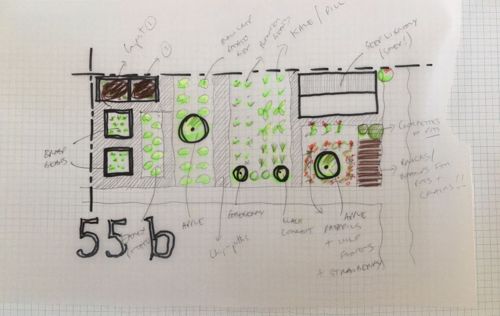
This was the challenge facing artists Felicity Bristow and Susie Wilson, who have been carrying out a Landmarks residency with Art Walk Porty. The project is based around a plot at Craigentinny Telferton allotments. After months of planning, preparing the soil, connecting with other plot holders and discovering what they had inherited from the previous owner, they were just on the cusp of beginning to plant, run workshops and kickstart the project in earnest when lockdown and the coronavirus crisis changed all that.
I had the pleasure of speaking to Felicity and Susie about their project, to find out how they have adapted and changed their approach to suit new surroundings. The interview has just gone live on the Art Walk Porty website. You can access it here.
Plot 55b, like all of Art Walk Porty’s residencies, is a place-centred project based in the local Portobello community. It is about process and engagement as much as, if not more than, about presenting a ‘final product’. In that way, the artists have discovered that although separated from the allotment itself, the process of growing things, of documenting their progress, could be carried out from their homes. They have set up a seed exchange and have been prompting each other with ideas, artworks and games sent in the post. They also discovered that the almost meditative act of sewing seeds and looking after plants has been beneficial to their mental health over the lockdown period. This is something that I can relate to even without access to a garden: managing not to kill my two houseplants over the last twelve weeks has been a source of great joy.
The recognition that connecting with the natural world can contribute positively to our mental health, combined with our need to avoid enclosed spaces in the coming months, will hopefully lead to more imaginative thinking in art projects, community engagement ideas and education as we turn to face our ‘new normal’. Plot 55b is a really lovely example of how that process can come to life.
The plan for Plot 55b – once Felicity and Susie can get back to it
It is often said that the two prime events that modern Britain’s identity is founded upon are victory in the Second World War in 1945, and the founding of the National Health Service in 1948. With the 75th anniversary of VE day on Friday, and the ongoing coronavirus pandemic, I’ve been thinking these things through lately in the context of British identity.
I’ve been helped on with these thoughts by a film by Alberta Whittle, presented as part of Glasgow International’s Digital Programme. The film is called business as usual: hostile environment (2020), and it was made especially by Whittle for the Digital Programme, adapted from a longer commission she had been working on.
Firstly I need to tell you, that if you want to watch the film you have to do so now, because today is the last day of Gi’s Digital Programme (though hopefully Whittle’s work will be added to her website soon afterwards). I wrote about two other Gi works in the previous blog post, but I needed to sit with this one for longer, because it’s more political, and therefore by nature it is harder to write about.
This is art as activism. It encompasses huge issues, from the treatment of immigrants and the hostile environment, to the Windrush scandal, to the lack of PPE available for frontline staff because of the government’s sluggish reaction and mismanagement of the unfolding COVID-19 crisis. I’ve read it as a reflection on British identity, and the holes in the narrative of that identity. That’s a lot to fit into one artwork, a 16-minute film which pieces together archival footage, news reports, computer generated images and home-movie style footage of a family’s day out on a boat.
Despite the difficult issues broached, its juxtapositions are delicately balanced, so the imagery is not overtly violent or traumatising to watch. Painful subjects are contrasted with some beautiful footage of couples dancing from the archives of an early 1950s Britain, which then sit side by side with brief snapshots of racists marching, and National Front graffiti covering a bridge. Whittle makes use of the split screen to heighten these contrasts: a very grey-looking Britain is paired with what we assume is the clear, beautiful Caribbean sea. Towards the end, a long duet with vocals and drums raises the tension and serves to make the viewer feel uncomfortable. That’s ok though: art doesn’t exist for pleasure alone.
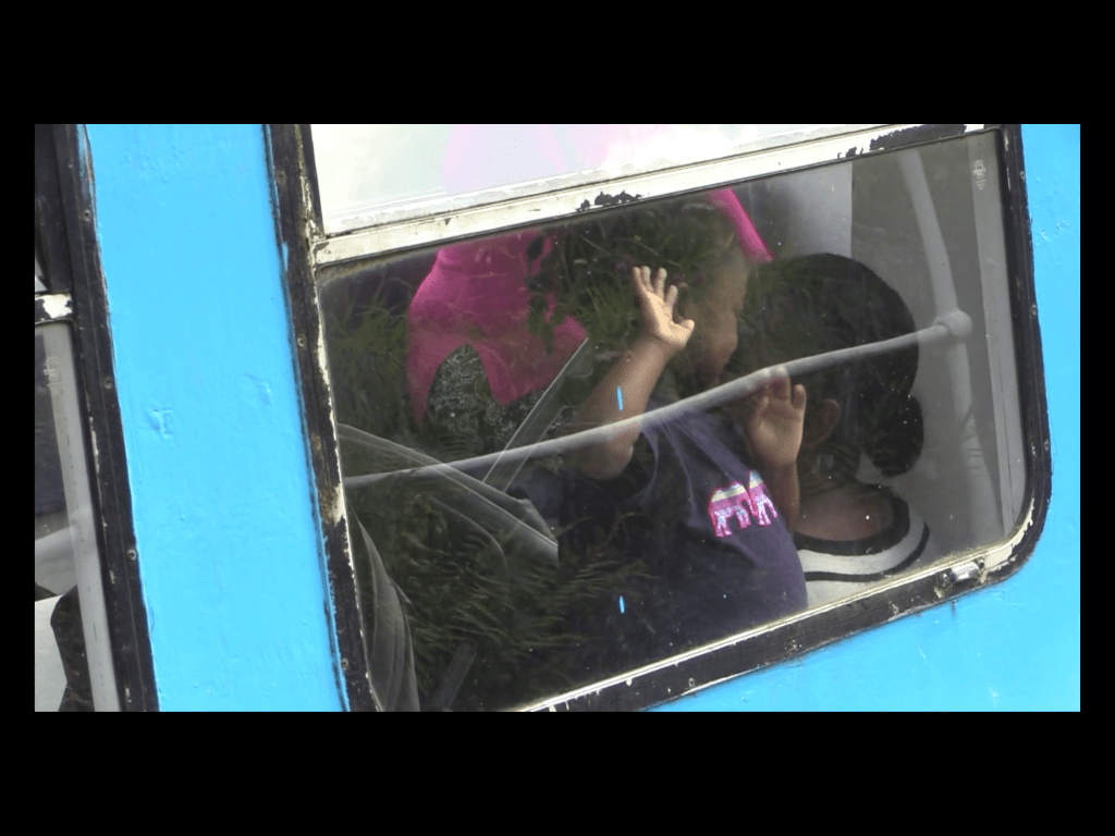
The film persistently subverts the romantic ideas around the images presented. It is partly a response to Visit Scotland’s theme for 2020, Coasts and Waters. What we (and Visit Scotland) might expect from that theme are artworks that respond to and promote Scotland’s amazing coastlines, images of peaceful landscapes with lochs reflecting mountainous scenery. In contrast, Whittle’s work looks at the role water, specifically the Glasgow Forth and the Clyde Canal, have played in the movement of people. There is one image that captures the cleverness and poignance of the film for me. A young black girl is having fun on a canal boat, smiling and knocking on the window, but a passing reflection makes it look for a moment like the window is barred, that she is imprisoned. That sent chills down my spine because of the other images I know of black people incarcerated on ships. It is the unsaid aspect which hovers over the film, including the hopeful images documenting the arrival of Empire Windrush in 1948.
A still from Alberta Whittle’s ‘business as usual: hostile environment’ (2020)
There’s a lot that can be achieved by subverting, questioning and exploring the ideas that nationhood is based upon. Frankie Boyle’s Tour of Scotland, broadcast on the BBC earlier this year, is another example of digging beneath the surface of ideas of who we are. It’s no longer available on iPlayer but clips are online. The section where he talks to Councillor Graham Campbell about Glasgow’s ties to the slave trade was fascinating and, like Alberta Whittle’s business as usual: the hostile environment, works toward educating us about aspects of our past that are often swept under the rug – an ignorance that has allowed for the hostile environment to develop and the Windrush scandal to happen.
Multiple commentators have pointed out that the British government have tried to tie modern Britain’s founding ideas together with its approach to this crisis. Coronavirus has been likened to an enemy, using the language of combat, which isn’t always appropriate, effective or clear when it comes to responding to a medical emergency. The semantics of sacrifice and loyalty are invoked to try and bring us together – though clearly the extent of lives lost could have been limited, had the situation been better handled. Whittle’s film is a reminder that no amount of metaphor should be allowed to submerge that truth.
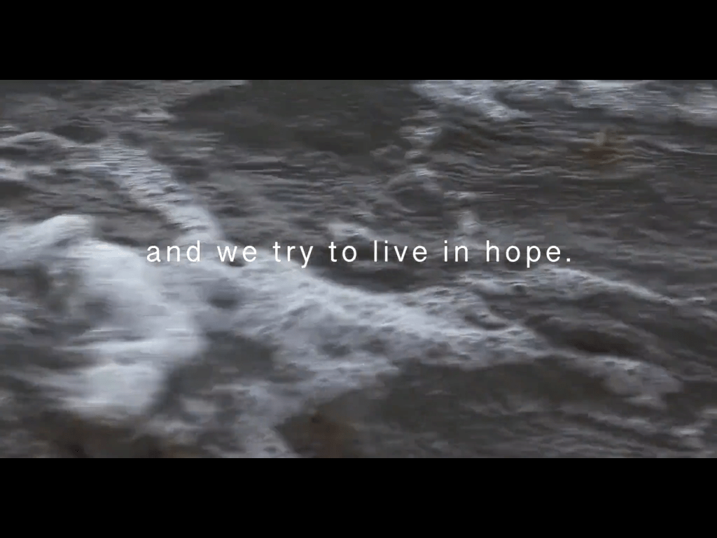
This work made me think again about how grateful I am to the artists, writers, comedians and journalists who encourage us to look deeper. The ones who question the myths, probe the difficult areas, who remind us to ‘stay alert’ to the situation unfolding around us, to the ideas and the language used to mobilise us. This has been a time of reflection and introspection for many of us, and there are some beautiful, human stories of solidarity that we can take pride in. But after it’s all over, we need a new consciousness to emerge and I want art to be at the forefront of imagining that to be possible as, to quote Whittle, “we try to live in hope” for a better future.
A still from Alberta Whittle’s ‘business as usual: hostile environment’ (2020)
The art festival Glasgow International (Gi) had to cancel and has curated a set of seven different artworks available online for the duration of the festival (until 10th May). Some are special commissions, some works were made long before the pandemic hit, but all artists would have been taking part in the festival itself, and the works represent a taster of what would have been available to see. While I understand that Gi want to mark the period when the festival would have taken place, it feels needlessly restrictive to have made this very interesting set of works available only to take them down after two and a half weeks. Time seems arbitrary now. I barely know what day it is, let alone the date. Why not leave them up until the end of lockdown or the end of May at least?
I was a bit late to the party but I’ve just finished watching/listening to them all and wanted to highlight two that resonated with me.
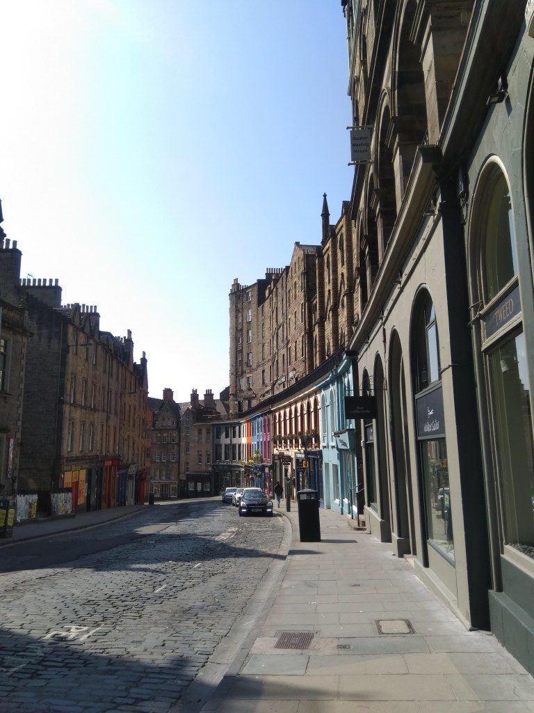
The first is Yuko Mohri’s Everything Flows – distance, 2020. Mohri has taken Yasujirō Ozu’s 1953 silent film Tokyo Story (which I haven’t seen), and has spliced together scenes devoid of human presence. What we are left with is a ghostly compilation of images which suggest humans through their absence. The city continues to function, ships move through water with purpose, but seem to be operated by remote control. Robotic railway station signs indicate platforms and train times to no one. Clothes on washing lines blow in the breeze and shadows on the walls of cramped interiors hint at human life, but each time, the film cuts out just before the figure comes into frame. It’s a tantalising series of almost-moments, which chimes well with having experienced a quiet, deserted central Edinburgh over the last month or so. There’s a strong sense of people watching the goings on from the high viewpoints over the city. Lanterns look like eyes. A moth bashes against a light, a fragile reflection on the futility of existence in this silent world.
Victoria St, Edinburgh looking empty on 25 April 2020
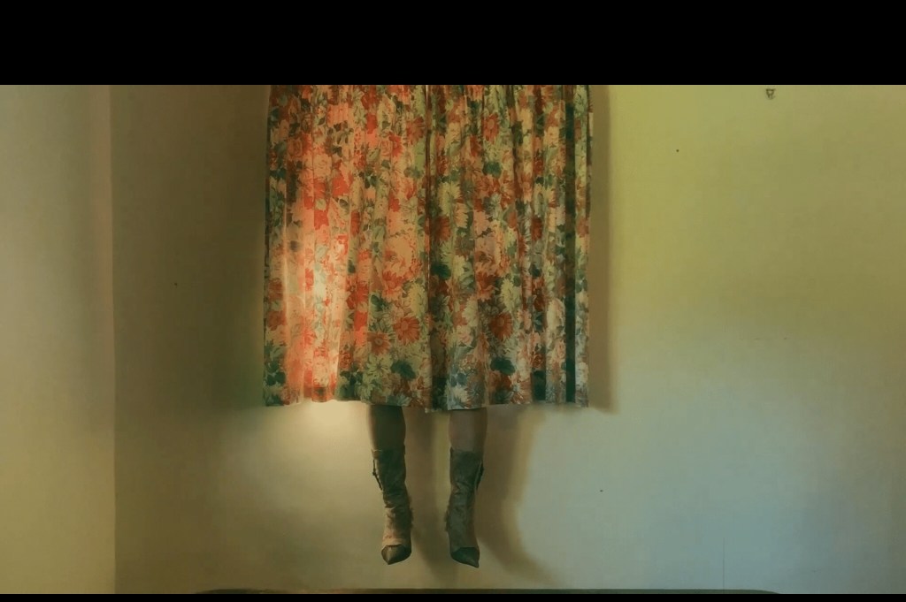
Urara Tsuchiya’s Give us a Meow, 2019, is my other pick of the bunch. This one surprised me – from the cover image and the title I didn’t think I would like it. But the 9 minute film is captivating. It tells a fragmented story, set in the rural idyll of a cottage and the countryside around it. We follow the escapades of a glamorous Asian woman who dons an impressive range of sexy outfits including animal print catsuits, fluffy negligee, powder blue and baby pink fur coats. The costumes are all made by Tsuchiya and are highly influenced by drag, adding to the fascinating confusion around the identity of our protagonist. She dances, applies makeup, takes selfies and does the ironing. It’s a surreal and humorous mash-up of the extremes of femininity, typified by one excellent shot which briefly flashes up, showing a pair of legs clad in high-heeled boots, sticking out from behind twee floral curtains. I took a screenshot which is probably not allowed, but who knows the rules of a digital art festival. Maybe this is part of a process of the democratisation of image-making, taken to a new level.
Still from Urara Tsuchiya’s ‘Give us a Meow’, 2019
For me, in a time of lockdown, it seems as though the character in Give us a Meow is attempting to recreate the experience of being in a nightclub within a completely incompatible setting of ‘home’. She dances like no one’s watching. She even has a little cry in the bathroom, picks herself back up and heads out again, an experience I’m sure we can all relate to. Seeing her vulnerability when navigating a cattle grid in heels is beautiful and moving and funny.
There’s also a fascinating, sinister aspect reflecting on the voyeurism of the film. She appears to be alone, but is not – she breaks the fourth wall repeatedly to interact with us, casting glances directly at the camera, creepily/seductively waving at us from the toilet seat. In the moments filmed outside, with her dancing by the side of the road, the film is shot from the perspective of someone watching from a car window. We are there, but it feels like someone else is there too. This also resonates particularly now – we rely on our cameras more than ever for interaction and attention, but constant rumours circulating about hackers in Zoom calls and sessions on Houseparty make us paranoid about who else might be watching. Tsuchiya created the work last year, but it feels more relevant than ever now.
So, that’s my take. I know there’s so much content out there at the moment, it can be overwhelming. I know that digital art events don’t appeal in the same way as the ones in ‘real life’, which can take you to different corners of your city and have a physicality to them that can’t be recreated on screen. But these artists have created something really interesting. What worked for me may not work for you – see what you think and let me know in the comments, or DM me on Instagram @encounters_art. I’m always here for a conversation about art!
Yesterday ArtAngel ran a live Q&A with artist and director Steve McQueen, following their most recent collaboration for his vast work, Year 3. For this artwork, McQueen arranged for 76,146 kids, from 3,128 Year 3 classes (ages 7–8) to be photographed in the timeless, traditional, and I would even say iconic format of the class photo. It’s something most of us can relate to. Bodies arranged in rows, taller kids standing, some sitting on plastic chairs or old wooden gym benches, and others cross-legged on the floor. What has emerged is a rich tapestry, a beautiful, huge patchwork quilt of thousands of photographs that document the present and, as McQueen emphasised in the talk, the future of London. What an incredible concept for a piece of art. I’ve heard it described as a giant portrait. But it feels far more dynamic, participatory and meaningful than that word implies.
I knew that the work was being exhibited at Tate Britain (I was due to visit in April, and am gutted that now I’m unlikely to see it at all), but from photos the installation looks impressive. The messy brightness of 1,504 schools packed into the grandiose space of the Duveen Galleries would always create a delicious juxtaposition. I hadn’t realised that for the ArtAngel side of the work, some 600 of the photos were created into billboards, situated across all 33 London boroughs, in November 2019. An ephemeral facet of a monumental artwork. It’s the stuff Encounters Art was made to write about – my only regret is to not have seen and documented them myself. In some ways that’s the beauty of these pop up artworks though. They aren’t supposed to be sought out, they mix and mingle with the everyday and you don’t know it’s there until you stumble upon it. If you did see a billboard in London back in November then I would love to hear your thoughts – leave a comment or DM me @encounters_art.
Installation view on Camden Road
Subverting a space that is usually used for adverts by filling it with a school photograph which is simultaneously strange (because we don’t know these children) and familiar (because we’ve all been children) is such a strong, engaging idea. One of the best moments I’ve come across by searching online for #year3project is a BT advert on Camden Road announcing “Technology will save us”. It is a timelapse video of BT’s billboard being surmounted with a photo of smiling kids in bright red cardigans and summer dresses in an old school hall. Here the children aren’t being prepped and presented as the consumers of the future. They are the future. They will save us. (Though I suppose ironically I owe my thanks to technology for preserving this moment for me to find months later.)
I love seeing these images interwoven into the London landscape. In tube stations, framed by carriage windows, this array of smiling young faces must have cheered up and intrigued countless commuters. Even in the gallery display, away from the urban fabric, it feels like a very London-based artwork, because it celebrates the city’s amazing diversity. McQueen chose Year 3 because for him, that is the moment we start to gain perception of our identities. Our classroom becomes a window on society and a crucible of the nuances of race, class, privilege and opportunity, all of which are explored in the work.
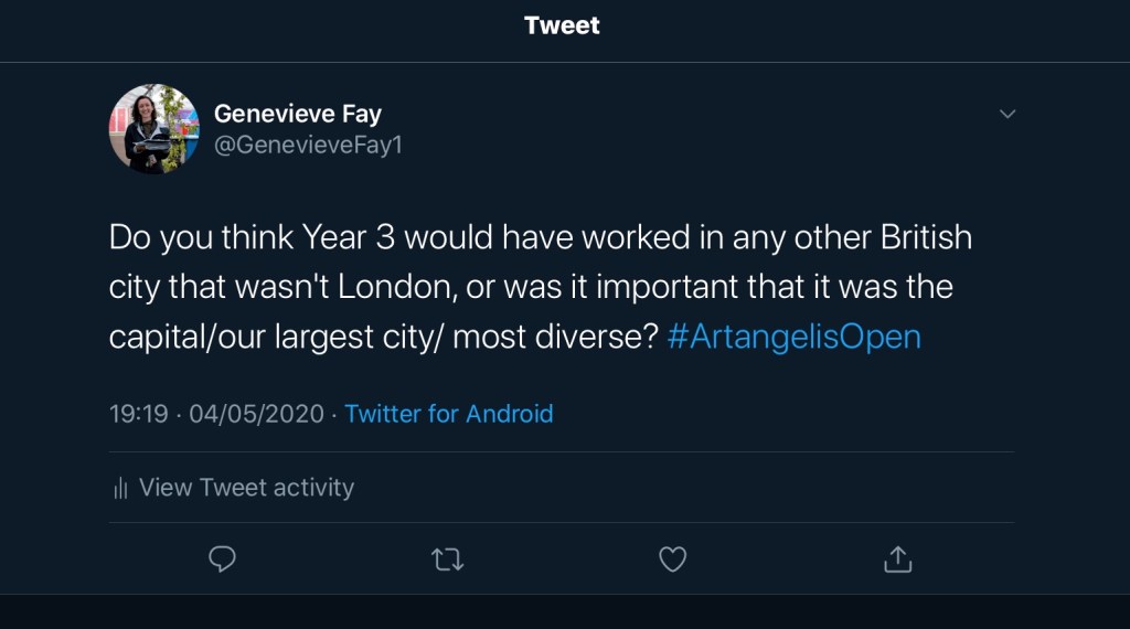
I found the London aspect particularly intriguing so I decided to ask a question using the hashtag #artangelisopen and I couldn’t believe it when it was picked for McQueen to answer. I was so excited, cheering and jumping up and down that I almost forgot to listen to his response. He said that for him, London was the clear choice, but it didn’t have to be limited to that – it could be carried out anywhere – and he seemed to be encouraging people to take up the project and move it on elsewhere. I would love to see that, particularly somewhere like Nottinghamshire (where I grew up) where there are rural and urban childhoods playing out. I wonder if it would click in the same way the original project does.
Installation view at Tate Britain Duveen Galleries
Listening to McQueen, the work was also understandably rooted in London because that was his experience – despite its scale, there is a highly personal context to the artwork which draws on his own boyhood engagement with art: a primary school outing to Tate Britain was the start of his journey. But it’s also about visibility. According to TIME magazine, Steve McQueen is one of the 100 most influential people in the world. For Twelve Years A Slave he won an Academy Award for Best Picture, and became the first black filmmaker to do so.
By creating this work, displayed in the gallery he visited as a child, he has come full circle. What an amazing thing, to provide an opportunity for the children in Year 3 be able to visit that same space, and see themselves, and others who look like them, on the walls. It fills me with hope that the project will be the spark that ignites countless artistic explorations and adventures. I can’t wait to see what they create when they’re fully grown.