Maggi Hambling’s Wollstonecraft statue

I’m currently locked down in London, so what better activity than to go to Newington Green and look at what the Guardian yesterday called ‘one of 2020’s most polarising artworks’. It is Maggi Hambling’s A Sculpture for Mary Wollstonecraft. If you missed out on the social media furore about this sculpture, the main issue was that people were very, very angry that what was supposedly honouring and commemorating one of the founders of feminism had a naked woman at the top of it. In principle I agreed and plus, visually it didn’t seem that interesting. More figurative art? Still?

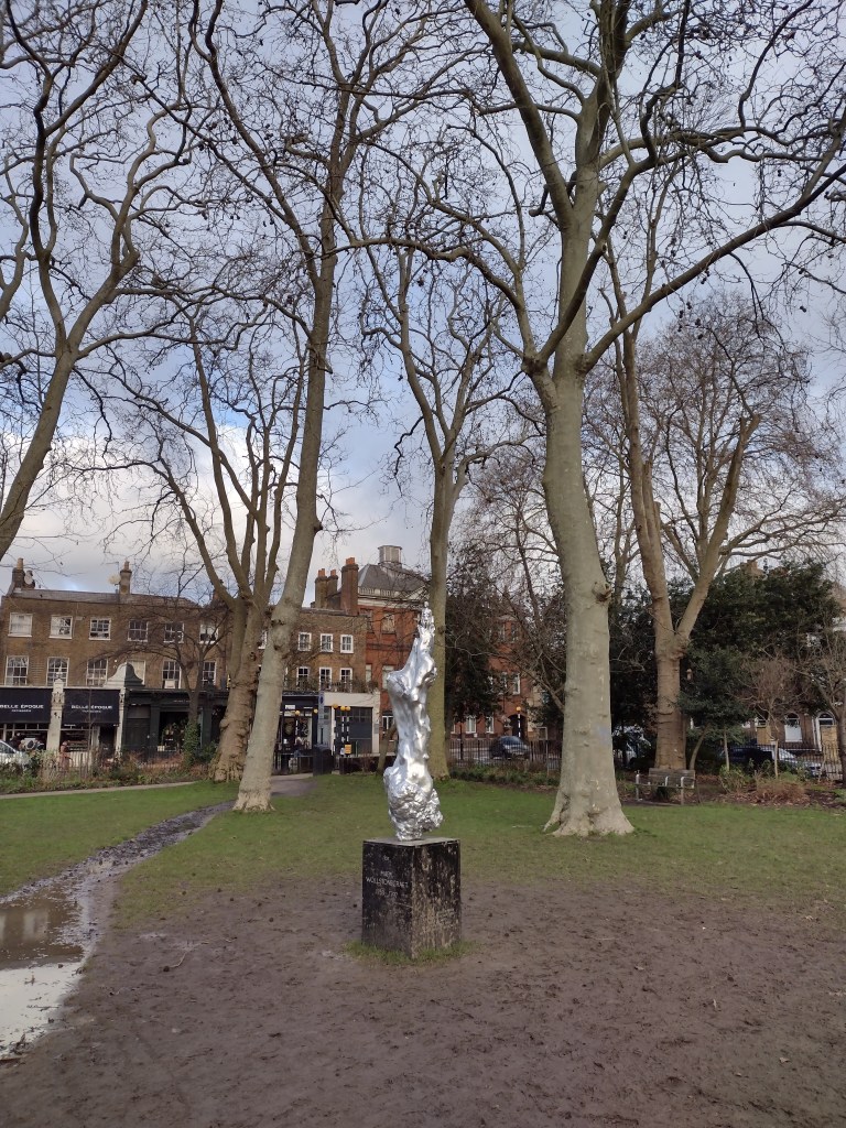
As I trudged up, I hoped that I might see some protest performance going on (it has been covered up at various points), but there was nothing except a LOT of mud on and around the plinth, which reads “For Mary Wollstonecraft”, i.e. it’s for her, not of her, which is important to remember.

The statue on a muddy Newington Green

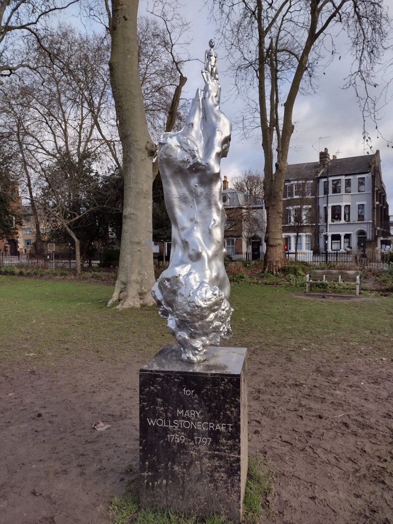
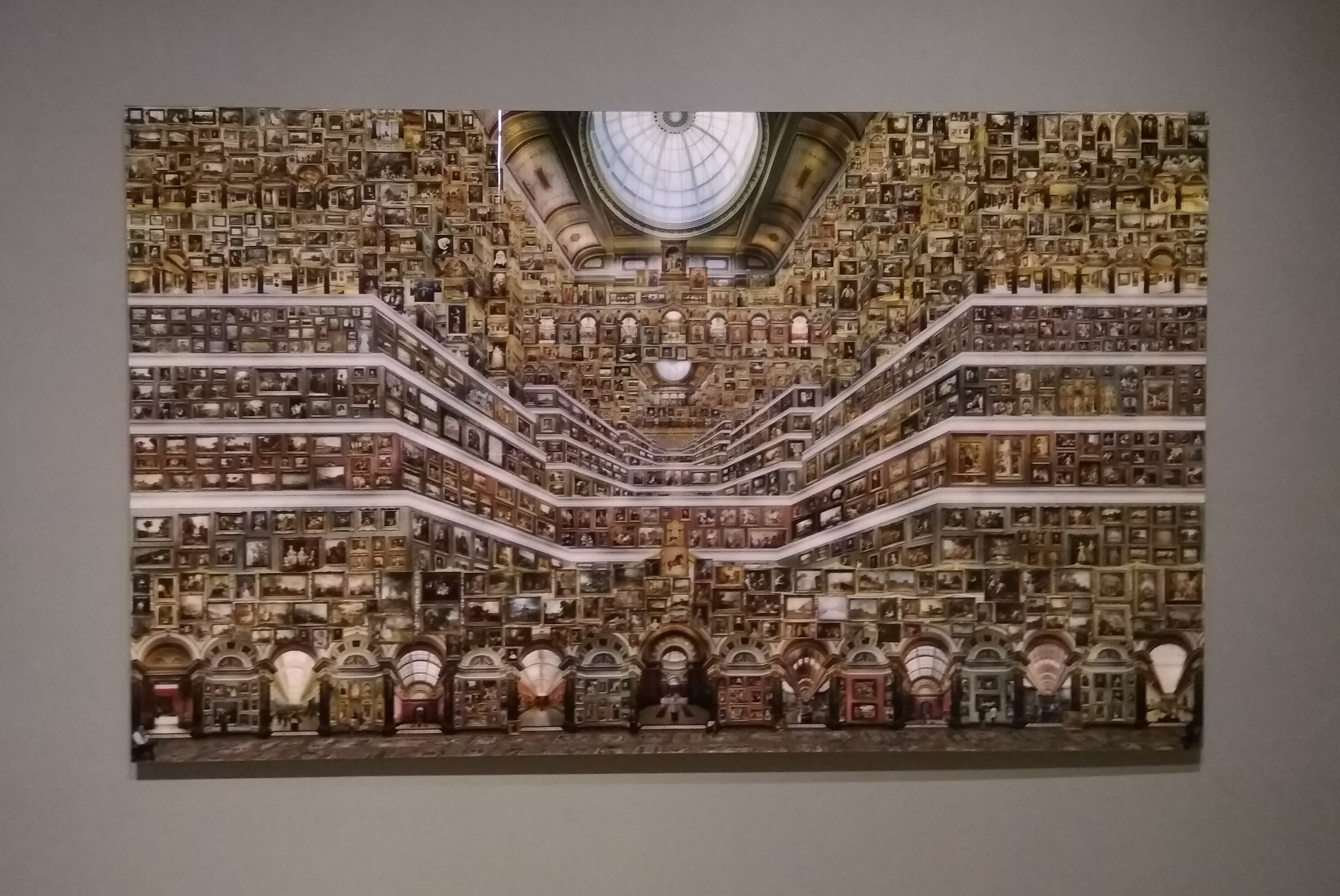
Firstly though, some perspective. The figurine that caused such a stir is TINY. She appears at the top of a much bigger silver blob, and though I was standing right up close, the height of the sculpture means she’s far away. On twitter and in the media, all the photos I’d seen were deceptive: closely cropped and zoomed in on the female figure, emphasising the defined abs, perky boobs and a full, rather prominent bush. Some were cross that the female body had been idealised in this way, but in the context of the full sculpture, that critique strikes me as odd. For me, this muscular figure brought to mind soviet-era sculptures, in particular, Vera Mukhina’s Worker and Kolkhoz Woman. Made in stainless steel, 24 metres high and created for the 1937 Paris World’s Fair, it is one of the most badass monuments ever. The diminutive size of the figure in Hambling’s sculpture works against this reading, but it still is a visual connection I find helpful when trying to place the work.

Vera Mukhina, ‘Worker and Kolkhoz Woman’, 1937

To me the figure does not read as sexual in any way. But, maybe, because of our understanding of the nude, it’s not possible to see a naked woman without this idea being drawn into this debate. As Heather Parry explained on twitter at the time:

Yep.

The woman emerges from a swirling mass, which calls to mind another transformation, Bernini’s Apollo and Daphne, the marble sculpture in the Galleria Borghese in Rome, made in 1622-25. It is based on the tale in Ovid’s Metamorphosis. Apollo has been struck by Cupid’s arrow, and is lusting after Daphne, chasing her. Daphne cries out for her beauty to be destroyed, or for her body to be changed to save her from the impending rape, and is transformed into a tree. Bernini’s sculpture captures the exact moment when flesh begins to become bark. Her outstretched fingers transform into leaves, she is swallowed up as the natural form encases her living body.

Bernini, ‘Apollo and Daphne’, 1622-25

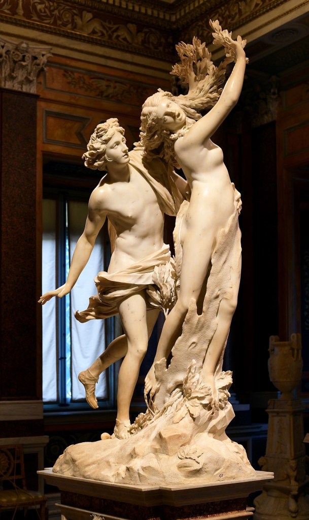
It feels strange to compare those works, because the Bernini is one of my favourite sculptures of all time, and the Hambling is certainly not. But perhaps we can see the Hambling sculpture as this metamorphosis process in reverse. Here, rather than being engulfed, the female figure emerges from the shapeless forms and looks powerful. The aesthetic of the shiny silvered bronze also acts as a reversal of the natural elements in Ovid’a tale. The sheer artificiality makes it look futuristic and alien and that is my favourite thing about it.

In its almost mirror state, it jars pleasingly with the muted, natural winter browns and greens of the mud and bark in its surrounding park. There’s no missing this sculpture, it is a beacon that demands attention and has definitely received it. Wollstonecraft has too, and that’s not a bad thing.

The take home for me is that artworks may be polarising, but art is not Marmite. You can simultaneously love and hate different things about it, you can sit with it and feel differently about it on different days. It’s a reminder that especially at the moment, when we’re consuming art on a screen and from afar, context is everything. It’s good to know if we’re getting a detail or the whole picture.

My two-year-old nephew taught me how to look at art after lockdown

Last week I spent a really nice chunk of time hanging out with the youngest member of my family. My nephew is two and he’s great company. He’s how I want to be: curious, reflective, eager for fun and a sponge for new information. With his wide-eyed wonderment, he has taught me how to look at art again after a long, enforced break (otherwise known as lockdown).

We read books together and looked at the pictures (me reading, both of us looking). Illustration is amazing, and I think a severely underrated form of art. I’m extremely lucky that in my day job, I interact with children’s books on a regular basis. Children’s books are some of the most accessible, universally loved and widely appreciated ways we experience art. The stories fascinate us, but the images are what portray and communicate the joy and terror of the narratives to young minds who cannot yet read or form sentences themselves. Fearfully gazing at the Gruffalo’s long black tongue and terrible teeth, or admiring the crisp and clear (read Scandi) aesthetic in Jon Klassen’s I Want My Hat Back, we carry the pictures with us long after the words have faded from memory.

Some of the most memorable books from my childhood were about looking at details. I was raised on books by Janet and Allan Ahlberg, searching for the characters and minuscule, meticulously written lost letters in The Jolly Postman was my delight. Later, The Most Amazing Night Book by Robert Crowther was my favourite. My nephew is also seemingly enthralled by the details. His favourite thing to do is to ask “Who’s dat?”, pointing excitedly at tiny ladybirds, trees, rocks, main characters, random piles of hay, clothes and anything else that catches his eye. Anyone who has interacted with children regularly will tell you they are incredibly perceptive and observant. Sometimes surprisingly so. They can see and sense things adults can’t.

A household favourite: The Gruffalo by Julia Donaldson, illustrated by Axel Scheffler

Last week, along with hanging out with my family I also went to a gallery for the first time in six months. After trawling the internet and realising most places in London had been booked out long before by far better-organised art lovers, I managed to get a midday slot at the Wallace Collection, one of my favourite places to see art, as well as admire luxurious furnishing (and pretend I’m part of eighteenth century aristocracy). I would probably go to see the silk wall hangings alone.

Blue wall silks and golden frames in a dense salon hang

I was so happy to have a slot, but despite really friendly staff and the safety measures that had been introduced, it wasn’t the most relaxing experience. It was a pressing reminder that we’re all still working through the anxieties this pandemic has produced. That the new normal isn’t going to be as good as the old normal for quite a while.

A one way system was in place and there were capacity limits on all of the rooms on the route, which created the slightly unpleasant feeling of being on a conveyor belt. Somewhat obliged to wait for those in front without pressuring them, but not wanting to take too long, disrupt the flow or be left behind, stuck in a swirling eddy without being able to rejoin the main current of my fellow gallery-goers. Not the best atmosphere for being absorbed by and for absorbing art.

I spent the first part of my visit worrying about the choreography of my movements between my fellow observers, concerned I was getting too close, getting mildly annoyed with pushy people behind me. But then I saw an oil painting, Still Life With A Monkey, attributed to Jan Jansz de Heem (c.1670-95), that made me stop in my tracks. I thought about my nephew, how much he would love looking at the cornucopia of riches in the painting and examining all the elements, individually interrogating their form and purpose. I stepped off the conveyor belt and just looked.

Still Life With A Monkey, attributed to Jan Jansz de Heem (1670-95)

The spiral of lemon peel, the oysters, the mushrooms scattered on the table, the oozing pomegranate, the jug on its side, the tankard on its side, the bright white cloth, the monkey?! This kind of artwork demands your time, forces your eye to wander. We understand that still life paintings are often laced with double or even triple meanings (broken column = transitory nature of human life), but just looking at the surface level composition of what is there, without any further knowledge of iconography or semantics, is a pleasure in itself. The brightness of the lobster, the chaos and excess of it all, the way the food packs 7/8ths of the entire canvas, the needlessly dramatic sky behind. The above is my photo taken on the day, but there’s a brighter, slightly yellowy version of the painting here if you want to look more closely at the details.

Much of what drives my blog and my Instagram is a need and a wish to celebrate the everyday, to encourage others to read the notes in the margins, to slow down and enjoy colours and contrasts, patterns, eccentricities, particularly of city life. We can apply this attitude to great paintings in grand houses too. We think we know still life paintings. I imagine they’re the paintings most readily walked past without so much as a second glance because they are rarely super-famous showstoppers — but let’s take this opportunity to recognise how very bizarre and beautiful they are.

When we return to art galleries, they might not be the same as they were. But if we remember to approach art with curiosity, to take time, and notice the details, even if we haven’t got the brain space to work out what they mean, they can bring us both joy and a little peace. As from now, I’ll be adopting the “Who’s dat?” philosophy of close looking. That’s how I want to return to engaging with art as lockdown lifts. I’ll encourage you to do the same, but if you’re not feeling ready just yet, you can always start with The Gruffalo.

‘National Gallery, London’, by Jean-François Rauzier (2018)

I keep on thinking about a remarkable work I saw as part of Cut and Paste: 400 Years of Collage at the Modern last week, which I didn’t include in my review. The work was made in 2018 by Jean-Francois Rauzier (b.1952) and is called National Gallery, London.

At this stage I will admit that I may have been predisposed to think favourably of the piece. I worked at National Gallery for around four years, and the bonds I form with places dear to me don’t tend to fade away casually. This work recreates some of the place’s grandeur, its abundance, then mashes it up and reimagines it in the most striking way.

Familiar architecture, reimagined

The composition is made up of thousands of different photos of the National Gallery, with around 3000 works from the collection digitally stitched together (hence being part of the ‘Cut and Paste’ narrative). The National Gallery’s architecture has been futuristically transposed, its famous long vistas and arches lined up across the base of the work, while the broad white borders that cut horizontally across the centre give the impression of a multi-storey building, packed to the rafters with paintings in a dizzying salon hang.

National Gallery, London is one of Rauzier’s “Hyperphotos”, which he began creating in 2002 and which combine the feeling of a panorama with microscopic detail. While it may not be evident from my own photographs of the work, snapped during an exhibition visit, each painting is reproduced with pinpoint accuracy, astounding detail and clarity. Getting up close to the work, the viewer can pick out any number of famous, recognisable and well-loved paintings. For me, finding some of my old favourites was like searching for the faces of long lost friends in a crowd.

I found George Stubbs’ Whistlejacket (1762), a painting I loved as a child, taking pride of place in the centre.

One of the special things about the National Gallery is that in the action of walking through its rooms, the visitor goes on a pretty comprehensive journey through the history of Western European painting from c.1250-c.1930. Within that broad narrative, each painting tells an individual story, and captures something of its own historical moment. With the help of wall texts, written by curators and educators, we as viewers use clues to decipher that story, such as the subject matter, the style in which it is painted, the life of the artist, or through the artwork’s history as an object itself (who it was painted for, who has owned it throughout the centuries).

Even though I am lucky enough to be familiar with some of the works photographed by Rauzier, I felt as though I needed hours, if not days, to look properly at this artwork and the paintings contained within it, just as when you visit an art gallery you know it won’t be possible to absorb everything before what a friend of mine calls “museum back” kicks in and you need to sit down in the cafe.

A wall of paintings by Titian (1490-1576). What’s not to love?

There is so much life packed into every single artwork, and the more you learn about the history of art, the more remarkable it is that here, Rauzier has piled a major chunk of that sumptuous and fascinating history into one single work, exercising his own curatorial and architectural choices along the way. He tells the story in way that would almost be legible in one glance, were it not for the sheer weight of all that’s packed into it.

As individuals, we create and take our own meanings from artworks, and our experience of art is informed by our own stories, which is certainly one of the reasons why I found this work by Rauzier so fascinating, and why I know I’ll keep finding things to say about it even after I’ve hit the ‘publish’ button for this blog post. Whether or not you are interested in art history, it is impossible to deny that Rauzier’s futuristic retelling of it is a visual feast, albeit an overwhelming one that is impossible to finish in one sitting.