This is perhaps the first of a series I’m going to call ‘crying in the gallery’. Art can move us in unexpected ways and catch us off guard at times. That’s what happened during a visit earlier this year to the Royal Scottish Academy for a look at their exhibition Dürer to Van Dyck: Drawings from Chatsworth House. It was a small exhibition featuring exceptionally high quality drawings and watercolours from the Devonshire Collection (amassed by the 1st, 2nd and 3rd Dukes of Devonshire) and usually housed at Chatsworth in Derbyshire.
As the title suggests, the exhibition featured some of the most famous-of-famous artists: Albrecht Dürer, Hans Holbein the Younger, Peter Paul Rubens, Anthony van Dyck and Rembrandt. The darkness of the room enhanced the magical effect of these delicate drawings, faces peer out from history and the darkness; animals and landscapes emerge with exquisite fragility.
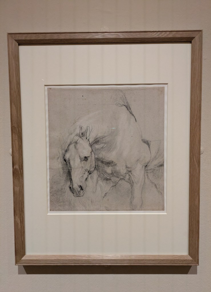
Head and Forequarters of a gray horse by Anthony van Dyck
So much of what we see in drawings feels like a glance into the ‘behind the scenes’ of an artist’s process, whether that is preparatory sketches, studies for prints or tapestries, observations of landscapes, or designs for much larger works. One piece that caught my eye was a beautiful sketch of a horse by Van Dyck. Its head is lowered, its gaze fixed. It appears to be waiting patiently – you can see the fine detail from pulsating veins to strands of its mane. This was a preparatory sketch for the 1618 painting, St Martin Dividing his Cloak, an altarpiece in the Sint-Martinuskerk in Zaventem, Belgium. If you look at them side-by-side, I much prefer the drawing to the fully fledged painting. It is the most immediate art form – far more intimate than a grand oil painting in a heavy gold frame.
Saint Martin Dividing His Cloak, Anthony Van Dyck, 1618
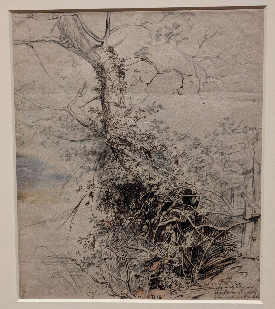
The horse wasn’t what brought tears to my eyes, though. It was this one: ‘A Dying Tree, its Trunk Covered with Brambles, Beside a Fence’, about 1618, by Peter Paul Rubens (though experts are divided as to whether it’s by Rubens or Van Dyck).
‘Dying Tree, its Trunk Covered with Brambles, Beside a Fence’, about 1618, by Peter Paul Rubens
The label explained that the drawing is made with a combination of materials: pen and brown ink; red and black chalk, with greenish-brown watercolour, touches of opaque watercolour and possibly oil paint. As with the horse, the drawing is a study for a larger painting. Rubens’ Landscape with a Boar Hunt, now held at the Gemäldegalerie in Dresden.
We see a tall, curving trunk of a tree emerging from a dark undergrowth. Its branches are bare, but all around it is covered in leaves, crawling up its spine, embracing it, possibly cradling its inevitable fall. The leaves fade in and out of focus, like a magnifying glass is passing over the surface of the drawing while we look at it. The undergrowth is dense and dark with cross-hatching. It reminded me of an oak tree I developed a fascination with when my mum was dying. While she was in hospital, I’d pass the time at walking near her home, watching the landscape blossom from late spring to the height of summer, this explosion of nature and life totally at odds with the personal turmoil we were experiencing.
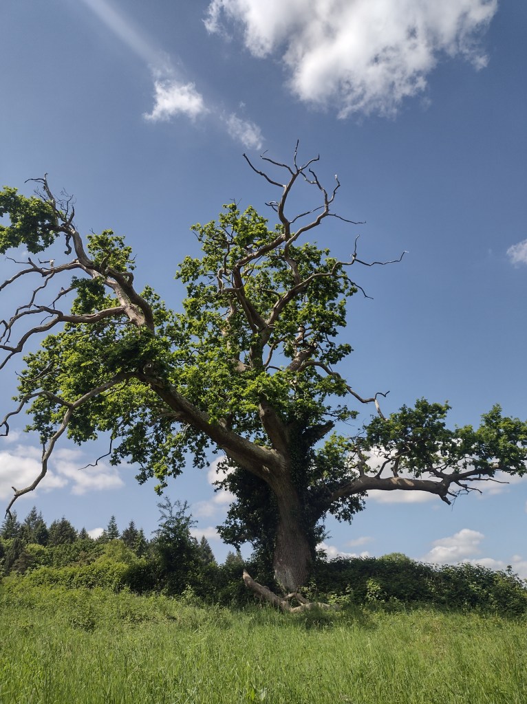
This special tree is a patchwork of life and death. Some branches are spindly and bare, but other parts of it are thriving, covered with masses of green, bright growth, healthy leaves shining in the sun. To this day, whenever I visit my dad, I check on the tree to see how it’s doing. It’s just a short walk from where my mum is buried.
The tree in May 2022
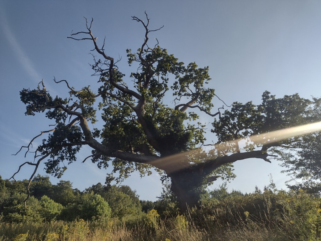
There is something comforting in being reminded that death and life coexist. Nature knows this: the ivy thrives on the branches of a dying tree, and dead wood itself is a great source of shelter for insects and is home to fungi. When a tree dies, the light that reaches down can cause huge spurts of growth on the forest floor beneath. Back in the early 1600s, Rubens took the time to observe this, laboured over it with intense detail to create what is now considered to be one of the greatest nature studies produced in Europe in the 17th century. Little did he know that 400 years later, his study of life and death would bring tears to the eyes of an observer, because it reminded her of someone, something, a time and a place, lodged in memory.
That, ultimately, is the beauty and meaning of art for me: every time you look at a picture, you bring the whole weight of associations of images, places and people you have encountered before along with you. It will mean something unique and distinct to everyone. Sometimes, it might just be a picture. Other times, it might be a whole lot more.
The tree in September 2024 – it’s still living and dying
Some exhibitions have an unofficial soundtrack in my mind. Francis Alÿs’ Ricochets at the Barbican, which closed a couple of weeks ago, has had Whitney Houston’s The Greatest Love of All bouncing around in my head. The song starts with a gentle falling scale on the synth, and then Whitney comes in with the words: “I believe that children are our future/ teach them well and let them lead the way… let the children’s laughter remind us how we used to be.”
I’m a woman and I’m 32. That means that I am almost daily drawn into discussions of children. People ask me why I don’t have them, or if I’m wanting to have them. I’m an auntie and a guideparent. Some of my closest friends have babies, toddlers, kids in primary school. Some are wanting babies and it isn’t happening for them at the moment, some have had miscarriages and lost unborn children. I kind of knew the phase would come, when this would be the main topic of conversation dominating my life, but I had never expected an art exhibition to bring me back to it once again.
I’m with Whitney, I do believe children are our future. I think that artist Francis Alÿs does too, which is why he has spent years and travelled the globe collecting and documenting children’s games, which have been compiled together in beautiful, moving, sensory-overload-inducing multi-screen installations for his exhibition at the Barbican. The photos I took weren’t great, but the most wonderful thing about the project is that all of the Children’s Games videos are available online. You can explore the whole roster here and I’ve linked to specific ones in this post.
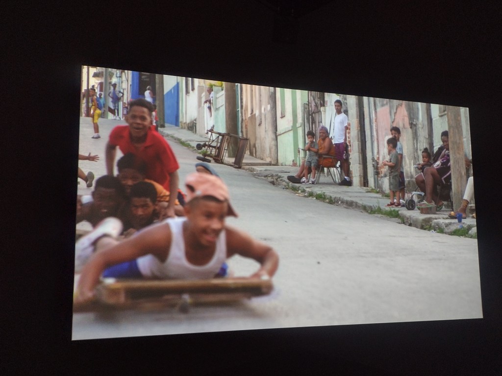
I loved immersing myself in the worlds of these children, as they raced perilously down hilly streets on makeshift go-carts, as they played “Doctor Doctor!” in a yard by a cold-looking lake, as they raced snails on concrete or flew kites, skipped and skimmed stones. They enliven and brighten and spark joy wherever these games take place. Even in war zones, places decimated by wars now over, in refugee camps, their flame and zest for life burns so brightly. The sensitive curation at the Barbican brought this home: when children play in barren wastelands, they are no longer barren. It kindles a moment of hope.
Children’s Game #40: Chivichanas La Habana, Cuba, 2023
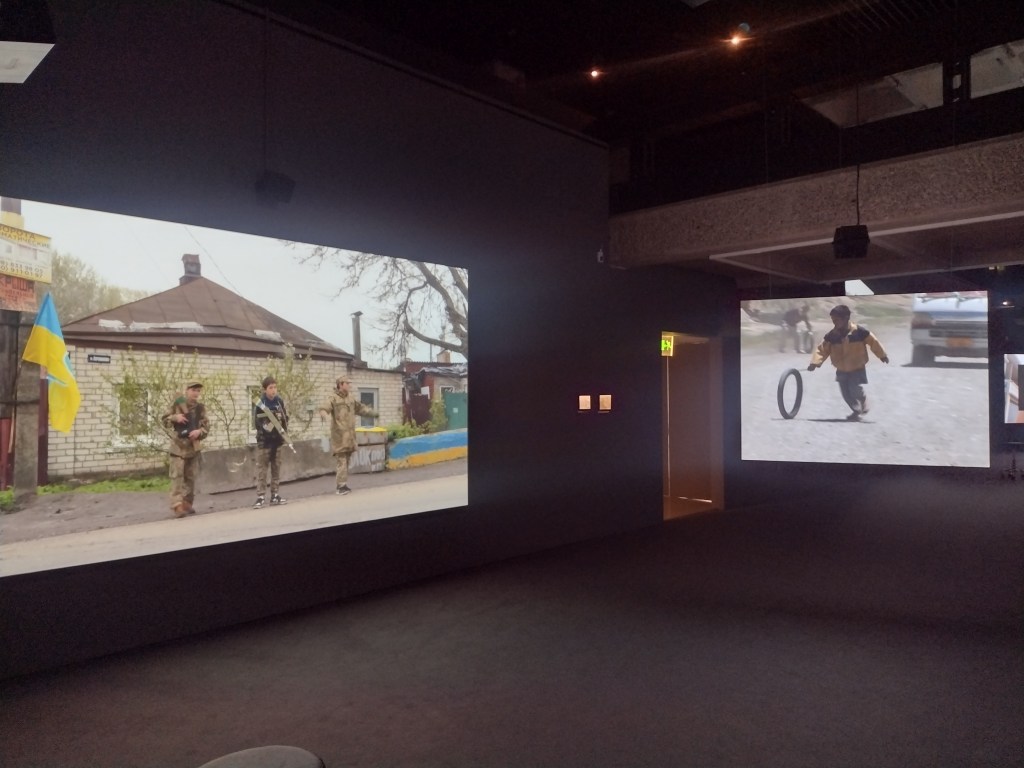
In one of the exhibition’s longer videos, Parol, three Ukranian pre-teen boys are dressed in khaki and have wooden rifles, daubed in yellow and blue, slung over their shoulders. As the accompanying text explains (beautifully written for each game by Lorna Scott Fox), the boys “act out a grown-up duty: to uncover Russian spies… Cars are flagged down, IDs requested, trunks inspected. A password is demanded: “Palyanitsya”, the name of a traditional Ukrainian bread, and a word that Russians can’t pronounce right.” While the drivers of the passing cars appear to be cheered by their interactions with the children, it’s a perilously pertinent reminder that in a few years, these boys won’t be playing anymore. They’ll be on the front line. The existence of innocence always implies the loss of it.
Children’s Game #39: Parol Kharkiv, Ukraine, 2023
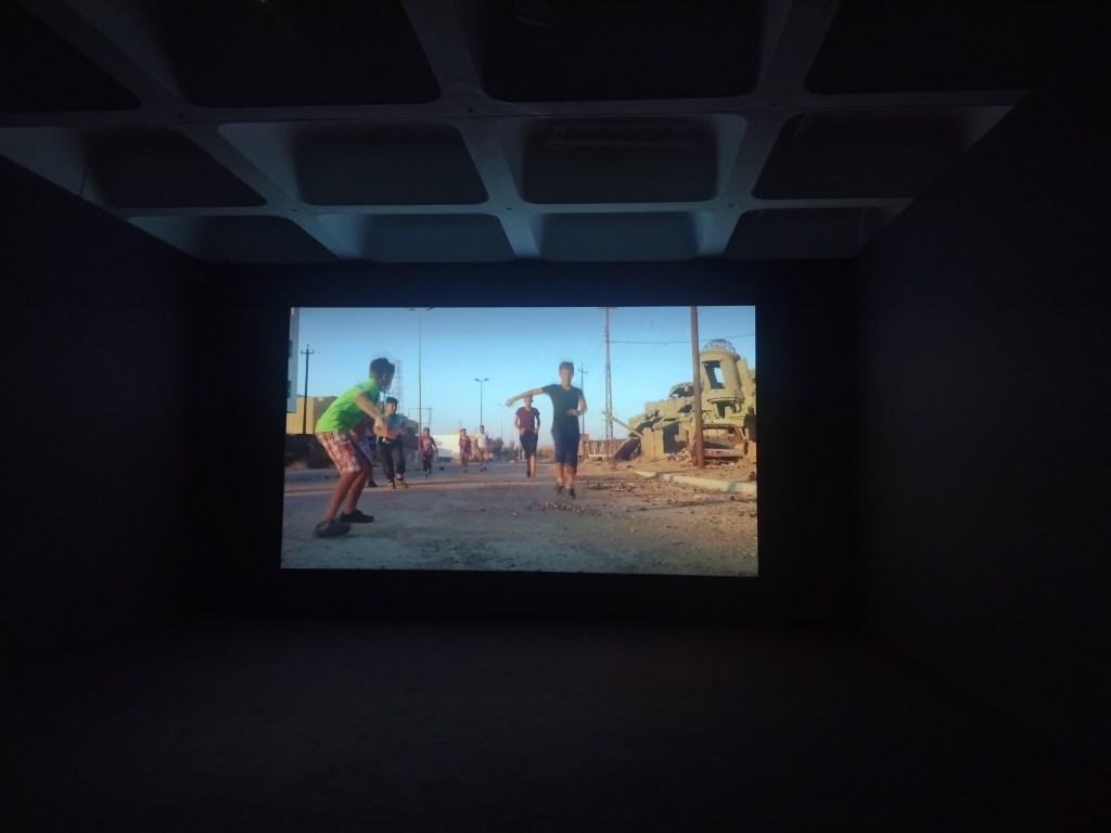
In Haram Football, a group of lads between 8-15 years old gather in the streets of Mosul, Iraq, to play a game of collective imagining inspired by ‘the beautiful game’. Haram means ‘forbidden’, and football was forbidden under the rule of Islamic State. In the shadow of that regime, these boys perfected their craft of playing football without a ball, a collective pretending, all in agreement where the ball bounces, rolls and flies through the air. They shake hands and once the game starts, they jostle, dribble and leap for headers. All around them there’s rubble and collapsing buildings, the sun is setting. At one point, a tank drives straight over their makeshift goalpost, the boys just rebuild it and carry on. They disperse into the rubble and the shadows at the sound of an explosion or gunfire, but return at the end under the cover of darkness, to announce their names paired with their favourite clubs.
Children’s Game #19: Haram Football Mosul, Iraq, 2017
It is utterly impossible not to think of Gaza. Back in May, Unicef estimated that 14,000 children had been killed in Gaza, with 17,000 of them unaccompanied or separated. Obviously that number just keeps on going up. While I’m sure that Alÿs will be visiting Gaza to document children creating games and hope from within whatever rubble is left, it is brutal and sickening to know that the children who do survive there will inherit decades of trauma, no matter how strong their resilience is, no matter how skilled they are at continuing to create joy even among the horror. I’m reminded of Greta Thunberg’s speech to the UN in 2019: “you come to us young people for hope? How dare you.” Yet we keep on turning back to children to kindle hope in the despair and darkness, to create something better than we have. They have so much resting on their small shoulders.
If hoping is a radical act, then having children surely must be the most radical act of hope. For me, in my head, I’m still the girl in the blue summer dress weaving through the cityscape and avoiding stepping on the lines, not one of the earthbound, onlooking adults. That is the magic of Alÿs’ project. It reminds us of the beauty and fragility of youth but also presents the language of play as the universal one, the one that connects us all, if we can only hear their laughter, to ‘remind us how we used to be’.
Children’s Game #23: Step on a Crack Hong Kong, 2020
It only feels like yesterday that I put together my five to see at 2023’s iteration of Edinburgh Art Festival. And we’re already one week in! The Festival officially finishes on August 25th, but don’t fret. Many of the shows carry on beyond festival season.
EAF is 20 years old this year and there really is something for everyone. So if you’re searching for something different to do this weekend, with a bit of space from the Fringe crowds, here are my suggestions.
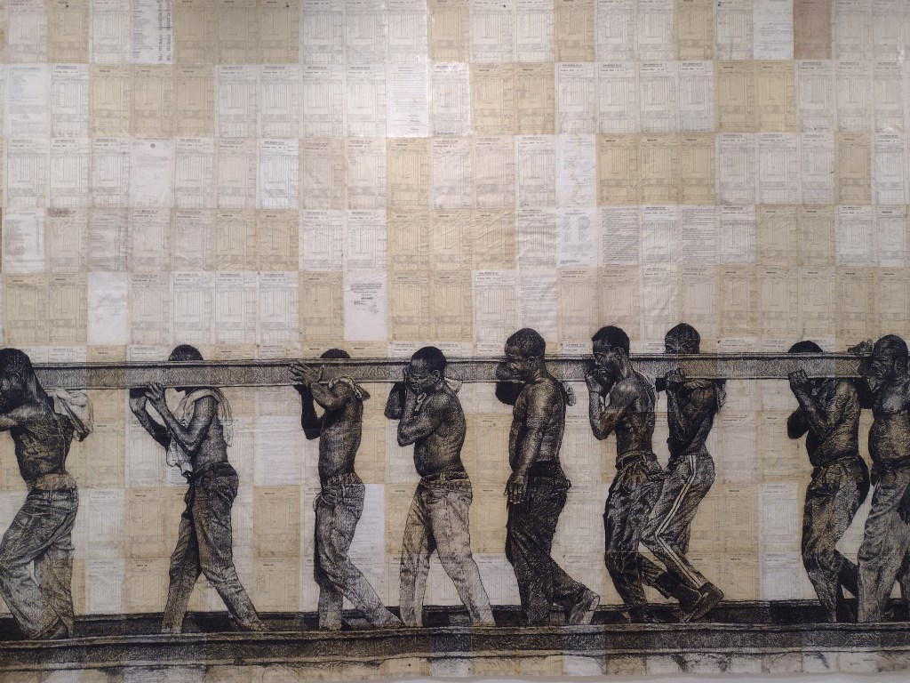
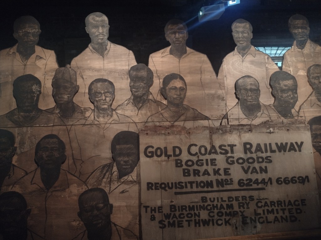
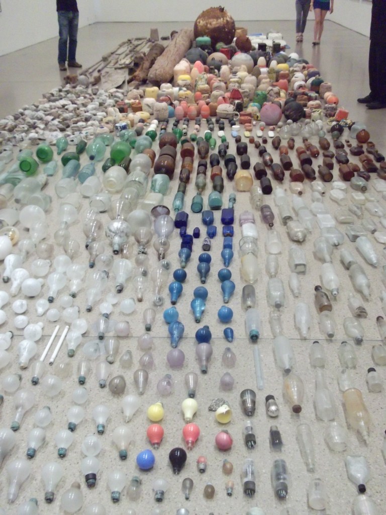
When talking to odious people about colonialism one of the things that might be brought up is how colonisers implemented infrastructure – roads and railways – to the country that enabled it to advance. Songs about Roses explores the reality: these infrastructures were just a mechanism for extracting goods out of that land to make profit for the colonisers (pillaging). Mahama has collected huge pieces of a now defunct railway that was built by the British in 1923 to transport gold, minerals and cocoa around the area of Ghana that was then known as the Gold Coast. He has subverted and reframed these materials and given them new meaning in the process. In a video played on the ground floor, we see drone footage of these immense, rusted train carriages being transported across the Ghanaian landscape, like a funerary procession. Archival documents show the administrative nuts and bolts of empire building, that have now become the canvas for portraits and line drawings.
Detail of My Dear Comfort (2024) by Ibrahim Mahama
Delving further into archival material, Mahama has gathered group photographs of railway staff, which were taken pre-independence at railway workers’ retirement parties and company events. These are now rendered lifesize in charcoal and mounted on old railway tracks. The ghosts of colonial infrastructure have now returned to the Fruitmarket Gallery warehouse space: the place has become a monument to the railway workers, members of strong unions that played a key role in Ghanian independece and its immediate aftermath. It’s a dark room, thick with dust and the smells of industry. Perched as it is above Waverley station, I couldn’t help but think of Jamaican philosopher and academic Stuart Hall’s words on empires: ‘we are here because you were there’. These legacies are the ghosts of history and they have come home to roost.
Detail of Sekondi Locomotive Workshop (2024) by Ibrahim Mahama
Yet it’s not an exhibition that is about the story of historic exploitation alone. It’s also about Ghana’s future. The collaborative nature of Mahama’s practice is a source of hope: he sells his work in Europe and the USA and funds art and education institutions and projects in Ghana with the profits. Many of the works in the exhibition have links to audio of Muhama discussing the process of creating the works and exploring the ideas that inspired them – definitely worth a listen when you visit.
I was lucky enough to meet artist Renèe Helèna Browne before seeing this piece, who explained how, though the surface story is about rally car driving, races and culture in Ireland, creating Sanctus! was really a mechanism to get to know their mother better. Browne discussed how, when thinking about their mother’s life, it was dominated by two systems: the catholic church which presided over her childhood, and the system of motherhood and raising children which followed. Both of these are explored in the work, but slowly, tentatively. The main piece is a film, lasting about 15 mins, obscured behind a red leather curtain (the red is a nod to the colour of Browne’s uncle’s rally car). As the viewer sits in the darkness we are confronted with the sounds of cars revving their engines. We see a distorted view of leaves and branches buffeted by the wind – reflections in the shiny paintwork of a vehicle.
What emerges is an intimate but simultaneously distant picture of the artist’s mother. At work at the farm. At home. Snippets of conversation where artist and mother discuss family deaths, the afterlife, faith and meaning. Their conversations seemingly evolve side by side but never quite join together. An intimate portrait of memory surfaces: the teenage child meticulously dyeing the mother’s hair and eyebrows. All the while the film explores the hyper-masculine space of rally driving. A little boy in full rally gear eagerly awaits the cars at the side of the road, poses for family photos with his father, uncles, cousins. Teenage boys drive cars in mesmeric circles like a dance, where they edge ever closer until you feel sure that one of them will collide (I think it’s called adjacent diffing). Meanwhile, we see the artist’s view from the sidelines. It feels as though this rally driving world is a source of nostalgia, a means of connection hovering close but always just out of reach. Fascinating and multilayered: I hope to go again to see the things I missed the first time. I also need to get some photos!
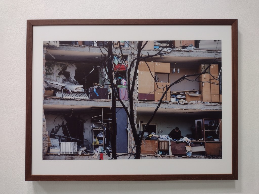
I am always drawn to the shows that Stills puts on and this one is no exception. There’s much talk about how now that everyone has access to good quality cameras via their smartphones, everyone’s a photographer. But when you go into a place like Stills you realise there is a still a difference. During the hype and excitement of the Fringe, it seems like the last thing you might want to do is look at photographs documenting the brutal realities of war. But the way this small but powerful show is put together makes it utterly necessary. We see a snapshots of clothes and possessions that refugees have left behind on a beach. There are insights too from Ukrainian life from the very end of the Soviet Era: in Passport (1995) photographer Alexander Chekmenev visiting the elderly at home to take passport photos and exposing the brutal reality of their living conditions. There’s an apartment block which looks like a doll’s house because the front of it has come clean off.
Damaged buildings in the aftermath of shelling, Podilskyi district, Kyiv (March 2022), Mykhaylo Palinchak
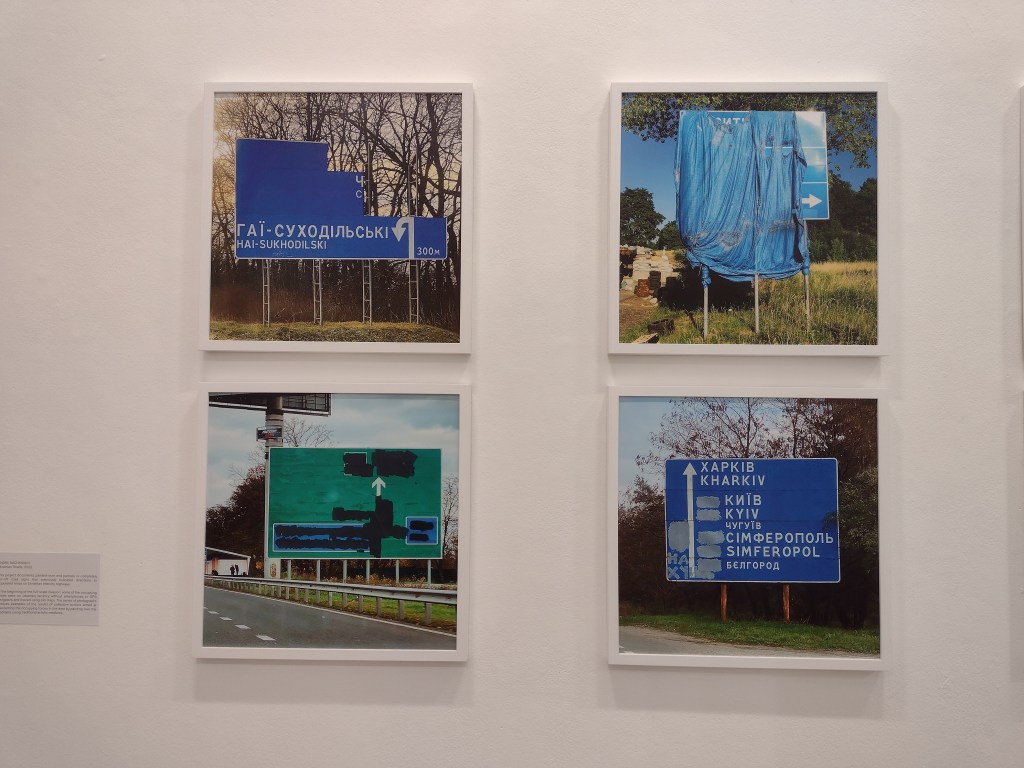
In the series that captured my attention the most, Ukrainian Roads (2022) by Andrii Ravhynskyi, we see roadsigns that have been obscured by bin liners, plastic bags, the mileage between towns and village names daubed with black paint: all attempts by local Ukrainian citizens to confuse and disorientate the Russian army whose GPS was patchy at the beginning of the war. Something so simple as a road sign, that looks so familiar, conflated with what has now become familiar because they are synonyms of war: Kharkiv, Kyiv, Simferopol. These images are deeply unsettling but demand to be seen.
I always enjoy seeing what the EAF Platform artists are up to. Now in its 10th year, the platform programme is a group show for emerging artists, and they have taken over a floor of the City Art Centre with this year’s presentation. The artists are Alaya Ang, Edward Gwyn Jones, Tamara MacArthur and Kialy Tihngang, who were asked to respond directly to the themes of the 2024 programme: intimacy, material memory, protest and persecution. My particular favourite was Gwyn Jones’ multi channel video piece Pillory, Pillocks!, where we see muck, slime, food residue and all manner of unknown substances flying at the face of a person looking back at us. He flinches, we flinch, and each time is saved by the presence of a clear screen. The artist says that it’s a response to historic shaming of people (think the stocks, rotten vegetables), humiliation and entertainment. It reminded me how as children we used to watch “get your own back” willing parents to be covered in slime. While you pity the man in the video, part of you wills for the protective screen to disappear.
I promise I will add some pictures to this section when I revisit!
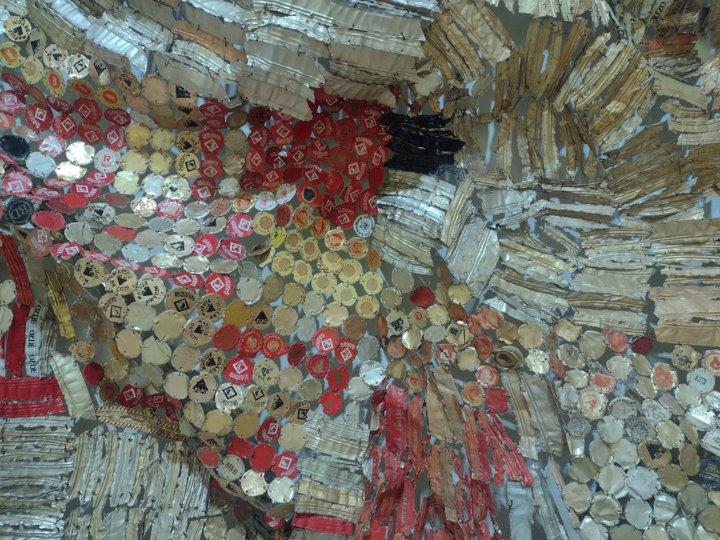
It feels so right that El Anatsui’s exhibition overlaps with Ibrahim Mahama’s at the Fruitmarket. Both artists are concerned with materiality, the legacies of history, colonialism, consumerism and they both work on a vast scale. I love El Anatsui’s work because it can be taken in on so many levels. You begin seeing the work from afar, dwarfed by it (recently, these huge scale works have adorned the side of the Royal Academy and the Turbine Hall in the Tate Modern). As you approach, it’s like zooming in to see the pixels in a photograph, each element emerges as unique and distinctive. These huge ‘tapestries’ may look like woven Kente cloth, but slowly reveal themselves as thousands of pieces of reclaimed aluminium bottle tops, from Ghana and Nigeria’s liquor bottling industries.
El Anatsui, details
This exhibition is the largest examination of El Anatsui’s work staged in the UK, and spans five decades of his career. The crowning glory is the beautiful and huge outdoor installation TSIATSIA – Searching for Connection (2013) which dominates the Old College courtyard, draped over the Georgian architecture like some shining shroud. Yet it’s also a treat to see smaller works which I wasn’t so familiar with: works on paper, and carved wooden reliefs. I would love to see these two giants of Ghanaian art in conversation. Or, at least responding to the other’s exhibitions. Come on Fruitmarket and Talbot Rice, make it happen?
TSIATSIA – Searching for Connection (2013) with Andrew for scale
There are still shows I haven’t managed to see yet, so what I’m looking forward to exploring next are:
I was in London last weekend, and with the cultural cul-de-sac of January now over, I was spoilt for choice as to what art to see. Exhibitions includingDonatello: Sculpting the Renaissanceat the V&A and Alice Neel: Hot Off the Griddle at the Barbican were clamouring for my attention. But instead, I picked a small exhibition at one of London’s ‘secret’ treasures – the Estorick Collection in Islington.
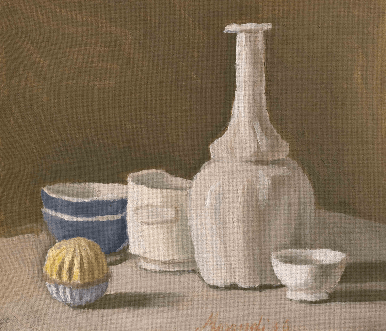
I don’t get art sometimes. Not perhaps the stance you’d immediately associate with someone claiming to be an art blogger. But what I really mean is I don’t always understand why I like what I like. Giorgio Morandi’s work is quiet, steady, pastel-coloured, and consists mainly of still lifes of vases. Writing it now, it doesn’t sound particularly scintillating. Luckily my pal trusted my artistic judgement and, coupled with the fact that that London postcode is particularly strong on post-gallery cake options, we headed along.
Still Life (1936), Giorgio Morandi
For the exhibition, the Estorick Collection has paired up with the Magnani-Rocca Foundation, combining both the Estorick’s own collection of etchings by Morandi, and the Foundation’s more extensive collection of paintings. Magnani was a persistent collector over the course of his and Morandi’s lives, and the letters between them on display in the exhibition provide an interesting insight into the artist-patron relationship.
The exhibition was small, made up of only a few rooms, which allows you to focus on each work in its own time, and I think these sorts of artworks need some time. There they were, lined up in neat rows along the white walls. Morandi’s persistent, almost obsessive, repetitive paintings of vessels. Vases, cups, bottles, all stand in grey and brown and pink arrangements. This should not be that interesting, but somehow I found myself under their slow spell.
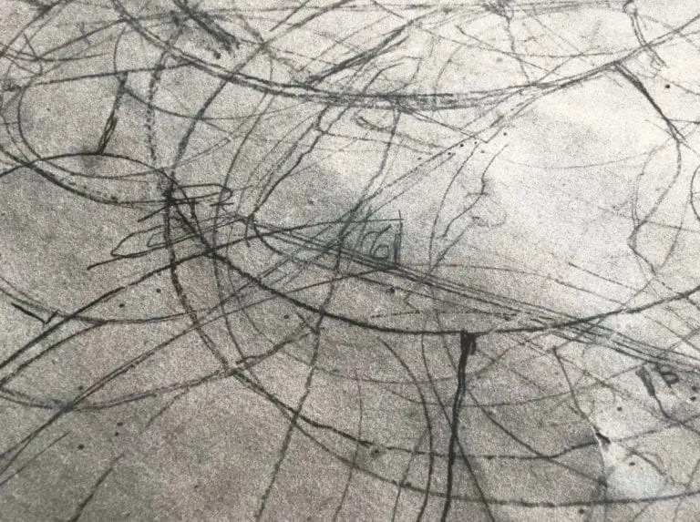
Artists over the decades have been fascinated by Morandi, and while looking at the paintings in front of me, I was reminded of a film, Still Life by Tacita Dean, made in 2009 after she spent time in the Bologna apartment where Morandi lived and worked for over 50 years. The film focuses on the measurements and careful markings found on the paper Morandi placed underneath his objects. These traces have a kind of magic to them, the same magic held by the objects, the empty vessels he returned to again and again.
Still Life (2009), Tacita Dean
I’ve long been a fan of still lifes, and by this, I mean the grand ones from the 17th century that you can find the National Gallery or the Wallace Collection. They are voluptuous, excessive, violent even. Full of reminders of life and death, tables groaning with the excess of food and silverware. Looking at these paintings is a visual treasure hunt, like reading Where’s Wally. Is that a monkey in the corner?
Still Life of Fruit and Vegetables with Two Monkeys (about 1620), Jan Roos
Morandi’s are the opposite. They are sort of dry and dusty. They are objects which hint at a precious use or existence but don’t give much else away. There are no extraneous distractions. It is not the sort of art that ‘performs’ well in the Instagram age, but there is a joy in this stillness. Up close, the objects are scrubby and mottled, the scratches in the paint are plainly obvious. But then, you take a few steps back and they meld and resolve, like a key change from minor to major.
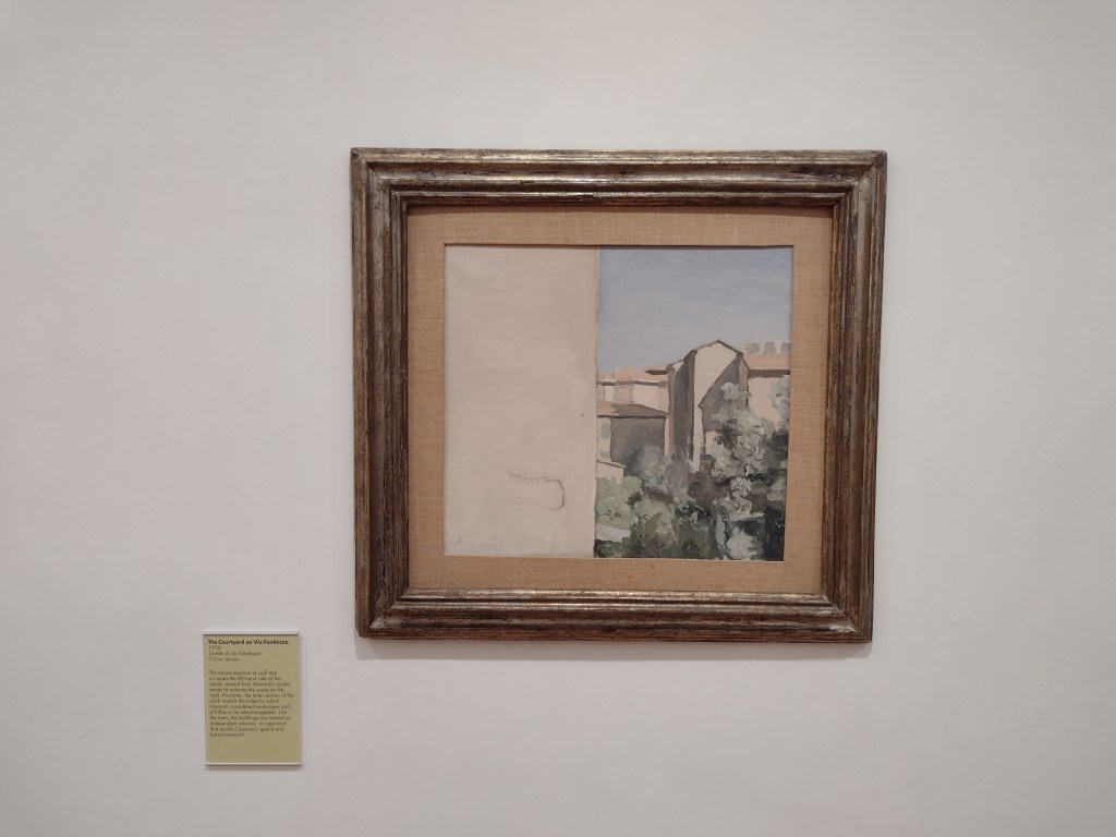
The only photo I took, shows The Courtyard on Via Fondazza (1954), a painting of some buildings and trees next to an enormous blank space on the left, which almost looks like totally untreated canvas, but actually depicts the empty side of a windowless building. It’s the space Morandi gives his subjects that I find satisfying to observe, and the exhibition wall text suggested similarities with Cézanne’s approach to space and form.
The Courtyard on Via Fondazza (1954), Giorgio Morandi
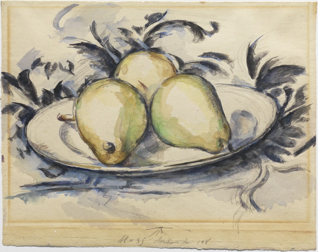
Perhaps this parallel with Cézanne is what endears me to Morandi so much. Years ago, I went to a Cézanne exhibition in Oxford where I bought a postcard of his work Three Pears (1889-90). After the show, a friend of a friend was bemused by it all: “I don’t get it. It’s just pears?”. I didn’t really know what to say. Yes, they are pears. But they are very lovely pears?
Three Pears (1889-90), Paul Cézanne
More and more these days, if I try to interrogate what I like about looking at art, it boils down to how it makes me feel. The feelings lead the way. After a while of walking around the exhibition wondering why Morandi was so obsessed with empty vessels, I decided to stop wondering why and just enjoyed the tranquillity, stillness and peace that looking at these quiet paintings can bring.
There’s a poem by Philip Larkin my Mum loved called Church Going, where he describes encountering an old abandoned church, and he doesn’t know why, but it means something to him. He says, “it pleases me to stand in silence here”, and that’s what came to mind looking at these small, intimate paintings. Sometimes standing, looking and feeling is enough. No other justifications or explanations necessary.
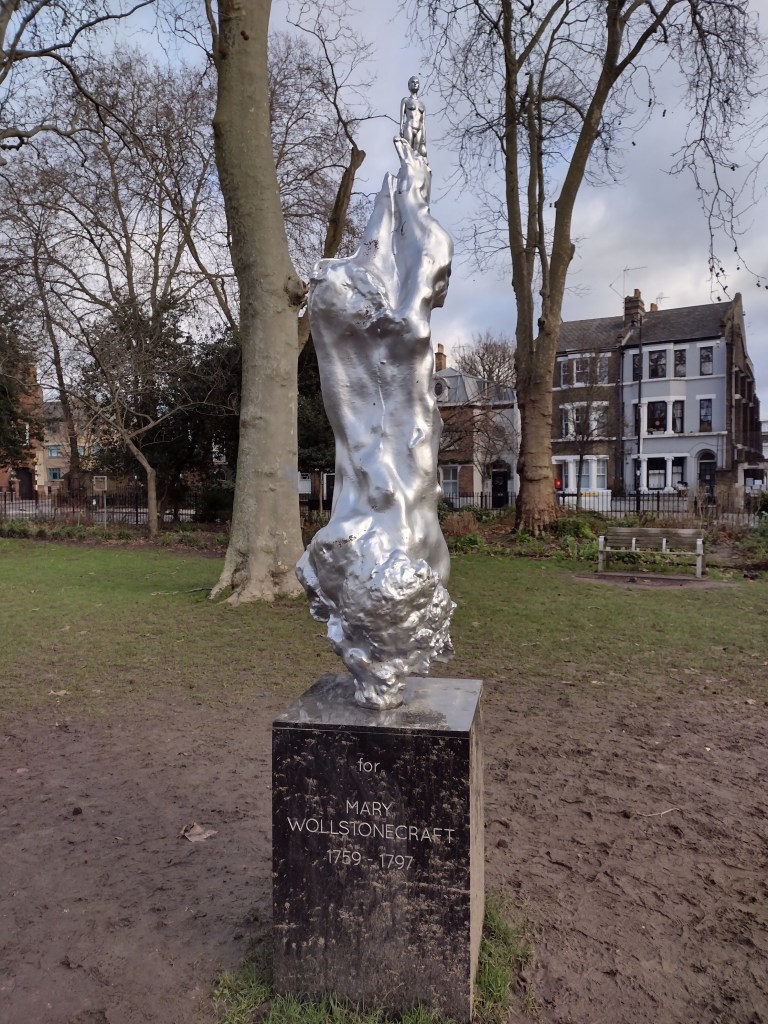
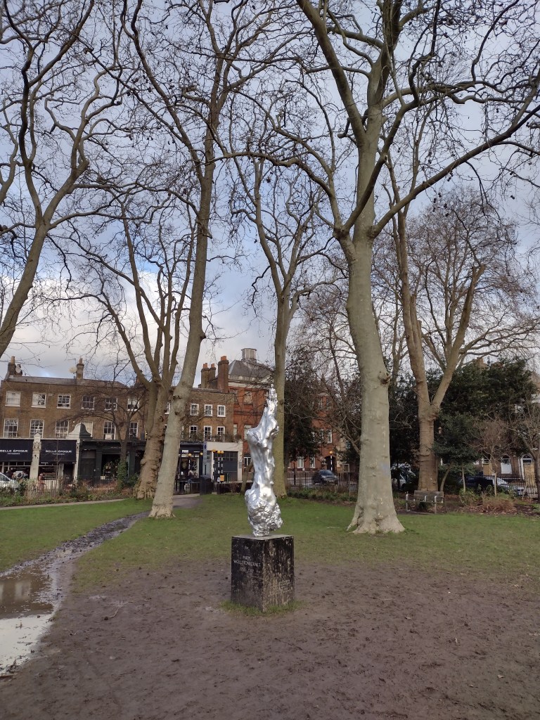
I’m currently locked down in London, so what better activity than to go to Newington Green and look at what the Guardian yesterday called ‘one of 2020’s most polarising artworks’. It is Maggi Hambling’s A Sculpture for Mary Wollstonecraft. If you missed out on the social media furore about this sculpture, the main issue was that people were very, very angry that what was supposedly honouring and commemorating one of the founders of feminism had a naked woman at the top of it. In principle I agreed and plus, visually it didn’t seem that interesting. More figurative art? Still?
As I trudged up, I hoped that I might see some protest performance going on (it has been covered up at various points), but there was nothing except a LOT of mud on and around the plinth, which reads “For Mary Wollstonecraft”, i.e. it’s for her, not of her, which is important to remember.
The statue on a muddy Newington Green
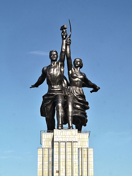
Firstly though, some perspective. The figurine that caused such a stir is TINY. She appears at the top of a much bigger silver blob, and though I was standing right up close, the height of the sculpture means she’s far away. On twitter and in the media, all the photos I’d seen were deceptive: closely cropped and zoomed in on the female figure, emphasising the defined abs, perky boobs and a full, rather prominent bush. Some were cross that the female body had been idealised in this way, but in the context of the full sculpture, that critique strikes me as odd. For me, this muscular figure brought to mind soviet-era sculptures, in particular, Vera Mukhina’s Worker and Kolkhoz Woman. Made in stainless steel, 24 metres high and created for the 1937 Paris World’s Fair, it is one of the most badass monuments ever. The diminutive size of the figure in Hambling’s sculpture works against this reading, but it still is a visual connection I find helpful when trying to place the work.
Vera Mukhina, ‘Worker and Kolkhoz Woman’, 1937
To me the figure does not read as sexual in any way. But, maybe, because of our understanding of the nude, it’s not possible to see a naked woman without this idea being drawn into this debate. As Heather Parry explained on twitter at the time:
I can't help but feel that the fuss over the Wollstonecraft statue is based in the shame placed on the female body by patriarchal systems and a misunderstanding of the naked form in art. I can't recall people saying the Anthony Gormleys should be covered up.
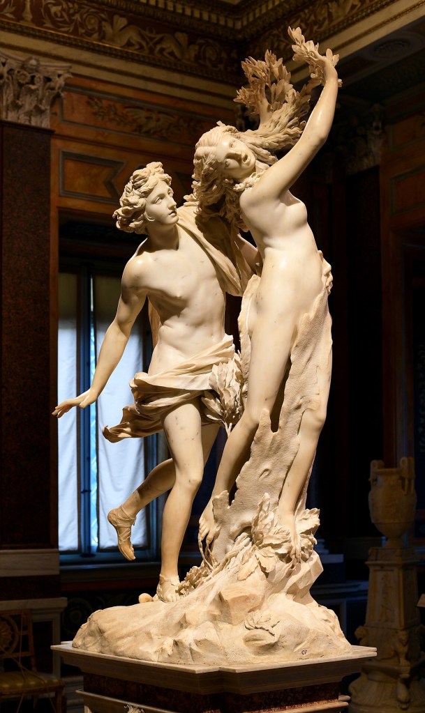
The woman emerges from a swirling mass, which calls to mind another transformation, Bernini’s Apollo and Daphne, the marble sculpture in the Galleria Borghese in Rome, made in 1622-25. It is based on the tale in Ovid’s Metamorphosis. Apollo has been struck by Cupid’s arrow, and is lusting after Daphne, chasing her. Daphne cries out for her beauty to be destroyed, or for her body to be changed to save her from the impending rape, and is transformed into a tree. Bernini’s sculpture captures the exact moment when flesh begins to become bark. Her outstretched fingers transform into leaves, she is swallowed up as the natural form encases her living body.
Bernini, ‘Apollo and Daphne’, 1622-25
It feels strange to compare those works, because the Bernini is one of my favourite sculptures of all time, and the Hambling is certainly not. But perhaps we can see the Hambling sculpture as this metamorphosis process in reverse. Here, rather than being engulfed, the female figure emerges from the shapeless forms and looks powerful. The aesthetic of the shiny silvered bronze also acts as a reversal of the natural elements in Ovid’a tale. The sheer artificiality makes it look futuristic and alien and that is my favourite thing about it.
In its almost mirror state, it jars pleasingly with the muted, natural winter browns and greens of the mud and bark in its surrounding park. There’s no missing this sculpture, it is a beacon that demands attention and has definitely received it. Wollstonecraft has too, and that’s not a bad thing.
The take home for me is that artworks may be polarising, but art is not Marmite. You can simultaneously love and hate different things about it, you can sit with it and feel differently about it on different days. It’s a reminder that especially at the moment, when we’re consuming art on a screen and from afar, context is everything. It’s good to know if we’re getting a detail or the whole picture.
This year, it is needless to say that we’ve not had the art experiences we might have been hoping for. With travel restrictions, exhibitions cancelled, rescheduled and put online, the art world landscape has changed significantly, perhaps forever. I have just had pre-Christmas visits to see Artemisia and Titian’s Poesie at the National Gallery cancelled, as London crashes into Tier Three. I’ve been longing to see these once-in-a-lifetime exhibitions for years, since I first heard they were going ahead. So I began writing this with a sad heart.
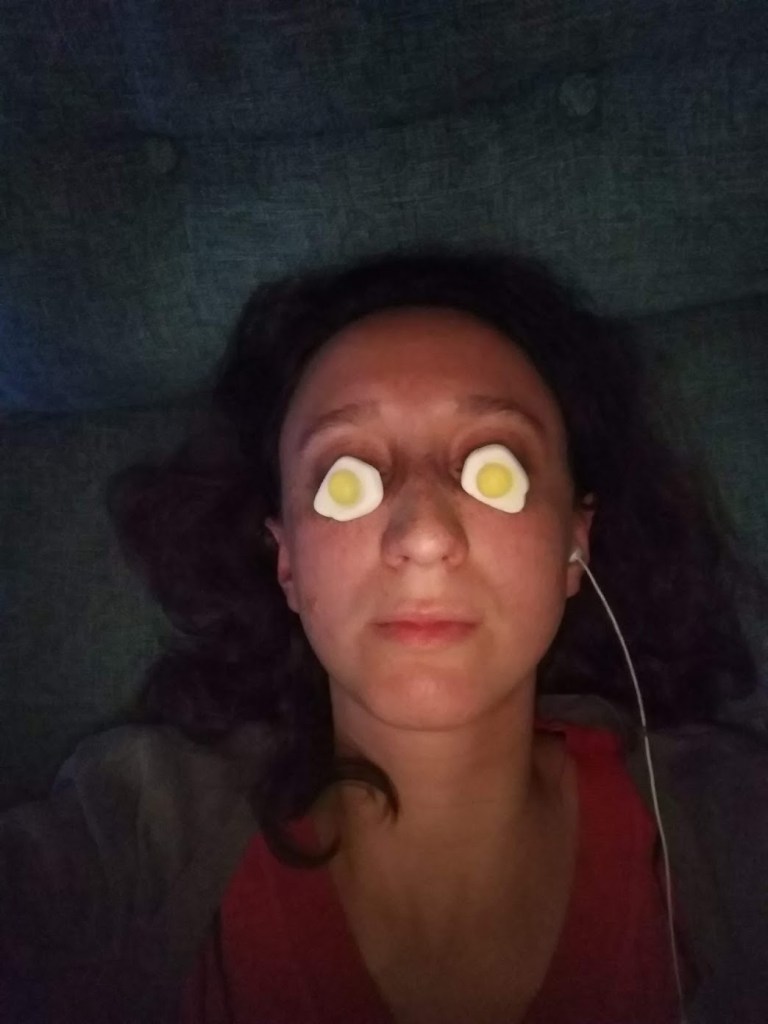
Yet despite and because of what 2020 has thrown at us, the need for art and culture is stronger than ever, as a way to escape, to heal, to reflect on what is happening. Many people have used 2020 to have a go at making art themselves, with countless organisations sending out art packs for people to unleash creativity at home. What I’m now calling Self Portrait with Haribo was born of boredom and childishness (yes I’m 29 and I still buy Haribo), but looking back at it now, it captures a particularly cabin fever-ridden moment of lockdown. Marking moments like this is a good way of acknowledging time passing, in a year that has felt interminable but with very little to show for it.
‘Self portrait with Haribo’
You’ll be relieved to hear, this blog post isn’t about my own personal creative output. Rather, it’s a moment of reflection and reassurance, to look back at 2020 and realise it hasn’t been a total creative wasteland. As by now you may have guessed, my concept of what art is is very broad, and that attitude has helped me this year. It helps me notice my surroundings, and to not feel culturally deprived, even when museums and galleries have been largely closed.
Art hasn’t gone away this year, we’ve just experienced it differently. So consider this an invitation for you to get out your phone, scroll through 2020’s photos and consider the past twelve months in a new light: there will be evidence of things you’ve seen that connect us, that have made life more interesting, that have enabled you to see or understand something differently. To me, that is the purpose of art.
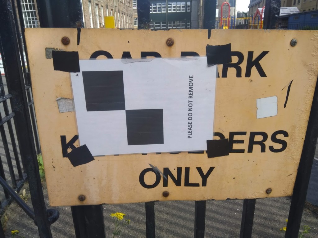
10) “Please do not remove” sign, Fountainbridge
This comes under the category of ‘weird things I take photos of in the streets of Edinburgh’. I first noticed this sign in Fountainbridge in January. It was still there in June. I love random signs, posters and stickers that are woven into the fabric of our cities. Once you start noticing them, you’ll never be able to stop: there are whole debates played out on bus stops, sign posts, bins and streetlights. I like this one because it shows how people did what the sign said by leaving it there. Either the people Edinburgh are very law abiding, or, possibly more likely, it went unnoticed.
‘Please do not remove’, Fountainbridge, June 2020
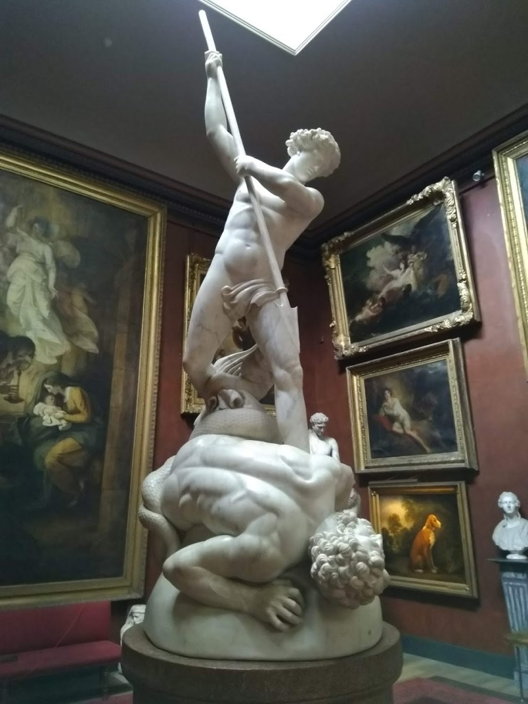
9) A visit to Petworth House
When infection rates were low, I visited Petworth House for the first time this year. I’d known that the house had lots of art connections, having seen it in the film Mr Turner, but I hadn’t realised how many treasures are packed into just a few rooms. The National Trust’s webpage says that it is one of the finest art collections in their care. It includes The Adoration of the Magi by Hieronymous Bosch, a bust of Aphrodite attributed to Praxiteles which is over 2,300 years old, and The Molyneux Globe, the earliest English-made globe in existence, made in 1592. My favourite moment was seeing the beautiful marble sculpture of Saint Michael overcoming Satan by Jonathan Flaxman, created 1817-1826. When I was studying at UCL, the full-scale plaster model that Flaxman made in preparation for this piece was on display in the main library, so seeing the final result felt like the artwork had come full circle for me.
‘Saint Michael overcoming Satan’, Jonathan Flaxman
8) Apple’s iPhone X advert at The Hermitage
Ah, who knew an advert would play such an important part in my year. I actually am one of those people who enjoy TV adverts: the ludicrous fantasies of high-end perfume, the terrible, expensive sofas at DFS. An oven chip advert about family made me cry once. Yet this advert was not your usual one. It was five hours long, a slow-paced art house film with minimal dialogue, all shot on iPhone X, filmed in The Hermitage in St Petersburg. Each Tuesday in the spring, my friend Jane and I sat down, started a phone call and pressed play on YouTube together as we watched an installment. We discussed the paintings, the dancers, the architecture, the narratives, and sometimes, we just talked over the film about life. It was as close as I came to the real experience of trawling through a major museum while on holiday and I looked forward to it every Tuesday for over a month. I’ve written a longer piece which has a link to the advert here.
7) A specific frame in The Wallace Collection
From my trip to The Wallace Collection in the summer, one object is thoroughly wedged in my mind: the frame of Ary Scheffer’s Francesca da Rimini (1835). The painting itself is very dramatic, it depicts a scene from Dante’s Inferno, with the tragic figures of Francesca and her lover Paolo condemned with the souls of the lustful to the second circle of hell. The frame completely wowed me, I think it’s one of the largest frames I’ve ever seen. You can see a book in the bottom right corner, there are doves, chains, oak leaves and a scroll which incorporates elements of Dante’s text. It was created by a certain Félicie de Faveau for the painting’s third owner, Anatole Demidoff, Prince of San Donato, who owned the painting from 1853-70.
Ary Scheffer’s ‘Francesca da Rimini’ in the Wallace Collection
6) Graveyards of Edinburgh
Edinburgh is one of the greenest cities in the UK and I recognise my privilege in experiencing lockdown here for that very reason. Exploring the city’s open spaces has led me to encounter several of Edinburgh’s old graveyards for the first time this year. Being a fan of the Romantics, the more dilapidated and ivy-covered the angels, skulls and crossbones and shrouded urns, the better. Perhaps it seems morbid, but I’ve always found these places peaceful and interesting, and as someone who doesn’t believe in life after death, seeing nature flourish in these places has always been reassuring. Warriston Cemetery, Greyfriars Kirkyard, Dean Cemetery and Dalry Cemetery are some places I’ve found solace this year, as well a place to appreciate the art and symbolism in the carvings, sculptures and iconography.
A grave with ivy, Warriston Cemetery
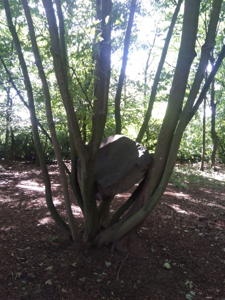
5) Andy Goldsworthy’s Stone Coppice at Jupiter Artland
Jupiter Artland – I visited at last! Cycling with my sister out to Wilkieston on the canal path, this was one of the most perfect art afternoons of the year. We walked around the whole thing slowly, soaking it all up, and got a seat in the café just as the rain came down. I love so many of the artworks here, but my top one for this list is Stone Coppice by Andy Goldsworthy. You stumble upon this artwork in one of the more unkempt pockets of the sculpture park, you might not even know it was there at first. It’s the perfect balancing act: the way the trees delicately hold the rocks, how some seem composed in a tender embrace, how others seem crushed by the branches or vice versa. The artist’s positioning of the natural matter, which is then left to its own devices to grow and unfold over the years, is poetic.
‘Stone Coppice’, by Andy Goldsworthy, at Jupiter Artland
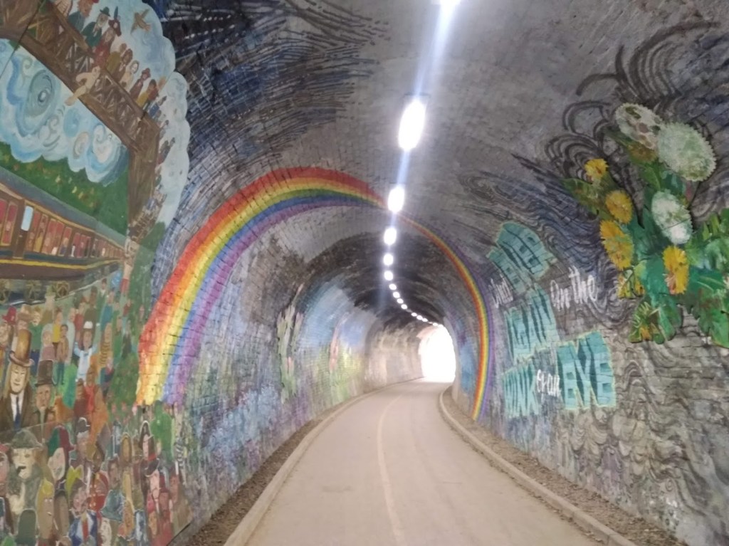
4) Rainbows – Colinton Tunnel
The cynical among you will perhaps raise your eyebrows at this… rainbows in windows everywhere were sweet at first, but as the grim reality and longevity of the pandemic set in, they started creating a backlash, with one of my favourite tweets of the year capturing a perfect counterpoint – a sign in Glasgow that simply said “This is shite”. But this huge rainbow, arching over me as I cycled through Colinton Tunnel stopped me in my tracks. Street art and bike rides have both helped me through the year.
Colinton Tunnel
3) Rediscovering Black Portraiture by Peter Brathwaite
Peter Brathwaite has taught me so much this year. His project to recreate artworks at home was born out of a light-hearted DIY art challenge started by the Getty Art Museum. But Peter’s project took on huge significance as he made it his mission to shine a light on Black portraiture specifically, and used objects in his home to explore his own ancestry and past. In the context of the Black Lives Matter protest movement this year, this exercise in sharing these portraits of Black people with the world was so important, reminding us that these figures do exist in art and history, we just haven’t seen them, we haven’t named then. The whole project showed how the personal is political. How art is a mirror that reflects history and society, flaws and all, and critical engagement with it can help us understand the world and ourselves. Scroll through Peter’s Instagram to have your mind expanded, or take a deep dive into five of his recreations as part of The Essay on Radio 3 – highly recommended listening.
Though I was a fan of Ru Paul’s Drag Race before 2020, the antics of the queens, their talent, their silliness, their mental strength and their artistry has meant the show has been my constant companion through lockdown. Yes, one of the reasons I love the show is that it satisfies my craving for gossip and drama, which has been so utterly lacking in real life this year. But despite its highly formulaic reality TV structure, the show has done so much to expose mainstream heterosexual audiences like me to the art of drag. And what an art it is! It’s difficult for me to pinpoint an exact moment, but I think we can all appreciate that the two-in-one catwalk outfit Violet Chachki burst on the scene with, in the very first mini-challenge of season 7, is the most delicious balance between high fashion and performance art.
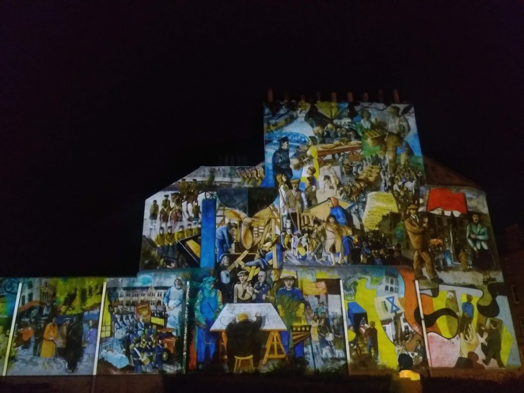
There are some artworks that seem a little like magic and this is one of those. If you’ve ever seen Leith’s historic mural near Leith Theatre, you’ll know it’s not in the best state of repair. The colours have faded, the edges are eroding, it’s difficult to decipher. I wouldn’t necessarily want to change that, fading is part of a mural’s cycle of existence. Plus I’ve heard that the artists Paul Grime and Tim Chalk, who created the mural in collaboration with local residents in 1985-6, have resisted suggestions of the mural being restored. This decision then, to use projections, sound effects and music to bring different parts of the mural to life, is inspired. With the projection focusing on particular characters and animating different parts, we see a ship’s rudder gently rotating, children playing and soldiers marching. We notice the mural’s complex layers, and the installation restores what is a special piece of street art and local history in the city’s collective memory.
There you have it, my top ten art moments of 2020 so far. What have yours been? I would love to hear from you, so feel free to leave me a comment or DM me on Instagram or Twitter.
Over the last six months, I’ve missed a certain feeling that being in a gallery or museum gives me. Before lockdown, I knew that looking at art made me feel calm and curious, slowed me down, gave me space. But my return to visiting a couple of places which house art (in London – Scotland’s major galleries are still closed for business) has made me realise what I particularly like about it. Experiencing art makes me remember I am part of something bigger than me.
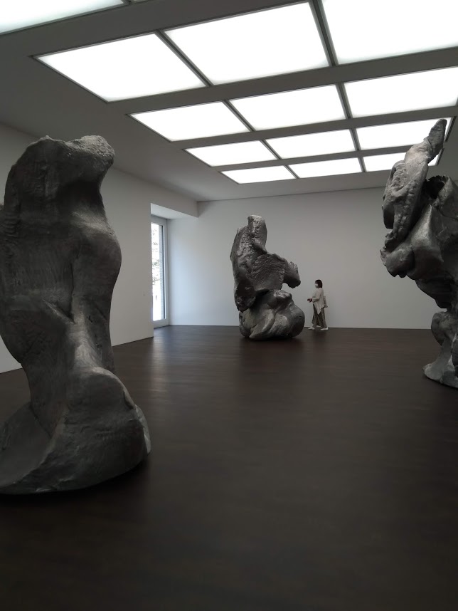
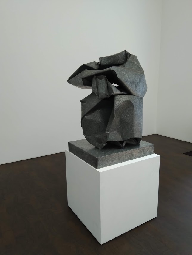
This realisation hit home most clearly when I went to Gagosian Grosvenor Hill to see Crushed, Cast, Constructed, a show with a wholly grey palette, featuring only five works. These are sculptures made in metal by John Chamberlain, Urs Fischer and Charles Ray. The three works by Fischer dominated the show: they started out as lumps of clay moulded by the artist’s hand, and then were scanned, enlarged so each model was over 3 metres high, and cast in aluminium. It’s like they are the product of a kindergarten for giants, that have been dipped in a vast vat of bubbling of metal and then returned to our world as serious, grown up objects. They are alien, they are too big, the Guardian’s critic Adrian Searle found them overbearing.
Installation view showing the vast scale of Urs Fischer’s aluminium sculptures
But that feeling of being overbourne (not a word) is actually pleasant after being the biggest thing in your same four walls night and day for six months. It’s the same reason I like big skies, mountaintop views, the sea.
Even the mechanisms and processes that created these objects and made them possible as art – the ideas, the funding, the training, the supplies, the gallerists, the agents, the transportation, the curation and a million steps in between are too big and complex for me to get my head around – especially after being separated from this ecosystem for such a long while. We, the viewers, are the very end point, the final cog in the machinery of the art world. Sometimes it’s actually nice to feel like a cog, while at the same time knowing you are the privileged recipient of all the cumulative hard work of others. It takes you out of the mundane minutiae or dramatic highs and lows of your personal existence and allows you to just be, for a brief moment, an uncommitted observer. You don’t even have to like the art you’re looking at to get this feeling.
In an era where we’ve all had so much time to sit with ourselves, in our sometimes messy, sometimes directionless lives, it was somehow restorative to spend time in this clean box of a gallery. With its white walls and dark, smooth floors, architecturally it is the polar opposite of a home, where each object is imbued with personal meanings or tasks yet to be completed (laundry, cards to respond to, bikes needing a service). To be an anonymous person in this quiet room, looking at these weird objects, is to abdicate responsibility. I owe nothing to them, they owe nothing to me.
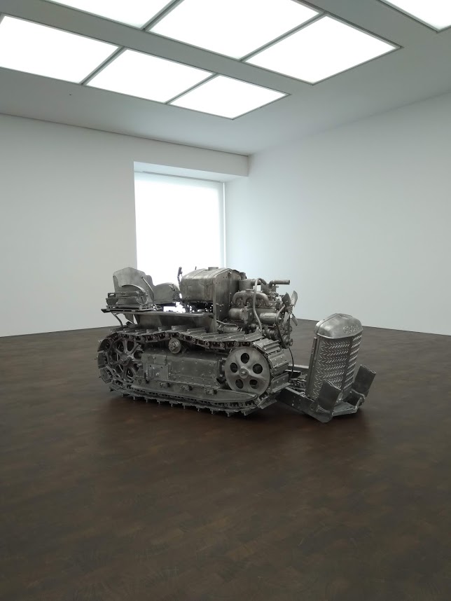
Charles Ray, Tractor, (2003-4)
They are weird objects. Alongside Fischer’s gigantic clay-as-metal lumps, there is a crushed box cast in galvanised steel and zinc by John Chamberlain and an old tractor that was painstakingly taken apart by Charles Ray and each piece cast in aluminium before being put back together.
Some might say this kind of art is pointless: it’s difficult to imagine who might even collect such objects, once perhaps useful and functional, now rendered inept by their recreation. But here, in their very pointlessness, in their mere taking up of space for our perusal, they signify everything we’ve been denied in these serious Covid times: fun, playfulness and even a kind of detachment from the chaos of the world unfolding around them. That shift in perspective was like a tonic to me. In their metallic, alien coldness, these sculptures restored my understanding of the world as something far bigger than me, a realisation I often find reassuring.
A few of my friends, who know I’m interested in public space, memorials, statues and public art (because I’m constantly banging on about it) have asked me what I think about the debate raging over statues in Britain. In order to try and express this, I’m going to draw on something I wrote during my MSc at Edinburgh College of Art last year, which takes two case studies from the USA as its main examples.
I want to show that public art, including performative rituals such as protests, can usefully inform debates around our identity, and that a frank discussion of visual culture in public spaces remains vital for understanding the public sphere we operate in today.
The essay was written for a class called Art in the Creative City, run by Harry Weeks (now at Newcastle University ). I’ve taken out large chunks, removed the footnotes and edited it fairly heavily in the interest of making it more accessible. If you want to see my reading list or access the original essay, send me a note in the comments, or DM me on Instagram. Events are changing so fast. ‘Statue defenders’ are holding protests at London’s Cenotaph as I write this. I’ll try and keep up with the momentum. Asterisks mark the start and end of the essay section, before sharing some of my thoughts on the situation in Britain.
***
The question of who is commemorated and who is erased in public space is one that is charged with different interpretations of history, politics and the concept of identity. Historically, public art has reflected the power of the dominant forces in society, because having a presence in public space, being deemed worthy of representation, is a signal of power, status and money.
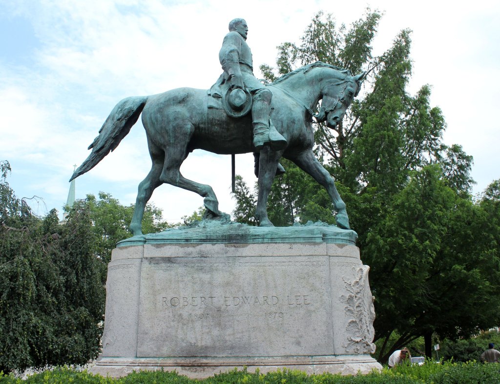
Statue of Robert E. Lee, Charlottesville, VA., (1924), bronze and granite, (7.9m × 3.7m × 2.4m including plinth)
The turbulent history surrounding the equestrian statue of Confederate General Robert E. Lee in Charlottesville, Virginia, is indicated by the renaming of its location three times over the past three years. Formerly Lee Park, it was briefly to become Emancipation Park, and now is known as Market Street Park; the difficulty of finding the right name for the space directly connects with the controversy around the statue of Lee. The monument was erected in 1924 as part of the wider movement known as the ‘Lost Cause’, which intended to frame the participation of the Southern States in a Civil War narrative of heroism and gallantry, with similar monuments erected in nearby Richmond, Virginia and further afield. In Charlottesville, city councillors took the decision to remove the monument in the spring of 2017, though its removal was delayed pending a legal challenge. During the delay between March and August of that year, the statue became a rallying point for far right groups, who protested against its proposed removal. Over the summer, a number of protests and counter-protests for and against the removal of the statue culminated in August, when violence at a rally for ‘Unite the Right’ resulted in the death of Heather Heyer, a peaceful protestor. The event was reported widely on national and international news.
As a piece of public sculpture, this statue and its interpretation as a symbol of either hateful racism or historic pride by different sides of the debate, is at the centre of these political events. The visual symbolism of the statue and the differing aesthetics that emerged around it, are therefore highly relevant. As embodied rituals, protests, marches and vigils can be read as forms of performance, which use visual tools to enhance their legibility and potency. The rallies both for and against the Robert E. Lee’s removal were no exception.
During a rally in May 2017 protesting against the removal of the sculpture, the leader Richard Spencer was heavily criticised for promoting the use of torches, which were interpreted as an symbolic visual invocation of Ku Klux Klan gatherings. Spencer’s response was to deny that the torches had any reference to the KKK, but justified their use on the basis of their ‘beautiful aesthetic’. This argument, highly doubtful given Spencer’s overtly white nationalist views, attempts to justify the use of a controversial symbol of terror on the basis of an aesthetic effect. It shows the extent to which aesthetic and political strategies are interlinked, and highlights the ways in which public art and aesthetic gestures can be (mis)used as tools for political agitation, whether progressive or regressive.
Scholar David Harvey has convincingly argued that cities as public spaces are constantly in a symbiotic relationship of shaping and being shaped by their inhabitants, through their political, intellectual and economic engagement. It is therefore no surprise that public art is persistently at the centre of debates about identity, collective memory, history and politics, and a whole range of different ideas about right and wrong, who is represented, and who is erased. The case of the Charlottesville statue of Robert E. Lee shows this in action. So far, the statue has been analysed as a magnet for far-right politics, but there are other tactics at work too, interventions that successfully question its validity as a supposedly heroic symbol.
On a purely formal level, the equestrian statue of Robert E. Lee, raised up on its stone plinth, works within the visual language of dominance and power: gazing up from below, we see nothing but galloping hooves. In 2015, prior to the council’s vote to remove the statue, the words ‘Black Lives Matter’ were sprayed on its plinth, and although removed soon afterwards, the outline remains vaguely visible. While many might categorise graffiti as anti-social behaviour and vandalism, Lucy Lippard has framed these kinds of gestures as ‘wake-up art’, and assigns them a significant role within the field of public art, with the capacity to call attention to problematic places and to galvanise communities into action. The political resonance of the graffiti gesture in this context, proven by the groundswell of support for the campaign to remove the Charlottesville statue, is indisputable. In February 2019, further graffiti covered the statue’s plinth, and it is likely that these gestures will continue to be enacted on the statue until its fate has been decided in the legal courts. In this context then, the graffiti acts as a kind of reframing mechanism, reminding passers-by and the media that the debate has not gone away. Statues and monuments commemorating military leaders who fought to defend slavery remain unacceptable to swaths of American society, and especially painful to the African-American community. The debate will continue in public life as long as these contentious symbols remain standing in shared, supposedly equal-access public spaces.
By existing in public spaces, public artworks and their interpretation are fundamentally unpredictable, just as people themselves can be unpredictable. Instead of being confined to the space of a gallery or museum, where artworks are constantly under surveillance and accessible only to a minority of people, public art is out in the open. It is exposed to all passers-by and, while this means it may exist completely unnoticed, equally it can also function as a site of intervention, either in the form of graffiti, or by being used as rallying points within performative gatherings, such as protests and vigils. It is through this very unpredictability and spontaneity that these public works can attain their meaning, and spark debate about what kind of society we wish to construct. Public art in all its forms can help to inform our debates about who is visible, who is represented in our public spaces, and can help us to articulate our equal responsibility in building our shared ownership of them.
Though the graffiti intervention on Robert E. Lee’s plinth effectively brings the sculpture back into the discursive realm and questions its validity, ‘wake up art’ is not the only option for diversifying public spaces. The right to be officially recognised in public sculpture and represented within the ‘symbolic public landscape’, to use Magdalena Dembinska’s term, is also important for the assertion of minorities’ identities.
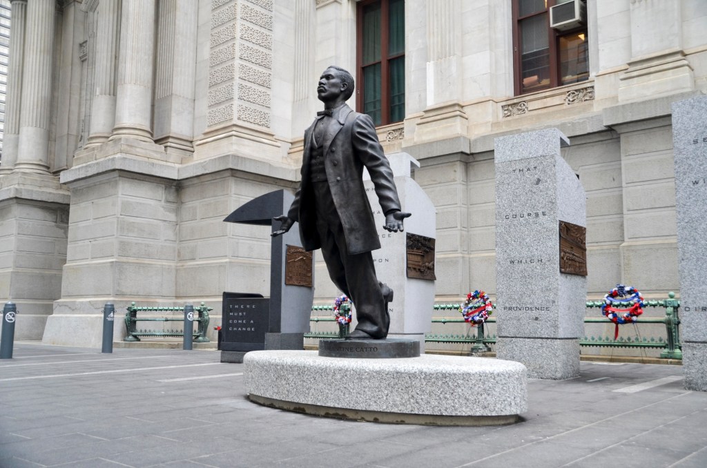
Branly Cadet, A Quest for Parity: The Octavius V. Catto Memorial, (2017), bronze, granite, and stainless steel, statue height 3.6m
Branly Cadet’s 2017 monument A Quest for Parity: The Octavius V. Catto Memorial, which is situated on the southwest corner of Philadelphia’s City Hall, is a useful example. The memorial is comprised of multiple elements which together form an impressive monument to an extraordinary figure – a Civil War-era activist who campaigned for the rights of African-American citizens – who is clearly deserving of recognition in the public sphere.
The monument operates strictly within the confines of the traditional aesthetic of monumental public art, through its figurative use of bronze, and its position outside City Hall. From a formal perspective therefore, it does not push the boundaries or challenge its viewers aesthetically – it is clearly designed to avoid provoking controversy. Yet this is perhaps the very purpose of the Catto monument: it allows African-Americans to assert their presence and validity within the mainstream tradition of monumental forms. The sculpture’s title, A Quest for Parity, specifically refers to Catto’s campaigns for equality. Yet the monument itself is also a reassertion of that quest for parity within public art and representation in the public arena more broadly. The monument therefore is an example of how traditional forms can also help to raise visibility of minority communities, and that their presence in the public arena need not only be represented by avant-garde artistic strategies or counter-monumental interventions.
Public art is embedded in a political landscape. In whatever form it takes, in both its inception and its interpretation, it is informed by differing ideological positions and political beliefs: what remains standing and what is removed from our parks, squares, and the façades of government buildings reflects the societies in which we live. Artworks can be deeply divisive, and can expose latent divisions within societies in ways that can be traumatic and will require healing. Art has the power to spark and intervene in public debate.
What was revered, relevant and what was commemorated in the past may not always be admirable and appropriate in the present and future, which is why those who manage public spaces need to enter into dialogues with the communities and individuals who use them. Artworks that evolve and change help us to question the notions of one fixed ‘public’, and can encourage us to embrace flexible visions of the public sphere, and recognise multiple viewpoints, helping to make those who had been invisible and unheard part of the many voices that make up public life.
***
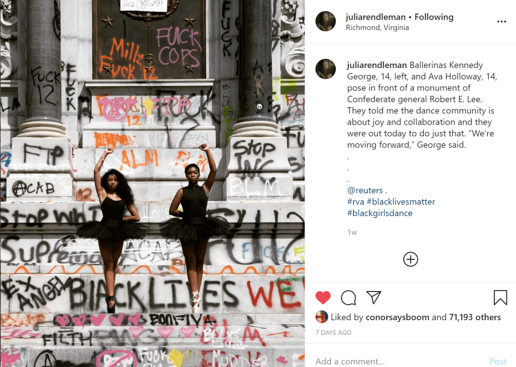
Fast forward a year and after the murder of George Floyd by a police officer, a wave of social activism has swept the US and Britain. In Richmond, Virginia, the government has pledged to remove a statue of Robert E. Lee on Monument Avenue. Images on Instagram of black ballerinas posing below the monument, now covered in graffiti, depict a significant historic moment and show the power of activism. Neighbouring Charlottesville campaigners are relieved that their state authorities are finally acknowledging the hurt these monuments have caused, and hope it will hasten the removal of Lee’s statue from Market Street Park.
In Britain, the argument over who is permitted representation in public space seems to be right at the heart of the nation’s identity crisis. There are a few thoughts I have to add to this debate, which is constantly evolving. Firstly, it is a good thing our public monuments are under scrutiny. They have remained invisible in plain sight for far too long.
The statue of Edward Colston that was forcibly removed by anti-racist protestors and symbolically dumped into the River Avon, where his ships that carried slaves across the Atlantic would have docked, was a momentous and powerful act. The act of its removal has done more to educate people about Britain than the passive existence of the statue itself ever has. As historian David Olusoga has said, rather than the erasure of history, this was the writing of it. Removed in this way is actually far better than had it been quietly taken down by the city’s authorities. It was a moment of activism, a kindling of hope that change could be possible.
For this reason, I don’t believe the statue should have been retrieved from the water so hastily, and I don’t believe it belongs in a museum. As stated above, museums are accessed by a small proportion of the populace, whereas the public space, city squares and streets, are used by us all. (Or were, until coronavirus forced us back to the private sphere, an act which though necessary and in the interest of public health, will serve to entrench the inequalities already prevalent in British society). Rather, Bristol City Council could commission an art piece which works in dialogue with the local community and their city to respond to Colston’s removal: an artwork which shows the journey of the statue from its plinth to the waterfront. Leave the plinth standing empty – the equivalent of an empty chair at a political debate. Leave up the graffiti. Use the landscape and the statue’s journey within it to teach people about Colston, about the legacies of the slave trade upon which Bristol and Britain’s wealth was built.
Graffiti on the Meadows, Edinburgh, 13 June 2020
For far too long have the British seen themselves as the “goodies” of history, an idea that has been perpetuated by an education system that doesn’t include the British Empire or colonial rule. I had to do a history degree before I was really exposed to these aspects of our past. If we need inspiration, our European neighbours have examples of public art that helps passers-by work through the traumas of the history. The Berlin wall is commemorated by a copper line which traces the footprint of where the barrier once stood, an artwork woven into the urban fabric which educates but doesn’t erase. Britain could learn a lot from Germany when it comes to acknowledging the past through the use of public space and visual culture.
Understandably, the movement to reassess our statues and monuments has now gathered significant momentum, and other historical figures have come into focus, which has exposed some uncomfortable truths that many would rather sweep under the rug. I think, or would hope, that the vast majority of people agree that slave traders like Colston should have removed long ago. Meanwhile, figures like Winston Churchill and Robert Baden-Powell attract both support and denouncement. Many see these men as heroes, while others reject them for their support of ideologies which, while perhaps common in their day, are not to be celebrated in 2020.
I personally know that the Second World War was not won by one man, and believe that it is possible (and more constructive) to celebrate the now inclusive and welcoming Scout movement without glorifying its founder. However, when I ‘read the room’, and see who is in power in the UK, I think we may have to concede the impossibility of removing all contentious historic figures from view in this current climate. If that is the case, then we need to level the playing field by following the example of Brandy Cadet’s Octavius V. CattoMemorial: let’s commission artists to create monuments to those who have been forgotten, the historically powerless and marginalised. Edinburgh infamously has more statues of animals than of women. If we can’t topple the statue of Henry Dundas in St Andrew’s Square, let’s set up a sculpture that counteracts the ridiculous, phallic intrusion of his monument on our city’s skyline. Let’s insert the narratives of the witches who were publicly executed, the Windrush generation, the LGBT+ community, working class voices, immigrant communities and all who have built our cities into the diverse and interesting places they are today.
Public art can help to articulate and inform our very understanding of who we are, and how we operate in the public sphere, as both individuals and within the groups to which we identify ourselves as belonging. Britain is a deeply divided society, so a proper exploration of our art, which acts like a mirror, can be a way of working through and understanding these divisions. It’s not going to be an easy task. It’s not going to be pretty. There will be lots of feathers ruffled, tears shed, arguments and fights in the process, but asserting our public spaces as sites for activism and debate will be a necessary catharsis, and will enable us to ‘build back better’ in the imminent future.
‘Wake up’ art at a bus stop in Edinburgh, seen 13 June 2020
I recently found an old hard drive I’d stored photos on for many years, dating back roughly to 2009 – pre cloud storage and Instagram. Back then, I was getting ready to leave school and move out of the family home I’d lived in for most of my life. Finding these photos now, I’m struck by what you can learn about yourself by seeing what you’ve carried with you, and who you’ve journeyed with, over the years.
I never thought I’d taken that many pictures, and yet here they are. A selection of moments documenting around 8 years of my life. Over that time, what did I decide to photograph? Is this curation, of a sort?
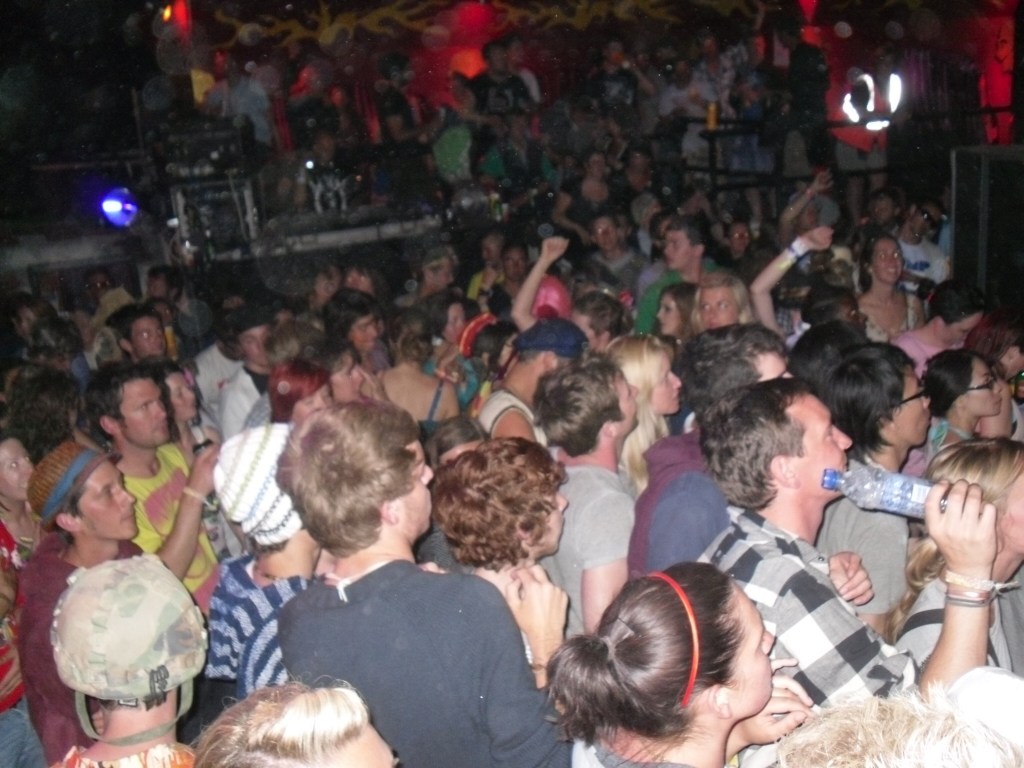
Of course, my favourite photos, the ones that give me the most pleasure, are those of people. Family and friends, people I’ve held close, literally, over the years. My appearance has barely changed, I’ve never had an interesting or drastic haircut. But despise the lack of intrigue provided by my personal aesthetic, these pictures of people together show moments of joy, some of which feel so distant now – a packed Shangri la at Glastonbury in 2010. Look how many people are in such close proximity!
Shangri-la, Glastonbury, 2010
There are a couple of art photos, but not that many. Before formally studying and writing about art, I don’t think I took many photos of paintings or sculptures. In fact, I thought that was lame. That it was a distracting side quest which got in the way of the true purpose: engaging directly with the art, without intermediaries. Yes, I was a censorious undergrad. Now of course, photography is one of the prime ways I engage with and consume art.
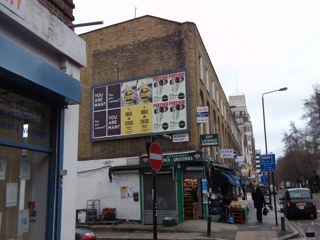
Themes start to recur. There are photos of old buildings, the backs of houses. The patchwork aesthetic of cities, their layering, has always appealed to me. I like seeing things in multiples, billboards that repeat themselves, tiny bricks, signage, squares of different colours and textures that make up a whole.
Drummond Street, London, as a patchwork quilt
It turns out that the idea which underpins Encounters Art, of finding intrigue or humour or beauty in the everyday has been there for a long while. There are more photos of graffiti, ephemera, what I call ‘notes in the margins’ than there are of Art™, and each of these is loaded with associations and place-memories. My photo library treasures are a bin in Berlin that screams “HATE Gentrification” and an annotation on a signpost in New Haven (the home of Yale University) that advises, “God = 1st / College = 2nd).”
Bin graffiti, Berlin, 2012
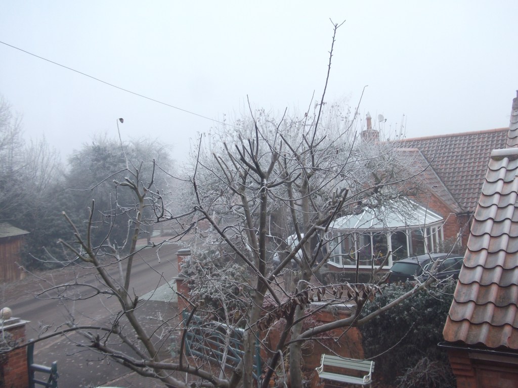
Some of the photos that unexpectedly chimed with me were of a different kind of ‘everyday’, not in the city but at home. There aren’t many of these – clearly we don’t document where we live as much as the special, occasional, noteworthy moments in our lives. There’s a photo from my childhood bedroom window which I must have taken to preserve the delicate lattice of snow and frost on trees and buildings, but now it’s everything else, the normality of it, that resonates.
The view from my bedroom from 1992-2010
Looking back at the somewhat unremarkable picture, I realised that the view I saw every day for nearly 18 years (the apple tree in the garden, our neighbours’ grand conservatory they never used) had been forgotten. Or rather, it was covered in memory-dust that had gathered over years without me realising, which I hadn’t bothered to wipe away. Even my basement room in university halls of residence, a place I hated, seems interesting at this distance, captured in blurry photographs, hastily taken and packed away until now. Artists who work with found objects (a genre I, perhaps predictably, love) have understood that things don’t actually need to be our own to feel intimate, to resonate. Certain feelings, moments, memories are almost universal, though drawn from vastly differing actual experiences.
Perhaps these images of home interiors and window views have taken on a new significance since lockdown began. Looking at these photos didn’t feel simply like a trip down memory lane. I felt more like an archivist with the task of retrieving and reviving the forgotten. Unraveling continuities and disruptions in relationships, places, things my eyes have been drawn to, was a task which felt like the psychological equivalent of traveling. It gave me reassurance I think I needed, that this period of staying at home doesn’t have to be a vacuum because nothing has really happened. That memories can be made out of and despite boredom, via the simple act of taking a photograph from your window, or failing that, just looking out of it.
One of the exhibitions I did photograph, Gabriel Orozco, Deutsche Guggenheim in Berlin, 2012
It is often said that the two prime events that modern Britain’s identity is founded upon are victory in the Second World War in 1945, and the founding of the National Health Service in 1948. With the 75th anniversary of VE day on Friday, and the ongoing coronavirus pandemic, I’ve been thinking these things through lately in the context of British identity.
I’ve been helped on with these thoughts by a film by Alberta Whittle, presented as part of Glasgow International’s Digital Programme. The film is called business as usual: hostile environment (2020), and it was made especially by Whittle for the Digital Programme, adapted from a longer commission she had been working on.
Firstly I need to tell you, that if you want to watch the film you have to do so now, because today is the last day of Gi’s Digital Programme (though hopefully Whittle’s work will be added to her website soon afterwards). I wrote about two other Gi works in the previous blog post, but I needed to sit with this one for longer, because it’s more political, and therefore by nature it is harder to write about.
This is art as activism. It encompasses huge issues, from the treatment of immigrants and the hostile environment, to the Windrush scandal, to the lack of PPE available for frontline staff because of the government’s sluggish reaction and mismanagement of the unfolding COVID-19 crisis. I’ve read it as a reflection on British identity, and the holes in the narrative of that identity. That’s a lot to fit into one artwork, a 16-minute film which pieces together archival footage, news reports, computer generated images and home-movie style footage of a family’s day out on a boat.
Despite the difficult issues broached, its juxtapositions are delicately balanced, so the imagery is not overtly violent or traumatising to watch. Painful subjects are contrasted with some beautiful footage of couples dancing from the archives of an early 1950s Britain, which then sit side by side with brief snapshots of racists marching, and National Front graffiti covering a bridge. Whittle makes use of the split screen to heighten these contrasts: a very grey-looking Britain is paired with what we assume is the clear, beautiful Caribbean sea. Towards the end, a long duet with vocals and drums raises the tension and serves to make the viewer feel uncomfortable. That’s ok though: art doesn’t exist for pleasure alone.
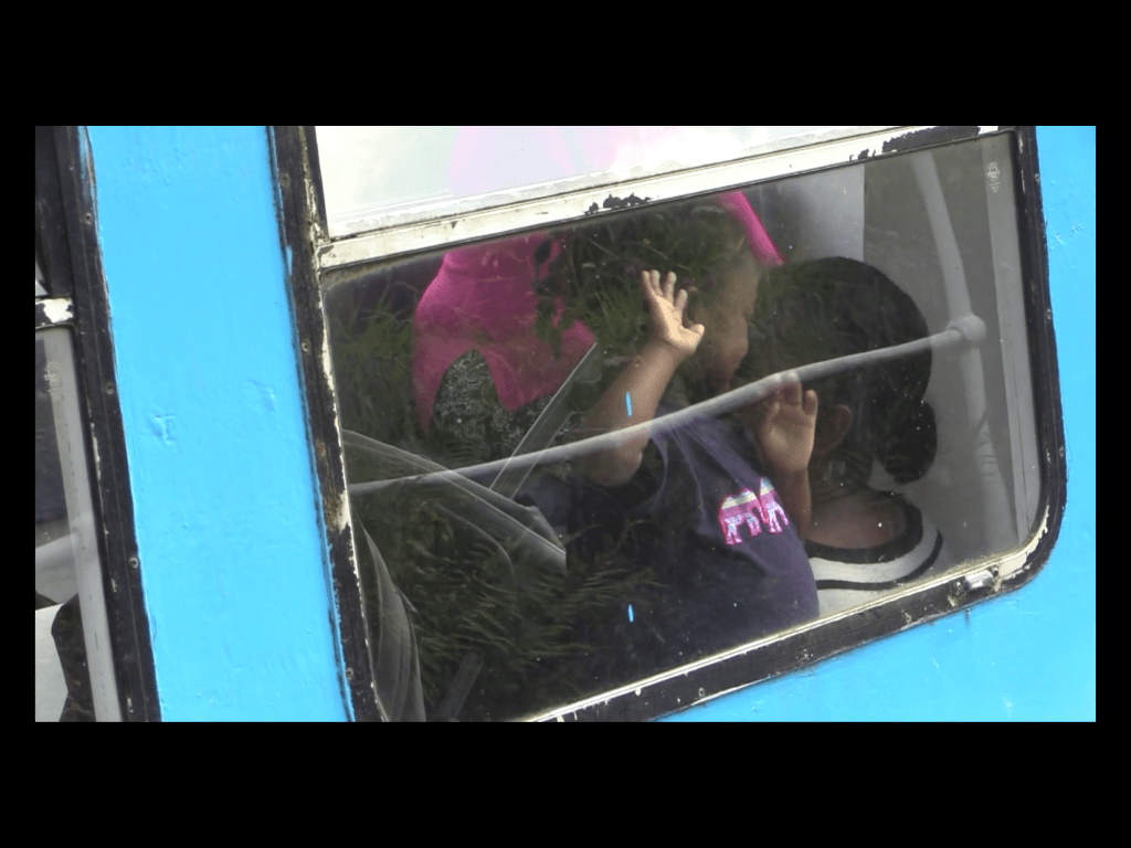
The film persistently subverts the romantic ideas around the images presented. It is partly a response to Visit Scotland’s theme for 2020, Coasts and Waters. What we (and Visit Scotland) might expect from that theme are artworks that respond to and promote Scotland’s amazing coastlines, images of peaceful landscapes with lochs reflecting mountainous scenery. In contrast, Whittle’s work looks at the role water, specifically the Glasgow Forth and the Clyde Canal, have played in the movement of people. There is one image that captures the cleverness and poignance of the film for me. A young black girl is having fun on a canal boat, smiling and knocking on the window, but a passing reflection makes it look for a moment like the window is barred, that she is imprisoned. That sent chills down my spine because of the other images I know of black people incarcerated on ships. It is the unsaid aspect which hovers over the film, including the hopeful images documenting the arrival of Empire Windrush in 1948.
A still from Alberta Whittle’s ‘business as usual: hostile environment’ (2020)
There’s a lot that can be achieved by subverting, questioning and exploring the ideas that nationhood is based upon. Frankie Boyle’s Tour of Scotland, broadcast on the BBC earlier this year, is another example of digging beneath the surface of ideas of who we are. It’s no longer available on iPlayer but clips are online. The section where he talks to Councillor Graham Campbell about Glasgow’s ties to the slave trade was fascinating and, like Alberta Whittle’s business as usual: the hostile environment, works toward educating us about aspects of our past that are often swept under the rug – an ignorance that has allowed for the hostile environment to develop and the Windrush scandal to happen.
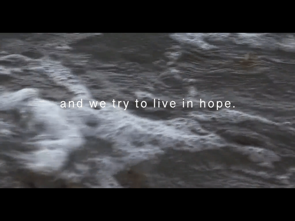
Multiple commentators have pointed out that the British government have tried to tie modern Britain’s founding ideas together with its approach to this crisis. Coronavirus has been likened to an enemy, using the language of combat, which isn’t always appropriate, effective or clear when it comes to responding to a medical emergency. The semantics of sacrifice and loyalty are invoked to try and bring us together – though clearly the extent of lives lost could have been limited, had the situation been better handled. Whittle’s film is a reminder that no amount of metaphor should be allowed to submerge that truth.
This work made me think again about how grateful I am to the artists, writers, comedians and journalists who encourage us to look deeper. The ones who question the myths, probe the difficult areas, who remind us to ‘stay alert’ to the situation unfolding around us, to the ideas and the language used to mobilise us. This has been a time of reflection and introspection for many of us, and there are some beautiful, human stories of solidarity that we can take pride in. But after it’s all over, we need a new consciousness to emerge and I want art to be at the forefront of imagining that to be possible as, to quote Whittle, “we try to live in hope” for a better future.
A still from Alberta Whittle’s ‘business as usual: hostile environment’ (2020)