I was in London last weekend, and with the cultural cul-de-sac of January now over, I was spoilt for choice as to what art to see. Exhibitions includingDonatello: Sculpting the Renaissanceat the V&A and Alice Neel: Hot Off the Griddle at the Barbican were clamouring for my attention. But instead, I picked a small exhibition at one of London’s ‘secret’ treasures – the Estorick Collection in Islington.
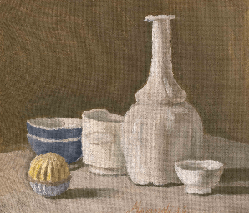
I don’t get art sometimes. Not perhaps the stance you’d immediately associate with someone claiming to be an art blogger. But what I really mean is I don’t always understand why I like what I like. Giorgio Morandi’s work is quiet, steady, pastel-coloured, and consists mainly of still lifes of vases. Writing it now, it doesn’t sound particularly scintillating. Luckily my pal trusted my artistic judgement and, coupled with the fact that that London postcode is particularly strong on post-gallery cake options, we headed along.
Still Life (1936), Giorgio Morandi
For the exhibition, the Estorick Collection has paired up with the Magnani-Rocca Foundation, combining both the Estorick’s own collection of etchings by Morandi, and the Foundation’s more extensive collection of paintings. Magnani was a persistent collector over the course of his and Morandi’s lives, and the letters between them on display in the exhibition provide an interesting insight into the artist-patron relationship.
The exhibition was small, made up of only a few rooms, which allows you to focus on each work in its own time, and I think these sorts of artworks need some time. There they were, lined up in neat rows along the white walls. Morandi’s persistent, almost obsessive, repetitive paintings of vessels. Vases, cups, bottles, all stand in grey and brown and pink arrangements. This should not be that interesting, but somehow I found myself under their slow spell.
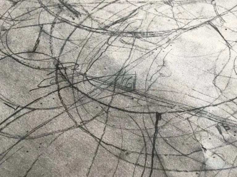
Artists over the decades have been fascinated by Morandi, and while looking at the paintings in front of me, I was reminded of a film, Still Life by Tacita Dean, made in 2009 after she spent time in the Bologna apartment where Morandi lived and worked for over 50 years. The film focuses on the measurements and careful markings found on the paper Morandi placed underneath his objects. These traces have a kind of magic to them, the same magic held by the objects, the empty vessels he returned to again and again.
Still Life (2009), Tacita Dean
I’ve long been a fan of still lifes, and by this, I mean the grand ones from the 17th century that you can find the National Gallery or the Wallace Collection. They are voluptuous, excessive, violent even. Full of reminders of life and death, tables groaning with the excess of food and silverware. Looking at these paintings is a visual treasure hunt, like reading Where’s Wally. Is that a monkey in the corner?
Still Life of Fruit and Vegetables with Two Monkeys (about 1620), Jan Roos
Morandi’s are the opposite. They are sort of dry and dusty. They are objects which hint at a precious use or existence but don’t give much else away. There are no extraneous distractions. It is not the sort of art that ‘performs’ well in the Instagram age, but there is a joy in this stillness. Up close, the objects are scrubby and mottled, the scratches in the paint are plainly obvious. But then, you take a few steps back and they meld and resolve, like a key change from minor to major.
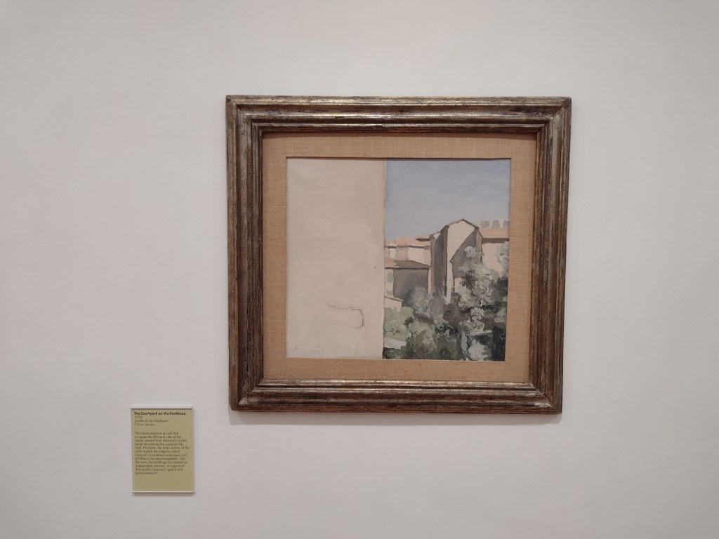
The only photo I took, shows The Courtyard on Via Fondazza (1954), a painting of some buildings and trees next to an enormous blank space on the left, which almost looks like totally untreated canvas, but actually depicts the empty side of a windowless building. It’s the space Morandi gives his subjects that I find satisfying to observe, and the exhibition wall text suggested similarities with Cézanne’s approach to space and form.
The Courtyard on Via Fondazza (1954), Giorgio Morandi
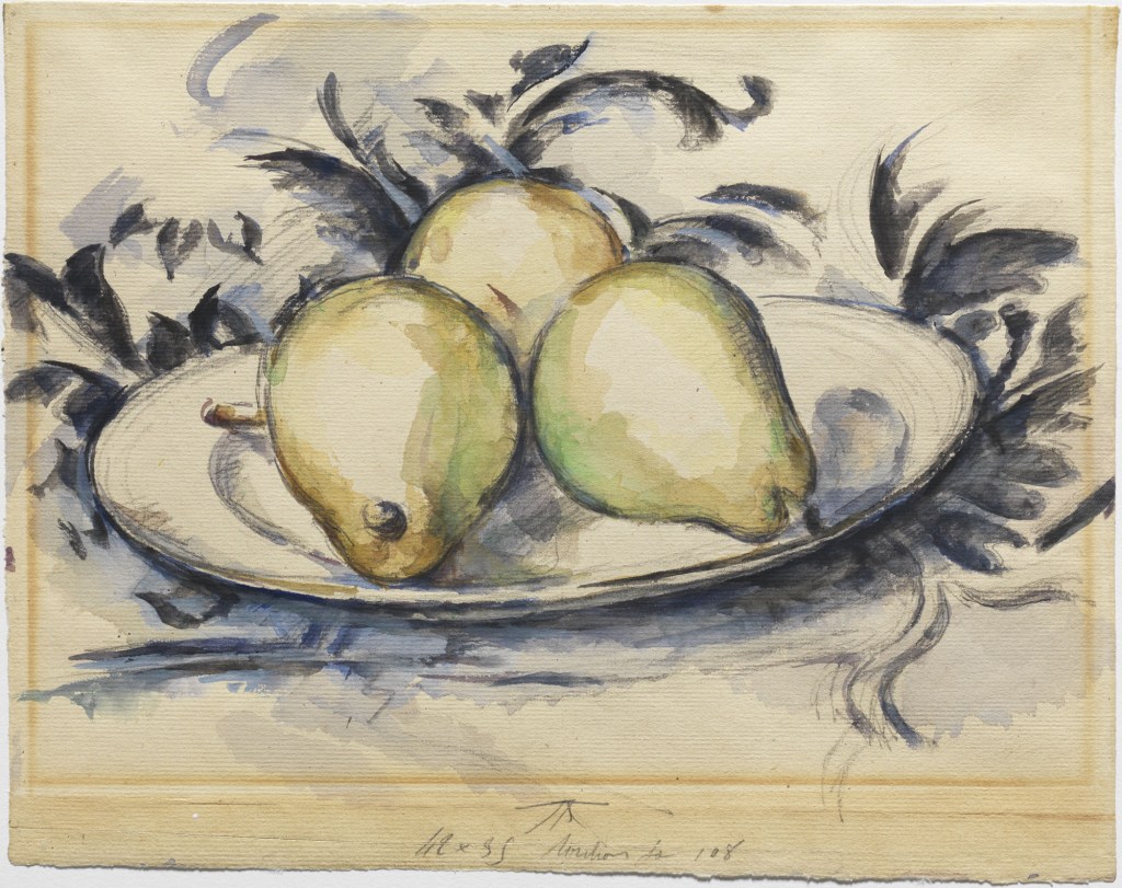
Perhaps this parallel with Cézanne is what endears me to Morandi so much. Years ago, I went to a Cézanne exhibition in Oxford where I bought a postcard of his work Three Pears (1889-90). After the show, a friend of a friend was bemused by it all: “I don’t get it. It’s just pears?”. I didn’t really know what to say. Yes, they are pears. But they are very lovely pears?
Three Pears (1889-90), Paul Cézanne
More and more these days, if I try to interrogate what I like about looking at art, it boils down to how it makes me feel. The feelings lead the way. After a while of walking around the exhibition wondering why Morandi was so obsessed with empty vessels, I decided to stop wondering why and just enjoyed the tranquillity, stillness and peace that looking at these quiet paintings can bring.
There’s a poem by Philip Larkin my Mum loved called Church Going, where he describes encountering an old abandoned church, and he doesn’t know why, but it means something to him. He says, “it pleases me to stand in silence here”, and that’s what came to mind looking at these small, intimate paintings. Sometimes standing, looking and feeling is enough. No other justifications or explanations necessary.
I ask myself how can it already be the end of April. What happened to the first third of the year? It seemed to have passed me by without me noticing, meanwhile the world plunges from one crisis to another. I find myself asking, ‘was it always like this?’ Did we always lurch from tragedy to crisis in a never-ending cycle? Have I only started noticing now, after living in a pandemic-induced state of hyper awareness? Or are things just particularly bad at the moment?
War, suffering, poor health, exploitation, callous political decision-making. It seems to be closing in on every side. Has it always been like this?
Four months since my last blog post and the time just keeps on ticking away. The truth is, in times like these, I don’t feel like I have much to say. Or maybe I just don’t feel like any contribution I could make adds much value. The old saying, “If you don’t have something nice to say, then don’t say anything at all”, is pretty deeply ingrained in me, and I don’t have anything nice to say about the times we’re living in. They’re scary, depressing and disorientating, and sometimes it seems like the only alternative (for the privileged ones like me) is to wrap ourselves in a comfort blanket and disengage – I actually re-downloaded Candy Crush and got to level 306 – my way of wishing it was 2015 again. Sometimes, you just don’t have anything to say.
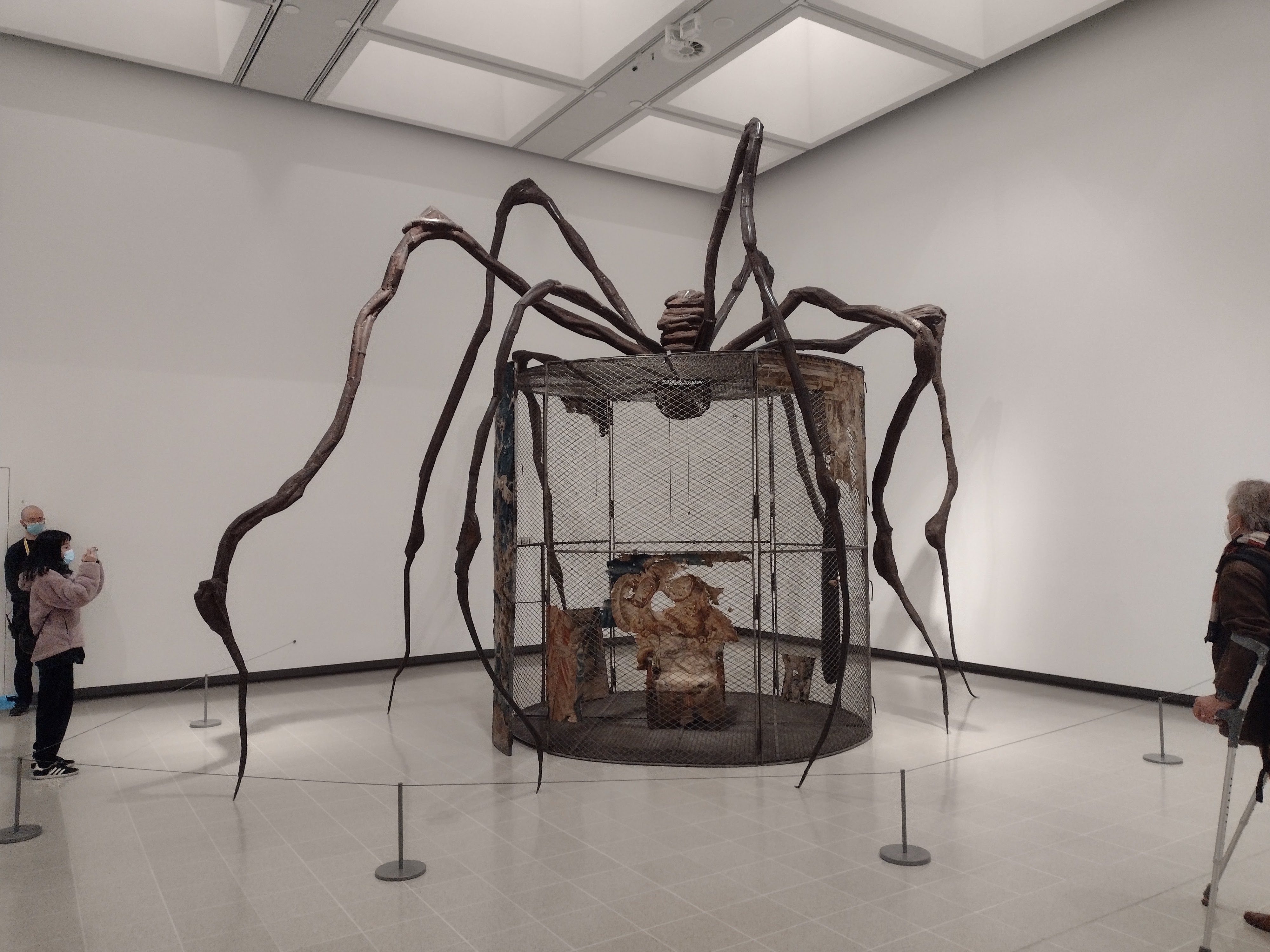
I haven’t seen much art, for one thing, which is a big contributing factor in not having much to share here on the blog, or on Instagram. I went to the Louise Bourgeois exhibition at Hayward Gallery, and while I loved the huge spider and appreciated the dark, uncanny bone sculpture installation, it didn’t make me want to write. The show was busy. The photos I took were blurry. And perhaps I just didn’t need more heavy subject matter to struggle with in my free time – Bourgeois’ art is about as far as you can get from light and breezy.
Louise Bourgeois, Spider, (1997)
Despite my personal reaction to the weight of this show, I continue to believe that engaging with art that seems difficult can be enlightening, illuminating, and can give us tools to help us process difficult things. Art can say things we don’t want to, or that we don’t have the words for. A few weeks ago, it was on this basis that I decided to use my Instagram to “highlight some artworks that speak to what’s happening in the world over the coming weeks, if that doesn’t seem too crass”. The aim was to post a couple of works per week, broadly related to the displacement of people and refugees, with the Ukraine crisis unfolding on our doorstep.
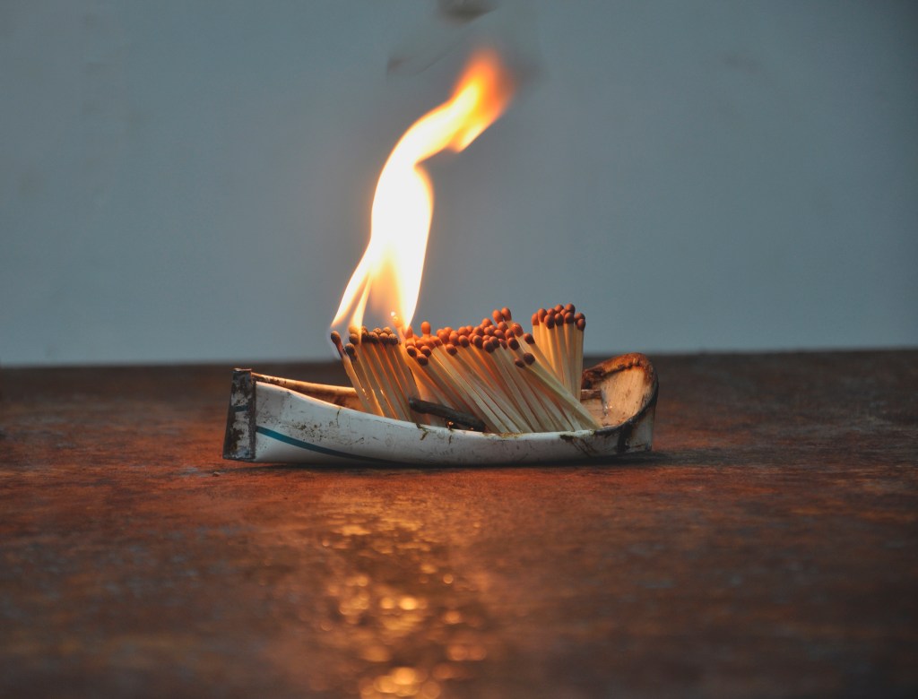
A couple of months prior, I’d posted Dark Water, Burning World (2017) by Issam Kourbaj, an unforgettable work made up of boats, packed with burnt-out matches that resemble people. I wanted to try and make the effort to promote works and artists that engage with, rather than shirk, these difficult themes. But it tuned out that was far more challenging than I could’ve anticipated, with research becoming draining as the overarching complexity of posting artworks about refugees made me hesitate. The very fear of being crass or insensitive or saying the wrong thing was enough to shut me up. These are real people’s lives. Is it exploitative, or somehow trivialising, to wrap them up into bitesize chunks of ‘content’? Welcome to my brain. There are a lot of rhetorical questions.
Issam Kourbaj, ‘Dark Water, Burning World’ (2017)
Art that is fraught with difficulty is something Mary Beard grapples with on her latest excellent two-part series, Forbidden Art. I think I have a fairly sturdy threshold for engaging with art and film that can make me feel uncomfortable (the example I pride myself on is that I loved Julia Ducournau’s 2016 film, Raw), but I was surprised at how I found some of these works, including Martin Creed’s Sick Film, and Marcus Harvey’s Myra, extremely challenging. I’d love to see the ratings on the show, which aired on the BBC at prime time on two Mondays in February. Surely I wasn’t the only one who felt genuine nausea as Mary broke taboo after taboo.
Probably the most shocking image of all from the series was Peter Howson’s Croatian and Muslim (1994), which depicts the rape of a woman with her head being shoved down a toilet. Howson was an official war artist in The Bosnian War (1992-95), though the work since has attracted controversy for being based on eyewitness accounts, rather than direct observation. Whatever the circumstances, the image points to what we now know for certain: that rape was used as a weapon in the conflict (Wikipedia estimates between 12,000-50,000 women were raped). The stories emerging from the war in the Ukraine suggest the same. As I hear this news, I have the grim realisation that I am not surprised.
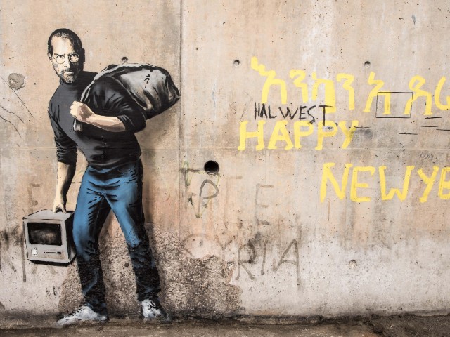
In the end, I just posted two works, Tarifa by Daniel Richter, and Soleil Levant by Ai Weiwei. They are both works I’d encountered before, which felt more natural than specifically seeking out refugee-themed works. If you google ‘art about refugees’, one suggested piece that pops up is Banksy’s ‘Son of a migrant from Syria’, (2015), a mural that the world’s most famous anonymous street artist created in the Calais Jungle, which depicts Steve Jobs as a migrant. But the message behind this idea, that among refugees the next Steve Jobs might be lying in wait, is way too simplistic, clumsy and misses the point entirely. The point of welcoming refugees is not because of the part they may end up playing in global capitalism, or because they look and live like us.
Banksy, ‘Son of a Migrant from Syria’, 2015
Building these narratives into a piece of artwork is challenging, and so much of the art I came across didn’t sit right. Even Jeremy Deller’s poster artwork, Thank God For Immigrants (2020), which I have a copy of, delivers a cloudy message that is (intentionally) fraught with complexity.
Someone who has done a significant amount more meaningful thinking and research about this than me is art writer Tom Jeffreys, whose brilliant piece, reviewing Iman Tajik’s Bordered Miles performance for Glasgow International, broaches the issues of borders, safety, identity and what is at stake for undocumented immigrants and refugees in this country. Tajik’s work is built upon lived experience as a detainee at Dungavel detention centre, but his art, which encompasses performance, photography and installation, seeks to widen the lens beyond his own life and perspective, to deal with ideas, not stories. It is the kind of nuanced work with a scope and resonance goes way beyond that of an Instagram feed. The kind of work that shows us that if we want to engage with art, we may as well do it properly. That can sometimes take stamina, research, and courage.
When we encounter art, we may not always like what we see. We may want to look away and in some moments, the act of avoidance may feel like be our only option, for self-preservation and protection. As long as we clock that urge to shy away, I think that’s ok. In the meanwhile, artists will continue to respond to crises in ways that can range from the effective to the offensive. And when we do decide to re-engage, artists and artworks will be ready to receive us, to educate us, and to challenge us.
A few months ago I was in the Self Help section of a bookshop. It isn’t a zone I am particularly familiar with, being a cynically-minded, stubborn sort of person. I had been searching for a specific book in the Art section ‒ much more familiar territory ‒ before realising I’d been looking in the wrong place: cue the obvious metaphor here.
The Artist’s Way: A Spiritual Path to Higher Creativity by Julia Cameron is a multi-million-copy worldwide bestseller. It’s something my sister read years ago, and she had gleaned a lot from it, but I’d never considered giving it a try myself. Until now. It was late Autumn, I hadn’t written anything for weeks, and creativity of any kind seemed an exhausting and far-off prospect. Along with the background of the never-ending pandemic slowly eating away at my sense of self, I could tell I was in a rut. Keen to bundle myself out of this rut by any means necessary, I decided to put my scepticism aside while attempting Cameron’s twelve-week journey which promised to ‘unblock my creative potential’. Yikes. Writing that down makes me physically cringe. But I’m doing my best to embrace the cringe, the daily freewriting, the imaginative exercises and the creative affirmations. Yes, these elements are all part of the process (some are a bit much).
Around the same time, I went to a wonderful wedding in Bristol, one of my favourite cities. With a strong culture of street art since the late 70’s, explored brilliantly at a recent exhibition at M-Shed, and the recent history of trundling Edward Colston’s defaced and disgraced statue into its harbour, Bristol is the kind of place where creative and political agency seem to fizz just beneath the surface. If there were ever a place to mix up my stagnant energy, then surely it was here, with time to myself and new places to explore.
Looking at art is one of my main ports of call when dealing with a whole range of emotions and feelings. I expect a lot from my interactions with art, but one of the best things is when these interactions surprise me. This kind of joyful surprise can be something incidental, like the unexpected shapes and surfaces in the city fabric captured by Matt Calderwood on Instagram, but if you want to be surprised at a gallery, you have to go in with little to no expectations and as little background reading as possible.
On the day I visited the Stephen Gill: Coming Up For Air exhibition at the Arnolfini I didn’t know that I’d end up being so enchanted with it. I almost ended up missing my plane back to Edinburgh because I was so absorbed (yup, I flew there, I’m a bad person). Stephen Gill is a Bristol-born, internationally-exhibited photographer who I didn’t know anything about before seeing this show, which is free and on until 16th January (omicron willing).
‘Audio Portraits’, 1999-2000
I skimmed through the first half of the first room, until I came upon his Audio Portraits, (1999-2000). These are portraits of people with headphones on, with what they’re listening to written below. I like it when artists can articulate a thought you’ve already had, but never known how to express. As someone who frequently listens to music while on the move, I love the feeling that I’m immersed in my own world. I can listen to Ariana Grande with no one judging me. I can stomp down the streets of Edinburgh listening to Rage Against The Machine’s Kick Out the Jams when I’m feeling angry or rebellious. I can silently sing along word-for-word with Joseph and His Amazing Technicolour Dreamcoat whilst commuting and no one suspects a thing. In Audio Portraits, Gill lifts the lid: he lets us into other people’s worlds. The people and the tracks won’t always match or be what you expect. This is the artwork that made me realise that I was going to enjoy the exhibition.
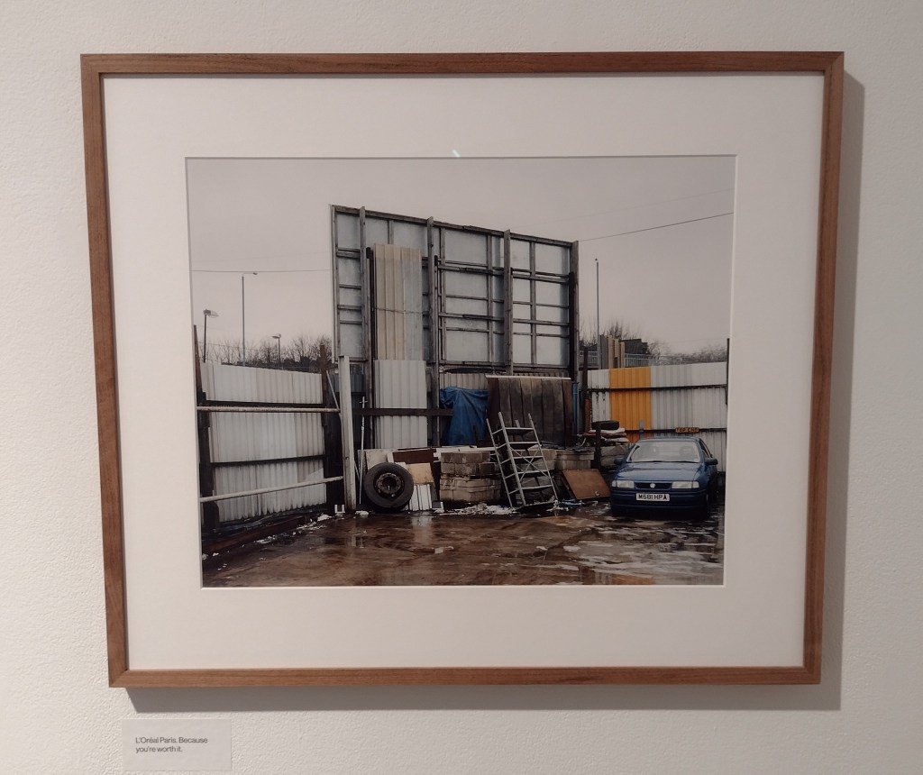
The next was the Billboards series from 2002-2004, where Gill has photographed the back of several billboards, showing the stark and frequently ironic contrasts between the aspirational notions of the advert and the reality surrounding it. L’Oréal Paris proclaims “you’re worth it” and backs on to a wet yard surrounded by corrugated iron, a tyre and some upturned shelving units. Noticing the unnoticeable, and allowing us to notice that magic too, is the photographer’s special gift. It’s a gift we need in a world full of drudgery.
“L’Oréal Paris, Because You’re Worth It”, from ‘Billboards’, 2002-2004
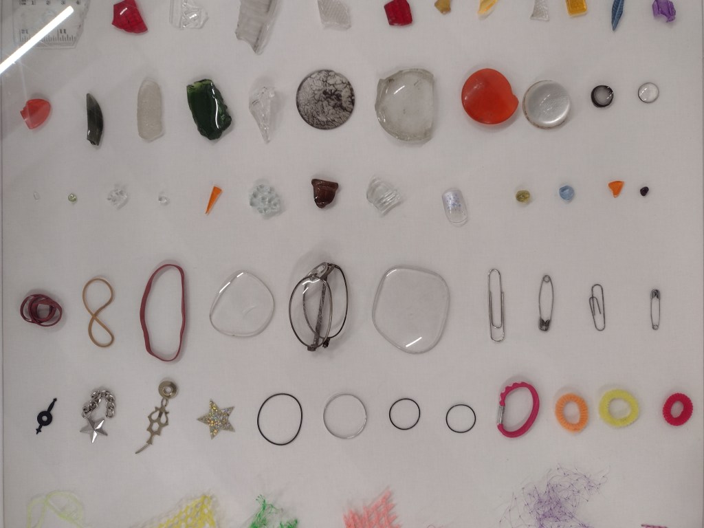
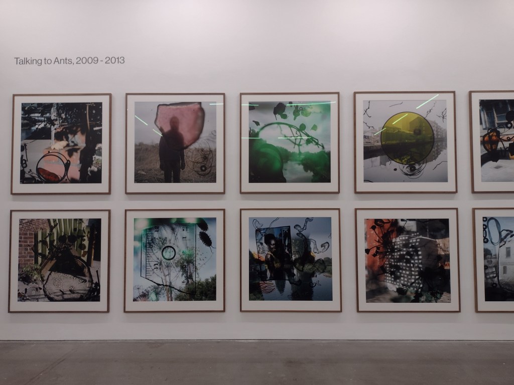
There’s a playfulness and sense of experimentation in Gill’s work that I loved. For his monumental work Talking to Ants, Gill scooped up detritus from the surrounding landscape and embedded it into his camera: stray hair bobbles, broken glasses frames, seed heads, bits of ruler and even insects weave their way into his photos and complicate the scale of the landscapes behind them. These ‘image ingredients’ make for a fascinating display that is utterly mundane but also strangely beautiful. Cable ties have never looked so poetic.
Image ingredients for ‘Talking to Ants’, 2009-2013
Gill, ‘Talking to Ants’, (2009-2013)
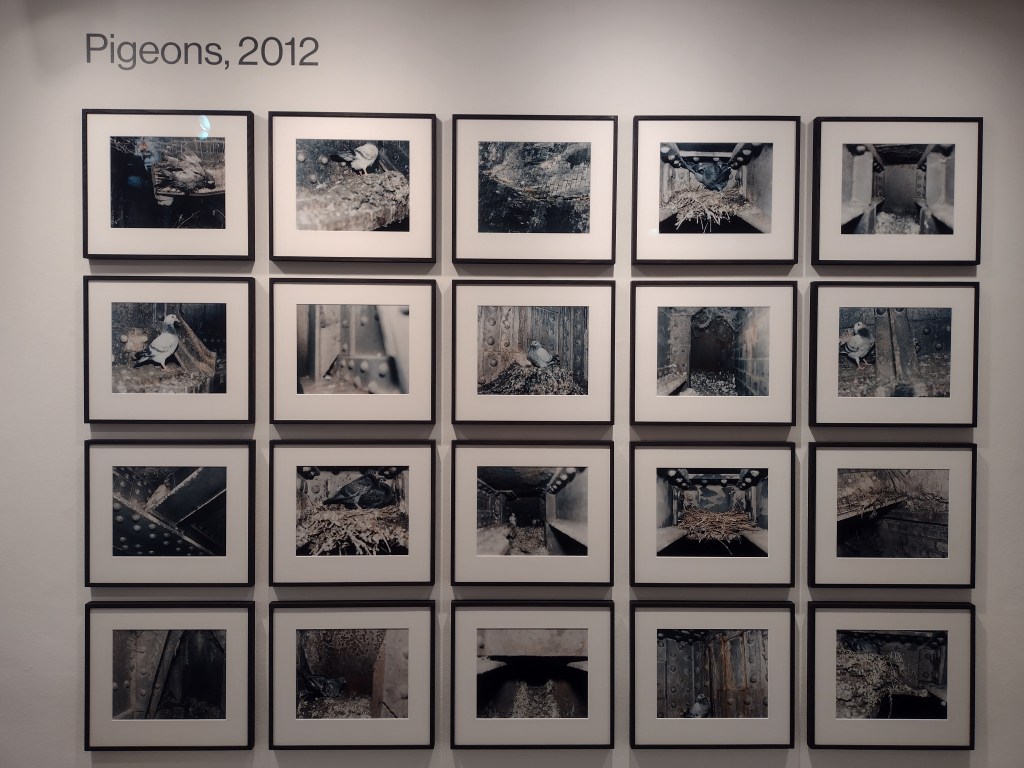
I feel somehow reassured that creative people will be brave enough to do things that others wouldn’t dream of: sticking a camera on a pole and shoving it between iron shafts on railway bridges in order to try and photograph the pigeons that live there (Pigeons, 2012) or collecting lipstick-marked cigarettes from the streets of St Petersburg to compile a series of anonymous portraits for Russian Women Smokers (2002). There’s a courage in this sort of experimentation, one that is drawn from a conviction that an idea is worth exploring, that there’s something special to be found in the documentation of everyday scenarios, no matter how repetitive or odd the process of capturing those scenarios may be.
‘Pigeons’, 2012
I wanted to make a study deep within the underside of brick and iron railway bridges where I found the bleak and colourless hidden labyrinth of the pigeon world
Stephen Gill
Gill, ‘Russian Women Smokers’, (2002)
For his work Pillar (2015-2019), Gill set up a motion-sensor camera on a fence post outside his home in Sweden, and over the years, that camera caught so many wondrous sights, even he was surprised by the variety of birds that visited this strange rural CCTV outpost. There were flypasts from flocks of starlings, contortionist crows and even fearsome looking birds of prey that seem to be posing for the camera. The feeling that underpins Gill’s work is one of trusting the process, a conviction that if you look out the window for long enough, something good will happen.
Stephen Gill, from the series ‘The Pillar’, (2015-2019)
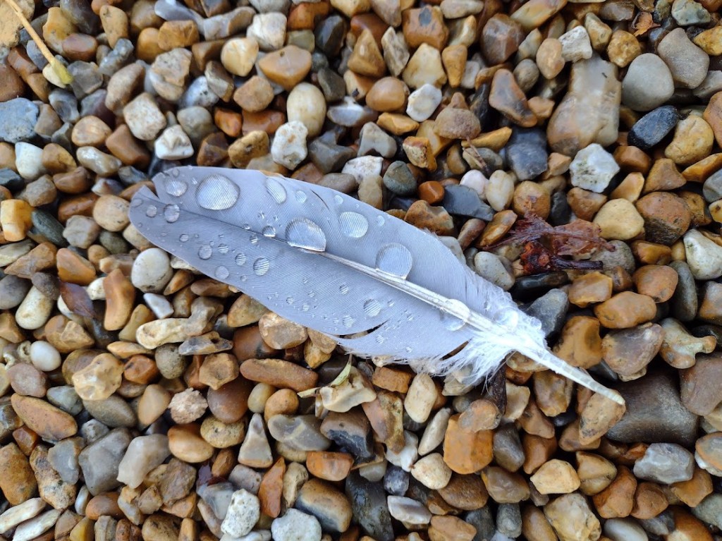
It’s an attitude that is reflected, emphasised and celebrated in The Artist’s Way, which I have been working through, sometimes diligently, sometimes reluctantly, for eight weeks now. Week Six (when I began writing this blog post) is all about ‘recovering a sense of abundance’ and includes some of my favourite tasks so far, collecting interesting rocks, flowers or leaves, playful reminders of natural beauty and ‘creative consciousness’. I’ve not yet bothered to collect any stones or leaves, but I did see a feather with raindrops on it on a gravel drive, which was so beautiful it stopped me in my tracks. I’m thankful to both Cameron and Gill for helping me to see it.
Photo of a feather on a gravel driveway
As December now draws to a close, I find myself reflecting again on my own creative endeavours over the past year. This is my first proper blog post for six or seven months, so perhaps The Artist’s Way is helping me get back into writing at last. It hasn’t been an easy year for anyone, and it doesn’t look like 2022 is about to get a whole lot easier. However, I continue to draw comfort from art and the way it brings interesting, creative and supportive people together. Thank you to everyone who recommended shows, books, articles and exhibitions, who challenged me with creative conundrums, who joined me on Instagram for 20 Mins With and the (recently somewhat elusive) Sunday Spotlight. You’re all gems for reading this far. My wish for 2022 is that we continue to encounter art, and hope, where we least expect it.
I am standing in a light-filled room, one that is almost silent. The walls are white, the ceiling is high. Across the middle of the space, a huge diagonal tapestry floats, seemingly hovering, swaying slightly. It is made of the lightest of materials, silk panels hang there, lightly stitched together, suspended.
I am in a gallery for the first time in months, in a town I don’t know well. I’m looking at Emma Talbot’s Ghost Calls, created specifically for the main exhibition space at Dundee Contemporary Arts. It feels really good to be back.
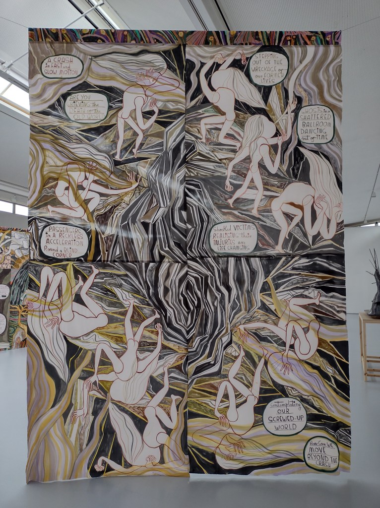
‘A Crash in Fast And Slow Motion’, 2020
The thing I notice first about this display is the colour palette: greens, ochre, rusty red, greys and creamy white. The repeated tones help to conjure the feeling that we have entered a specific world. There is a narrative here: the first work you encounter, also a large silk tapestry, depicts an unnamed disaster that has shattered the earth and turned it upside down. There are ghostly white bodies everywhere, positioned at strange angles and holding their heads in their hands. Scattered speech bubbles tell us more: ‘passengers in a reckless acceleration round a blind corner’; ‘a crash in fast and slow motion’.
The centrepiece, a large tapestry that bisects the room, tells the story of what happens after the cataclysmic crash. Text in the first panel both questions and explains: ‘Do you hear ghost calls? A teary lament for human existence. A shout out to the living to take more care of themselves, of the world, of each other.’ I like these little ghostly souls with their long, wavy hair. The way they journey through an unknown landscape, little disembodied heads blowing long trumpets – or are these trees lying on their sides?
A section from ‘Ghost Calls‘, 2020
Though the story is about processing collective trauma, looking around me, I feel surrounded by a complete sense of calm and serenity, like a blanket has settled over the entire room. Something in the fragility of these artworks makes engaging with them a very tender encounter. Even calling the largest works ‘tapestries’ feels wrong, because that conjures up images of heavily-embroidered, thick wall hangings, decorating old castles and torchlit halls. Here, there is a palpable lightness.
The drawings are my favourite. Small-scale and pinned to the wall, they exist almost completely without ceremony: these are pages from sketchbooks. There is no glazing, there are no frames. Everything feels very immediate, right in front of me and so utterly delicate – the papers are handmade.
‘Celtic Birds’, 2020
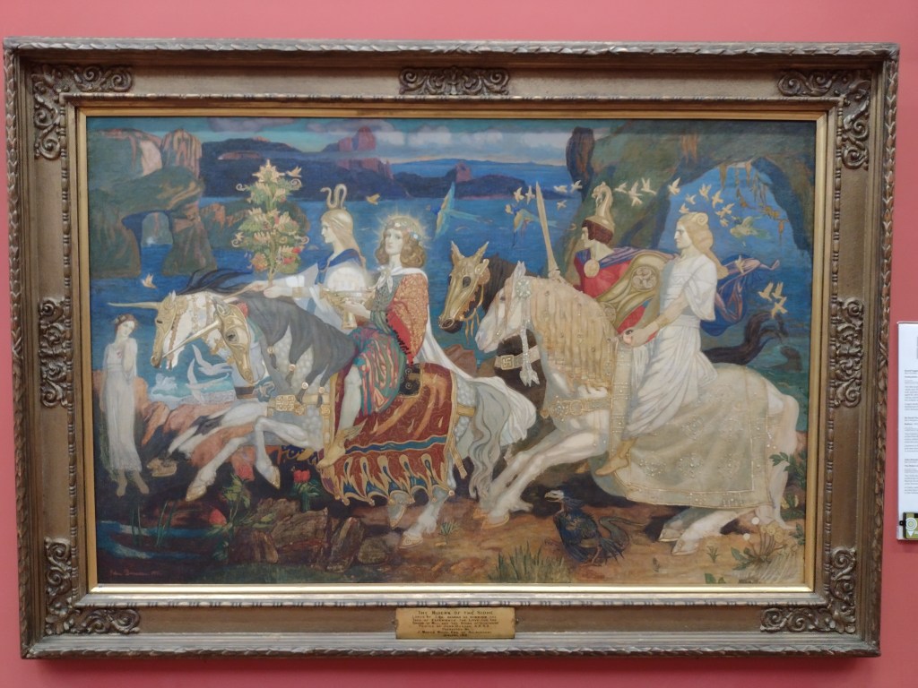
When researching for this exhibition, Talbot came to Dundee and was struck by the paintings at the local museum, the McManus. You can see here her fascination with The Riders of the Sidhe by John Duncan, one of the collection’s most famous paintings, a work thick with symbolism and arcane magic, and of great importance in the Celtic Revival movement. I had just been to the McManus and was admiring it too, so the connections felt particularly present in Talbot’s fine drawings of mythical beasts, a connection that was reinforced by the sense that her tapestries represent a linear journey, one with a similarly ambiguous destination.
John Duncan, ‘The Riders of the Sidhe’, 1911
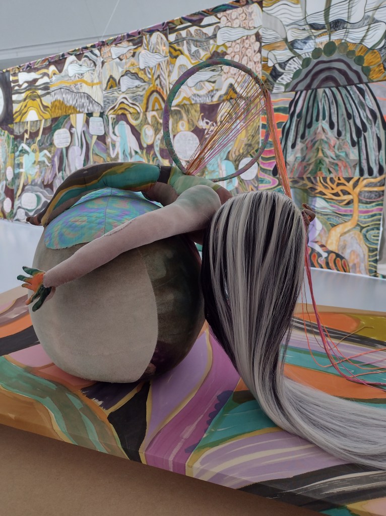
There were five sculptures dotted around the exhibition, but these struck me as out-of-place, needless add-ons to the main body of work. The stuffed figurines were 3D versions of the ghost characters, made from a kind of velour material, with crudely kirby-gripped wigs and random accessories (a dream catcher, a willow tree). To me, they looked clumsy and jarred displeasingly with everything else, which was so finely drawn and meticulously put together.
A much more successful use of a different medium was the animated 14-minute filmKeening Songs, where figures of women move through a landscape, meeting animals and spirits, enacting a ‘keening,’ a mourning ritual associated with old Gaelic communities in Scotland and Ireland. These stories were enchanting, layered with poetry and intrigue, and the exhibition as a whole suggested that we will have to enact our own keening, as we journey beyond the global trauma of the pandemic. Perhaps art can be a tool in that process?
I was visiting my second gallery of the day, for the first time in over a year, and my stamina was wavering. Yet despite the inevitable ‘museum back’, I was here at last, looking at new art in all its freshness. I felt so much gratitude for this place, these artworks, that they existed right here in front of me, without the intermediary of a screen. There is an undeniable physicality to the experience of looking, and looking carefully, one that can make the viewer feel truly present, truly awake and alive for the first time in a long time.
After months of closed doors and darkened rooms, museums and galleries are set to begin opening in Scotland from Monday 26 April. Unsurprisingly, I’m excited about the prospect of returning to experiencing art ‘in the flesh’, though lockdown has proven that art can be found everywhere and anywhere, and isn’t confined to the walls of a hushed gallery space.
Over the past year, I’ve had to be more imaginative about what to look at and write about: seeking out artists to highlight each week on Instagram, exploring virtual viewing rooms and reading more art criticism. This unwanted pause on what had seemed a never-ending cycle of exhibitions has, I hope, made the blog less of a diary of exhibition reviews, and more a set of broad suggestions of how we can engage with art.
The more I think about it, the more I realise we’ll have to reacquaint ourselves with how to look at art in person, as the world around us becomes available again in all its glory. How will we prioritise our time? Can we pace ourselves? Will we be overwhelmed, underwhelmed, or just ‘whelmed’? Will our stamina for standing and wandering around galleries be a shadow of its former self?
Contrary to what some might suggest, Edinburgh is alive and buzzing with art all year, so here’s a round-up of some things I’m most looking forward to visiting in person this spring and summer.
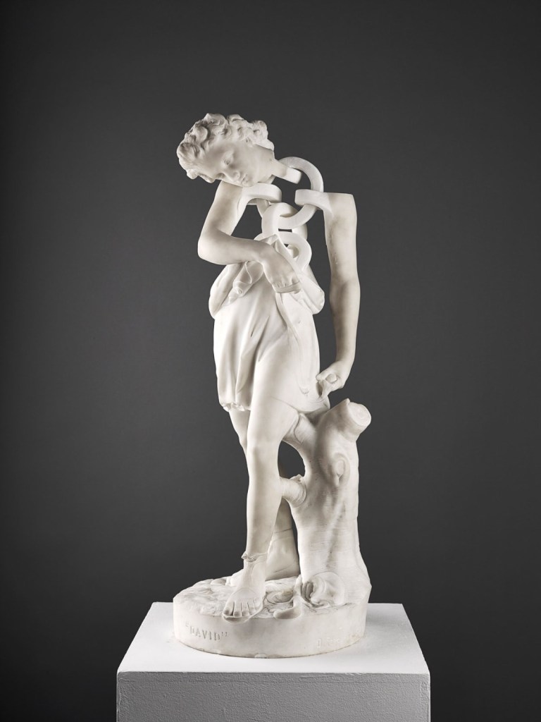
Jonathan Owen at Ingleby Gallery: 29 May-17 July
Regular readers will know that I love the Old Masters. That’s where my art journey started (as a child I loved The National Gallery card game). But I also love it when contemporary artists reinterpret traditional forms to say something new e.g. Meekyoung Shin’s slowly eroding soap sculpture of the Duke of Cumberland in Cavendish Square. Jonathan Owen is such an artist. His work uses erasure and interventions to alter found materials, including marble statues. This show at Ingleby Gallery, one of my favourite places to see art in Edinburgh, will feature these altered statues, and will also include the unveiling of a new life-size work about empire and exploitation. I’m sure this exhibition will go straight into the heart of the monument debate and I can’t wait to see these sculptural works in 3D. For me, sculpture is something you have to see in person. The screen just doesn’t cut it.
Jonathan Owen, ‘David’, (2013), nineteenth century marble figure with further carving
A very interesting rehang at the Scottish National Gallery: Open Thursday-Saturday from 6 May
When I was studying art history at ECA, we were incredibly lucky to get to visit the Scottish National Gallery before opening hours. I remember asking our host, Frances Fowle, Senior Curator of French Art, why some of the most famous paintings are kind of… hard to find in the Gallery. While some people love the fact that you go up a narrow set of stairs and suddenly you’re surprised to be in the company of Van Gogh’s Olive Trees, Monet’s Haystacks and Gaugin’s Vision of the Sermon, apparently lots of folk agreed that they seemed needlessly buried. The latest Friends newsletter explains:
You spoke, we listened. For the re-opening of the Scottish National Gallery we have moved seven of the much-requested Post-Impressionist paintings to a display on the ground floor.
While I doubt this will be a permanent change (the rooms upstairs are probably a much better scale for these works), it will be really wonderful to see these incredible paintings placed front and centre, and I’m fascinated to see how the team at the Galleries will take on this re-hang.
Vincent Van Gogh, ‘Olive Trees’, 1889. Excuse my wonky camerawork.
Fine Art Society Edinburgh, Joan Eardley 6-29 May
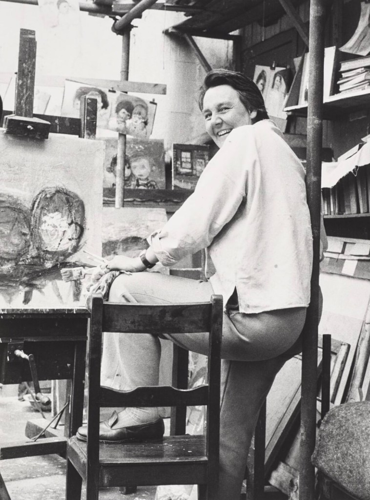
I’ve written about the forthcoming #Eardley100 celebrations before, and am hoping to write about her again several times this year. While the centenary celebrations are happening across Scotland (especially at Paisley Art Museum and the Hunterian in Glasgow), this exhibition at the Fine Art Society on Dundas Street in Edinburgh pairs works by Eardley with photographs of her in her studio. I’ve long been interested in our obsession with artists’ studios (the weird preserved Paolozzi studio at Modern Two is a great example), so I’m really curious to see this combination. It also ticks off a major ambition for me, which is to visit more of the galleries on Dundas Street. From the outside, they aren’t the most welcoming, but to learn more about Eardley, one of the best artists I’ve encountered since moving to Scotland, I’ll brave it.
Oscar Marzaroli ‘Joan Eardley in her Townhead studio’, 1942
Restless Worlds for MANIPULATE Festival: Lyceum, 22 April-2 May
This is why everyone should go to their local art school’s degree show (happening online this year, watch this space). At the ECA Degree Show in 2019, I came across an artist called Chell Young, who works to create miniature worlds that make you feel like you’ve had one of Alice’s EAT ME cupcakes. I’ve followed Chell’s work since, and that’s how I came across Restless Worlds. MANIPULATE Festival has commissioned eight Scottish artists to create kinetic sculptural works, displayed in windows, alongside a short story or soundscape that you download to your phone. While I’m especially looking forward to seeing what Chell has created, the whole project sounds fascinating. In Edinburgh, it is happening in the windows of the Lyceum foyer but there are projects planned for Glasgow and Aberdeen too. More info and tickets here.
Chell Young, ‘Fragile Realities’, part of installation at ECA Degree Show, 2019
Christian Newby at Collective: 13 May-29 August
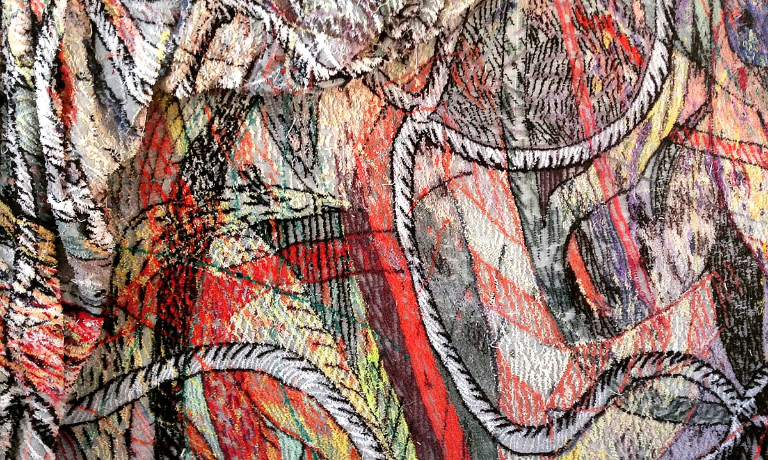
I’m sure lots of Edinburgh residents have braved the climb up Calton Hill for a lockdown walk, just to feel *something*. Well, from early May we will be rewarded with an open-for-business Collective Gallery at the summit. The exhibition they’re emerging from lockdown with is by Christian Newby, and features a large-scale textile called Flower-Necklace-Cargo-Net. This tapestry, made with industrial carpet tufting techniques responds to the building, which originally housed an astronomical telescope. Christian’s work explores ideas of craftsmanship, labour and the use of machinery in the fine and applied arts. I am intrigued by the description and I really want it to be absolutely massive. We all love a large scale work.
Christian Newby, ‘Flower-Necklace-Cargo-Net’ (detail), 2020
There will be so, so much more to talk about and explore, so please consider this an initial scanning of the Edinburgh art horizon. Other things I want to explore further are the Fruitmarket Gallery reopening after its refurbishment, The Normal exhibition at the Talbot Rice Gallery which explores the pandemic, the ECA Degree Show and the Art Festival. I’ll keep my ear to the ground and post more recommendations as and when.
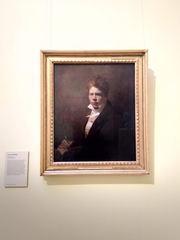
Alongside all that, we can never forget our old favourites. One of my first tasks when the Scottish National Portrait Gallery opens on 30th April is to go and visit my old pals, David Wilkie and Duncan Grant, to check they’ve been OK over the past year.
Inspired by Ben Street’s recent article in Apollo magazine about the meaning of art postcards, I’ve decided to have a root around in my own collection, and share five of them with you.
How art postcards collections come into being is a curious matter. We buy them as mementos from favourite exhibitions, or while visiting new places on holiday (remember those?). Some, we are sent by friends and family, not all of which we would’ve chosen ourselves. When I was looking through my own stash, I came across blank postcards of artworks I have zero memory of seeing in real life, which I don’t even like that much. Where do they come from? They seem to spawn independently in shoeboxes and desk draws.
Splitting by Gordon Matta-Clark, 1974
I often end up sending my favourite art postcards to people who I know will appreciate them. But I’ve never wanted to part with this one, I love this postcard a lot. I think I bought it at an exhibition at the Barbican in 2011, long before I started writing about art. I only really remember Matta-Clark from that show. His art hovered at the edges of architecture and performance, and this documents one of his most famous works, where he bisected an entire New Jersey house. It’s unlike anything I’d seen before, an artwork on such a huge scale. Cutting up a house like that makes it useless, which makes me wonder, what’s the point of this act? Why turn something useful, valuable, a place of shelter and memories into something broken and strange? I’m still drawn to it though. It’s an arresting image, the sunshine beaming down, a big wedge missing from the house’s shadow like a slice of cake. It stops you in your tracks, makes you curious, makes you a little confused. It’s like a beautiful, surreal cartoon and for that moment you see something as simple as a house in a different way. Sometimes certain artworks chime with us and we don’t really know why. Perhaps that’s the reason I’ve held on to this postcard for so long: I’m still trying to figure it out.
Gordon Matta-Clark, ‘Splitting’, 1974
From Roof to Roof by Gabriel Orozco, 1993
The artist Gabriel Orozco notices things. His eagle eye can spot a fleeting moment of enchantment from afar the way a shark can sense a drop of blood in an ocean. I recently wrote about how visiting his retrospective exhibition at Tate Modern changed the way I saw art and the world, and it resonated with lots of other people. Why? Why does this rectangle of water captured on a flat rooftop, reflecting light, sky and trees, pinpointing a passing breeze in its ripples, make such captivating art? I think it’s because it’s about seeing the magic, or the possibility of magic, in the mundane, which is something we all can do, a radical choice we can all make. It’s empowering, to be able to take a moment and see beauty, chance, luck, favour where we might otherwise just have seen a dilapidated outhouse with a flat roof.
Gabriel Orozco, ‘From Roof to Roof’, 1993
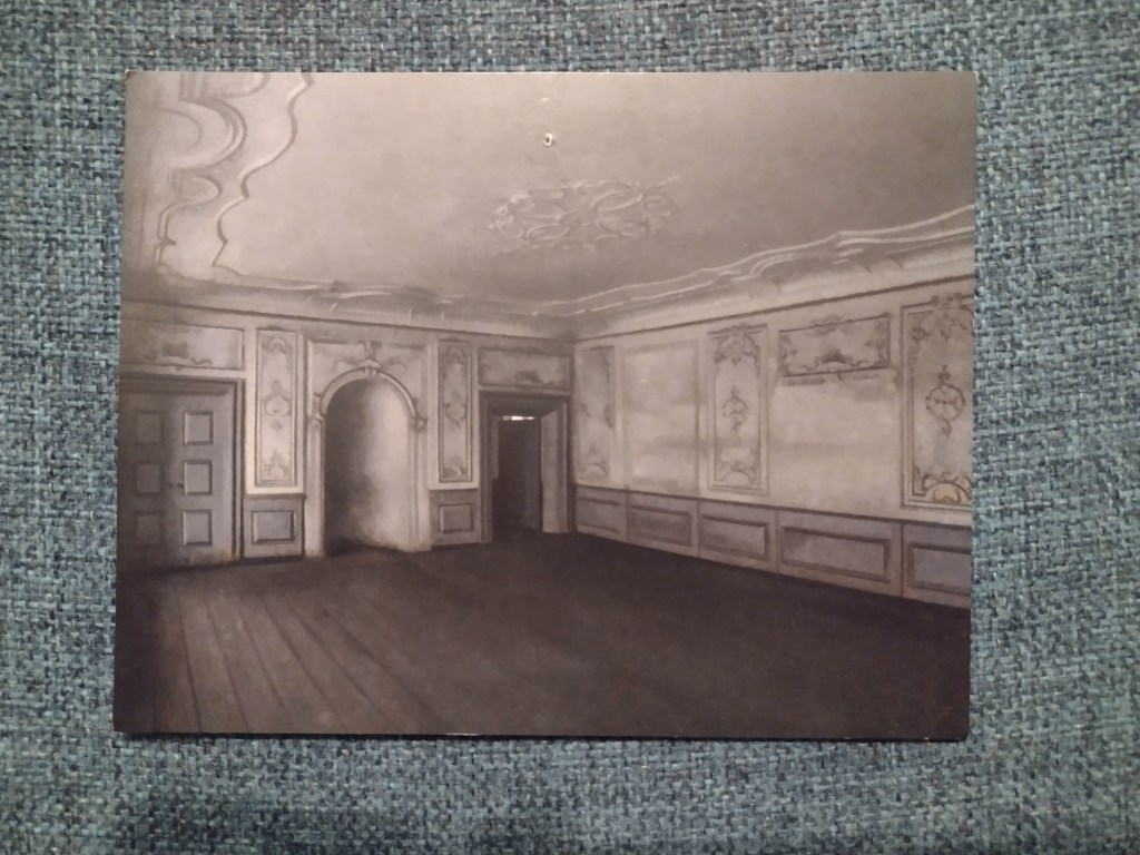
Interior of the Great Hall in Lindegaarden by Vilhelm Hammershøi, 1909
I am pretty sure I have loved every work I’ve seen by Hammershøi, though I don’t know many of them well. I think I first encountered his work at the National Gallery’s most modern rooms, and remember how the greys, and the stripped back aesthetic of his Interior, (1899) contrasted so shockingly with the bright colours of paintings by Manet and Seurat. This postcard is from a trip to Ordrupgaard, a gallery outside of Copenhagen I visited with a dear friend. The atmosphere of this ghostly, grand, empty room is so convincing, you feel like you are looking through a keyhole in a haunted house, not at a tiny postcard of a painting. I have so many questions about this room that I know will never be answered, and I’m ok with that.
Vilhelm Hammershøi, ‘Interior of the Great Hall in Lindegaarden’, 1909.
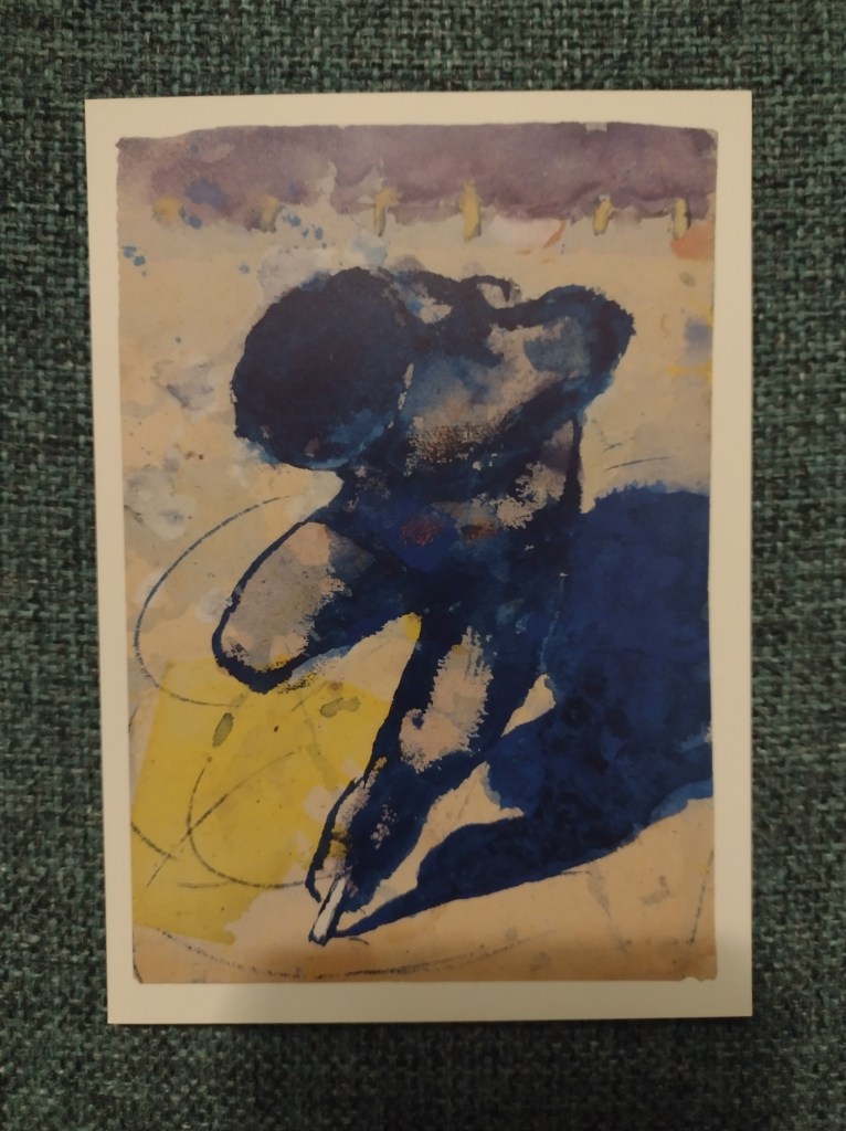
Skater by Emil Nolde, 1938-45
The reason I’ve picked this is that it’s simply one of the most beautiful prints I’ve seen. Some artworks really translate to postcards (in the same way that some really translate to Instagram) and this is just perfect. I remember buying two copies, and sending one to my sister just saying “look how beautiful this is”. The yellows and blues, the blurred splodges contrasting with the precise curved lines on the ice, the movement of the skater crouching forward, propelling into our space. I picked this postcard up at National Galleries of Scotland’s Emil Nolde: Colour is Life in 2018. Sometimes colour IS life. Looking at this picture lifts my mood in a big way. Thanks Emil.
Emil Nolde, ‘Skater’, 1938-45
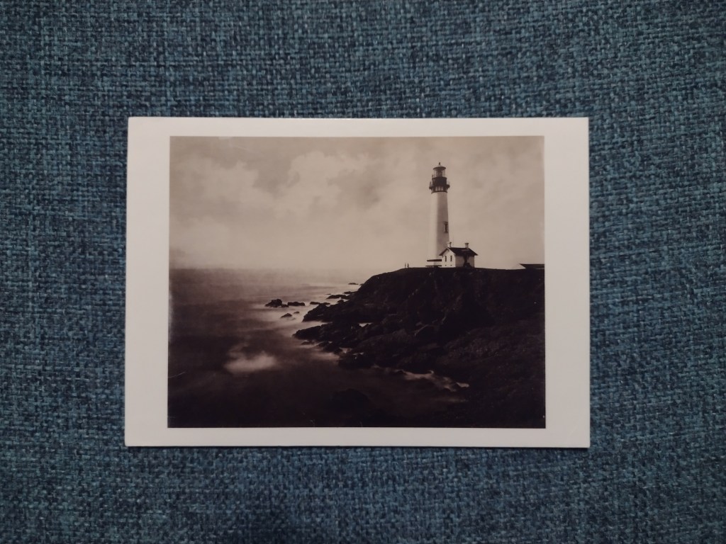
Pigeon Point Lighthouse by Eadweard Muybridge, 1873
My final choice from my collection of many, many art postcards is this one, bought at the Muybridge exhibition at Tate Britain in 2010. Lining up the dates, I must have seen this picture when I first moved to London. I would’ve been 18 or 19. I love photography, I think it has always tied into my fascination with the past – I studied history before I studied art. But I think photography might also have been a route in to contemporary art for me: it straddles past, present and future. Muybridge changed the medium of photography, the fields of art and filmmaking and with that, the way people saw the world. I look at this now and remember a visit in 2019 to a lighthouse on the most northerly point of the Isle of Lewis, where it was so windy we could barely open the car doors. That’s what’s special about these images. They are scraps of memory that live with us, they gather meanings as well as dust. They remind us of what we love about art, and sometimes tell us what we used to treasure that now doesn’t hold so much weight.
Eadweard Muybridge, ‘Pigeon Point Lighthouse’, 1873
Thank you Ben for inspiring me to look through this old collection of images. I’ll be doing it more often from now on.
If you collect art postcards, I would love to know which artworks they reproduce and what they mean for you. Head to the Contact page to get in touch, or DM me on Instagram.
For someone who writes about art, I will sheepishly admit that I haven’t read much art criticism. There were lots of academic papers while I was at university, but actual art magazines always seemed unattainable to me: sitting in rows at the entrance of the library, shiny pages, heavy and untouched by anyone, looking rich and intimidating. I used to wonder who those pristine publications were for, as I walked past them to go and bury my head in a battered old catalogue, full of black and white photo reproductions and not too much text.
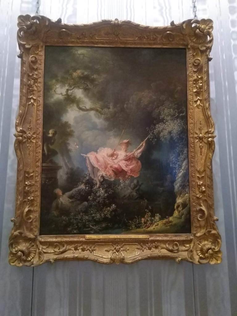
I’d heard of Olivia Laing through friends. One gave me a copy of Crudo, her first work of fiction, a couple of years ago, while another mentioned I might like The Lonely City. Then last summer a copy of Funny Weather, a collection of her essays, landed in my lap through work. When I finally started it, what struck me most was that this writing was both easy to read, and somehow had an air of poetic stillness to it. The force of the voice, the strength of the writing, would be enough to carry you through, even if you weren’t that into art. Take her description of wandering through the Wallace Collection, for example, an experience which I also wrote about last year.
The Wallace Collection was almost empty. I drifted through the violet and empire-green rooms, with their washed-silk walls… The Fragonard girl still hung on her swing, suspended in thick air; a goose lay perpetually unplucked on a kitchen table. Nothing beats paint for stopping time cold.
From ‘Dance to the Music’, December 2017
Jean-Honoré Fragonard, The Swing, 1767
Many of these essays started life as columns for Frieze magazine, but this didn’t feel like reading art criticism. Laing’s observations felt more like the notes in the margins from some recent but only half-recognisable memory, observing life, love, intimacy, rage, humanity, shame, identity. Her subjects are broad. One essay can take in Patti Smith, killer whales, abortion rights, as well as a performance at the Barbican, and she manages to connect them all cohesively. I learned more about later 20th century American art than I had ever bothered to before. Biographies of artists and writers mix with recollections of her own experiences, and every now and then you get a glistening nugget of a sentence which you just have to let soak in.
“It was a very bright day. The sun was so low that every grain of sand cast a shadow.”
From ‘Between the Acts’, November 2018
There are many fascinating things about reading these essays, and one is that they allow you to time-travel into what, since the juggernaut of the coronavirus pandemic, seems like distant history. They are dispatches from the recent past, and the unfolding events (the refugee crisis, Trump’s election, Brexit, Nigel Farage’s “breaking point” poster) are examined with unflinching insight and a healthy dose of terror. Funny Weather places art solidly in its political context. It shows us that news ages quickly, but reminds us that many of these threats still exist: they remain there to call out, and fight against, during and after the pandemic. The way visual signs and symbols are used in the political landscape will always be a fruitful trove for artists and art observers to analyse. I would love to get Laing’s take on all the union jacks we keep seeing in politicians’ homes. Deeply sinister, would be my guess.
Honestly. If I rolled up at someone's house and they had a flag display like this in their front room, I'd be calling the police. pic.twitter.com/jH45YQOFJh
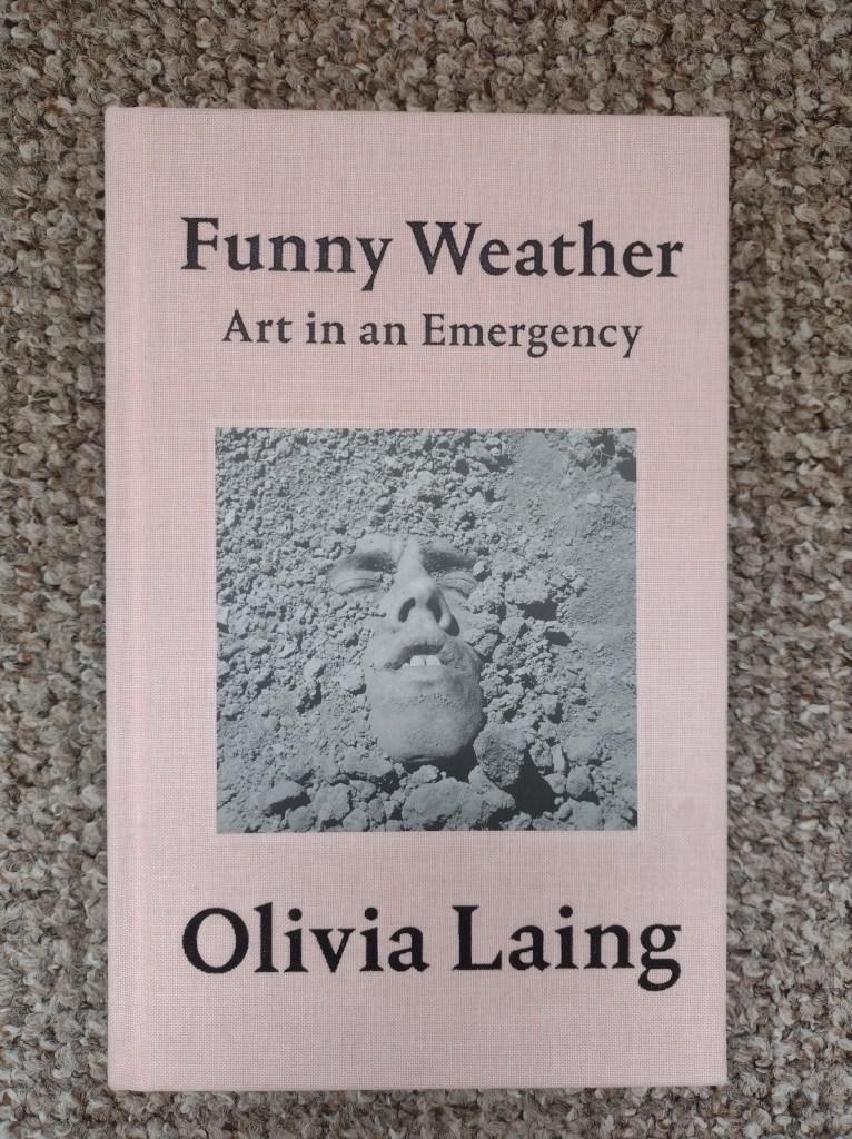
That the essays have been compiled into book form is a joy, because the book itself is a very beautiful object. Its pale pink, candyfloss-coloured cloth cover contrasts shockingly with the photograph: a close-cropped image of David Wojnarowicz’s partially-buried face, gritted teeth, covered in dirt and dust, called Untitled (Face in Dirt), 1992-93.
With such a strong cover, the book’s complete lack of images inside was a disappointment. Reading one article or essay online, it is easy to search for the images on my phone simultaneously. With a book, all that research is far too time consuming and disrupts to the act of reading. Asking people to read about art without including the visual reference point is a swing and a miss. It assumes a certain level of knowledge or awareness of the artists’ work, which I definitely didn’t have for every piece or even every artist discussed (I hadn’t heard of Sargy Mann at all, but now I’m glad I have). I wish they’d at least inserted a few pages of images. Or, how about a link to an online index, where we could browse all the works mentioned, side by side? That would be an amazing insight into Laing’s critical eye. That way, we could see what she is most drawn to, at a glance.
That’s a strong book cover
The major take-home for me was that Laing’s writing shines brightest when describing the work and lives of queer artists. Her essay on Derek Jarman, ‘Sparks through Stubble’ (2018) completely charmed me, partly because it lets us in to her own life too. Her mother was gay, and she grew up in ‘a village near Portsmouth where all the cul-de-sacs were named after the fields they’d destroyed’. I later discovered that this essay was written as an introduction to a recent edition of Jarman’s Modern Nature, which I added straight to my TBR list.
Through exploring the world of Jarman, Laing writes about the Aids crisis with such empathy. Her essay on David Wojnarowicz, who died aged 37 of Aids-related complications, is a plea for compassion, and re-opened my own eyes to the very recent reality of the gay community living every day in fear, their very existence politicised: ‘What does it mean if what you desire is illegal? Fear, frustration, fury, yes, but also kind of a political awakening, a fertile paranoia.’ Wojnarowicz was completely unfamiliar to me, but Laing’s writing about him illuminated connections to a young artist called Graham Martin whose work I was familiar with through Instagram. Martin’s depictions of empty, dilapidated warehouses, with naked male bodies barely distinguishable in the shadows, brought Laing’s essay to life for me. Making this conceptual link between Laing, Wojnarowicz, and Martin, I could feel the synapses in my brain lighting up. It all made sense.
Since starting this blog, a few people have asked me: if I want to learn about art, where should I start? What should I read? How does it work? I haven’t always known how to respond. If you want to read what other people have to say about art, if you find it helpful or illuminating, that’s great (thank you for getting so far with this review!) But reading Funny Weather has also made me understand that while great art writing like Laing’s can stand up by itself, the best way to engage with art is looking at it first, reading about it second.
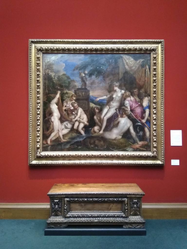
It started with the news that the Titian exhibition, which united all six of his poesie paintings, commissioned in 1551 by Prince Philip Spain, would not be travelling to Scotland. I was completely gutted. I had been looking forward to this exhibition since I first heard of the plans hatching, while I still worked at the National Gallery in London. The very idea of bringing these huge masterpieces of myth together seemed magical to me. An idea that somehow turned back time, reconstructed a historical moment, and recognised paintings as objects with lives of their own (over the centuries they travel, are put in different frames, owned by different people, and end up in different museums across the world). To have these paintings brought together once more, we would be able to see them as a series, to see them as Philip II of Spain saw them. I think I might have been mildly obsessed with the idea. I certainly saw myself as personally attached to two of these paintings, Diana and Callisto and Diana and Actaeon, which are co-owned by the National Gallery in London and the National Galleries of Scotland. When I moved to Edinburgh from London, I didn’t have a job and only knew about four people. So, I spent time in the Galleries, and seeing these paintings in their Scottish setting made me feel like I was reunited with old friends.
‘Diana and Callisto’ by Titian, (1556-9), situated in the Scottish National Gallery
The circumstances of its cancellation were understandable. The pandemic had disrupted the schedule completely (the show was supposed to go to London, Edinburgh, Spain and Boston – it still will go to the latter two locations). Even if the pandemic had been contained, the lack of festivals in Edinburgh in the summer meant the usual glut of tourists would not be in circulation, so presumably there would not be enough people paying to see these artworks and buying overpriced cakes in the shops to offset the huge costs of putting on exhibitions like this one. Travel for pleasure became a thing of the past and we were forced, by necessity, to embrace what the local could offer.
For years, uncertainty about funding has changed the way galleries operate, pushing them further down a path of supposed self-sufficiency. This is survival by embracing corporate opportunities such as venue hire, event experiences, cafes, shops, big-name exhibitions that can sell more pricey tickets (and on the more sinister side, outsourcing huge swathes of security staff and cutting specialist teams). The gallery-as-business was hit hard by the pandemic: by taking away the consumers, the model no longer worked. What is going to emerge from the wreckage of the pandemic and Brexit remains to be seen, but what’s for sure is our urgent need to recognise that art isn’t just about blockbuster exhibitions, much though we love them. Not all galleries will, or have ever, been able to afford to put on those shows. We must safeguard these places. We have to acknowledge the role of the local, the small-scale, the community-driven in art, and its capacity to provide inspiration.
To state the obvious, not everyone’s local is the same, which is why two articles that appeared in the Guardian and the Scotsman towards the end of last year made me angry (I’ve been stewing on this a while). Firstly, the Guardian’s review of the year featured the top 10 in the visual arts and literally everything, except one show in Oxford, one virtual tour, and one podcast, EVERYTHING was in London. I am not London-bashing here. I love London and its galleries, but as art writing, this is lazy. It’s likely that the writer lives in London, and wasn’t able to travel as much to explore other places in the UK, but I wish they’d acknowledged that, or simply call the article “The Top 10 Art Exhibitions in London”. Or maybe – crazy idea – the paper could have commissioned writers around the country to talk about what art was happening in their towns and cities? Yes, 9 million people live in London, but there are a further 58 million people in the rest of the UK. I could have just googled “big exhibitions London” and the same results would have come up. The article held no real reference to the pandemic, to the flourishing of artwork at home and online that it has engendered, to the incredible innovation by recent art graduates as they reinvented their degree shows, or to the turmoil it had thrown galleries around the country into.
The same lack of imagination was played out again in the Scotsman article picking highlights in visual art for 2021. Literally all suggestions bar one were in Edinburgh. As an art blogger based here, that’s a great list for me, but what about the rest of Scotland? For a start, everyone knows that Glasgow is the hub of exciting contemporary artistic development in Scotland. Beyond the central belt – what about Dundee’s thriving scene, or the two arts organisations in Scotland, Deveron Projects in Huntley, Aberdeenshire, and Inverness’ Eden Court, whose civic role in their local communities during the pandemic has earned them a place on the shortlist of a £100,000 prize from the Calouste Gulbenkian foundation?
I’m sorry to say it, but it’s likely that international travel will be off the menu for much of this year. But hopefully, just maybe, we’ll be able to visit places beyond our own homes. I’m therefore going to finish this post (this rant, sorry) with a highly personalised list of where and what I would like to visit once it is safe to do so, and with a personal commitment to push my writing, and not solely rely on reviewing big shows and exhibitions in capital cities. Art critics need to take a leaf out of the Ru Paul’s Drag Race UK’s book and start to celebrate diversity in a joyful way.
If you’d like to explore what’s out there, I’d recommend looking at the Art Fund map, an interactive tool that highlights interesting places you can see art across the UK. The National Trust and the National Trust for Scotland look after some brilliant art collections, sculpture trails and new contemporary art commissions in the UK too. Instagram can be a great way of finding out about art that is happening near you and online. If the pandemic has proven anything, it is that the local, the everyday, can still provide inspiration and wonder. Of course, we still want to see blockbusters, but there’s so much more out there to explore and to value.
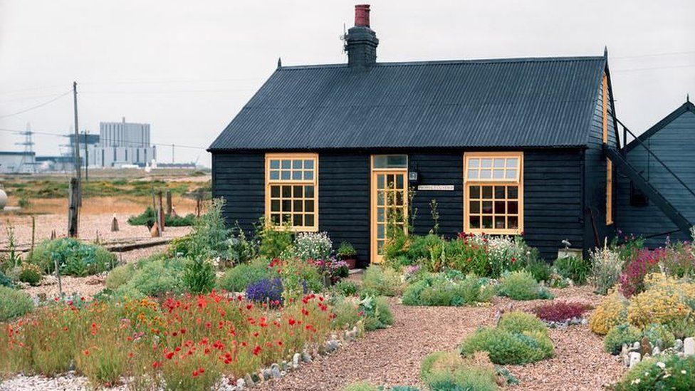
Prospect Cottage, Dungeness
My list: much is in Scotland and near-ish my parents’ house in Sussex, because I’m realistic that I might not be able to get to do a full UK tour this year. I’ll update as the year evolves.
Prospect Cottage, Dungeness
Those of you who follow me on Instagram know I’ve been reading Funny Weather by Olivia Laing, and I’m planning to post a review of that here soon. In this collection of essays, the one that shines through is ‘Sparks through stubble’, originally written as an introduction to a new edition of Derek Jarman’s Modern Nature. Laing’s talk of his special home, a fisherman’s hut on Dungeness beach where he ‘set about conjuring an unlikely oasis’, has bumped Prospect Cottage right to the top of my list for as soon as I can get there.
Deveron Projects, Huntly
Mentioned above and shortlisted for the Calouste Gulbenkian prize, I have known about Deveron Projects for a while, but when I started reading properly about it yesterday, I couldn’t stop. An innovative, place-driven project that uses a 50/50 principle to balance art/community, global/local, experimental/traditional in its ethos, it’s right up my street. I can’t wait to visit, and I hope to meet the inspiring people who run it. Until then, they are hosting a series of online talks/chats on Friday lunchtimes which I’m hoping to tune into, next week’s guest is Amanda Catto talking about Creative Scotland’s visual arts strategy.
Charleston
Ah Charleston. I have been meaning to go for years and then when it had to go into survival mode during the pandemic, I worried I would never get to see inside. Thankfully, the campaign to #ReopenCharleston was successful, and a further discovery of erotic drawings by Duncan Grant, gifted to the institution, has ensured it will continue to tell the incredible stories of the lives, loves and the art of the Bloomsbury Group in Sussex for a long time to come.
Self Portrait by Duncan Grant, (about 1920), in the Scottish National Portrait Gallery
Newhailes House and Gardens
This is a Palladian Mansion looked after by the National Trust for Scotland, situated down the road from Edinburgh, in Musselburgh. Apparently it has amazing rococo interiors including 18th-century trompe l’oeil decoration. The house is undergoing some restoration and hopefully will open in the spring. Book me up for a guided tour please!
Joan Eardley 100, Various venues
The work of Joan Eardley has been a revelation to me since moving to Scotland, and on 18 May 2021 it will be 100 years since her birth. This year several organisations are collaborating to form a series of retrospectives of her work, in a project led by Scottish Women and the Arts Research Network. There will be shows at the Hunterian Museum in Glasgow, Paisley Museum, Gracefield Arts Centre in Dumfries, a Heritage Trail on Arran, an exhibition at the National Galleries in Edinburgh along with more not yet announced. Follow #Eardley100 on social media for updates.
The BALTIC, Gateshead
I am ashamed to say I’ve never been to Gateshead or Newcastle. I can’t quite believe I’m confessing to that. I have no excuse, especially since moving to Edinburgh, it’s not a long train journey. The BALTIC has long been on my list of galleries to visit, so when I can, I’m booking a trip. We all know Newcastle is famous for its nightlife too, so I might try and hold out for when the pubs are open again, for this one.
Artes Mundi, Cardiff
The Artes Mundi prize is probably going online this year, but if there’s a chance to see it in person, I would love to take it. The prize was on Will Gompertz’s list of 2021 art to hope for (the list also featured places in Scotland and Northern Ireland. We ❤ the Beeb). Previous winners include Theaster Gates and Teresa Margolles, and this year’s winner will be announced on 11 February.
Towner Gallery, Eastbourne
The Towner got my attention recently because of its commitment to anti-racism action and pledges following up on statements made in the wake of the Black Lives Matter protests last summer. I like that they’re following up with action, not just words stopping at words. It makes me respect them as an institution and want to go there and support their work in Eastbourne.
CAMPLE LINE, Thornhill
Located in the countryside close to Lockerbie, CAMPLE LINE is an independent arts organisation for contemporary art and film. I’ve been waiting for restrictions to ease so I can see Sara Barker’s Undo the Knot exhibition, which looks like it hovers between sculpture and painting in a very satisfying way. Also, I’ve never really been to south west Scotland and I’d like to remedy that soon.
Dalmeny House
Cycling out to South Queensferry has been one of my favourite ways to alleviate the cabin fever of lockdown. Dalmeny Estate is on the way out there, and their art collection is usually open to visitors in the summer months. I have heard great things, fingers crossed they will open up again this year.
What’s on your list? What should I write about? I would love to hear from you! Leave a comment, click the contact page or you can DM me on Instagram or Twitter.
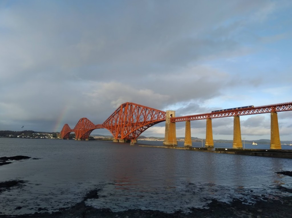
The Forth Rail Bridge from South Queensferry, reached by bike via Dalmeny Estate
I am a visual person. I work at a book festival. These two things marry in a particular way which means that I frequently judge books by their covers. It’s impossible not to, and the more you learn about the bookselling industry, the more you realise how important the cover is. Different visual tropes are used depending on the genre (think big, clunky font and capital letters for crime writing). I think most experienced booksellers and librarians would be able to shelve a book based on seeing the cover from 20 metres away.
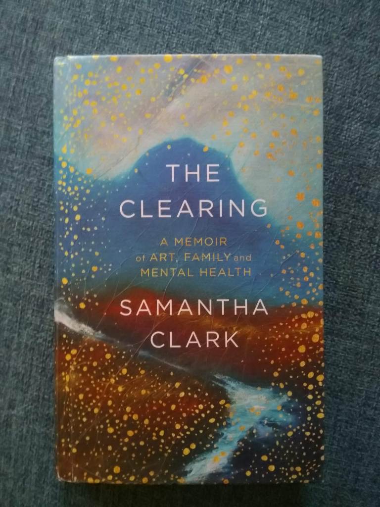
Naturally then, when I saw The Clearing by Samantha Clark, a blurry landscape speckled with flecks of gold, I was drawn to it, as I have been drawn to her art ever since. If you aren’t following her on Instagram I firmly suggest you amend that now. Her work is delicate, intricate, pleasingly detailed and you will also be treated to snapshots of her surroundings (she lives on Orkney so they happen to be sparsely beautiful).
The cover of ‘The Clearing’ by Samantha Clark
The book broadly follows the process of Clark clearing her parents’ house of a lifetime worth of belongings after their deaths. The clearing is twofold of course, because it’s also about memory, and in Clark’s case, dealing with the legacy and repercussions of her mother’s mental illness. As she wrote in a Instagram post on World Mental Health Day, ‘this is something that doesn’t just affect those who are ill, but everyone who loves and relies on them too’. It’s a memoir about some of the tough aspects of emotional life, but it’s not brutal or grim in the way you might fear a book about this could be. It is actually hopeful and there’s a calm quality to it that makes it easy to read and digest.
Reading the acknowledgements – I start with the acknowledgements, because I’m desperately nosey and I want to know about the writer whose world I’m about to immerse myself in – it was interesting to find out that the book didn’t start as a memoir. It was meant to primarily be about ‘the spaces between things’, meditations on philosophy and science that are part of Clark’s art practice.
The writings on art take a backseat to reflections on life and family, but the style is undoubtedly formed and informed by the piercingly observant eyes of an artist, one deeply connected to place and sensitive to the meaning of everyday things: ‘Memory is not just in the mind. It lives in actual places, in actual things. It sits in empty chairs and in worn carpets and smudged walls and light switches. I stand close to the wall and rest my own fingertips against the mark my father’s touch had left, a final intimacy, the closest I will ever get to his physical presence again.’
Clark writes about a worn mark near the light switch in her father’s workroom with precision and poignancy. This writing, this deep attention paid to surroundings, reminds me again how glad I am that artists and writers do all this observing, capturing, distilling. That they share it with me, the reader-observer, so I can be led to notice more, so I can get more out of the ‘stuff of life’, is why I love art. It makes me feel so privileged that I can be on the receiving end of all this work.
When I come to the end of a book, I tend to go back and write down the parts that resonate in my notebook. I read The Clearing back in January, in those pre-pandemic days, but looking in my notebook now, so much remains so utterly relevant to the present. Clark’s reflections on noticing the details, particularly of city life, have stuck with me. This passage helped remind and reassure me of a presence of hope, and I want it to do the same for you.
‘Perhaps every age feels like the end times. May be there is nothing new in this feeling that reality is full of pain and suffering, injustice and degradation, gathering pace, so much, too much to feel it all, so we make ourselves numb. But reality is also and at the same time full of startling beauty. The spinning feather catching the sunlight above the rush hour traffic. The starling on the rooftop signing a song of car alarms and squealing bus brakes. It feels like a small and necessary act of resistance, to pause to listen to the the urban starling’s city song, to attend to the careful washing of a cabbage leaf, to the uncountable blades of grass in my local park, each slender blade performing its own Indian rope trick as it lifts itself miraculously towards the spring sunlight.’
Page 164, The Clearing
These small and necessary acts of resistance are how we will get through this winter. Thank you, Samantha Clark, for reminding us.
Last week I spent a really nice chunk of time hanging out with the youngest member of my family. My nephew is two and he’s great company. He’s how I want to be: curious, reflective, eager for fun and a sponge for new information. With his wide-eyed wonderment, he has taught me how to look at art again after a long, enforced break (otherwise known as lockdown).
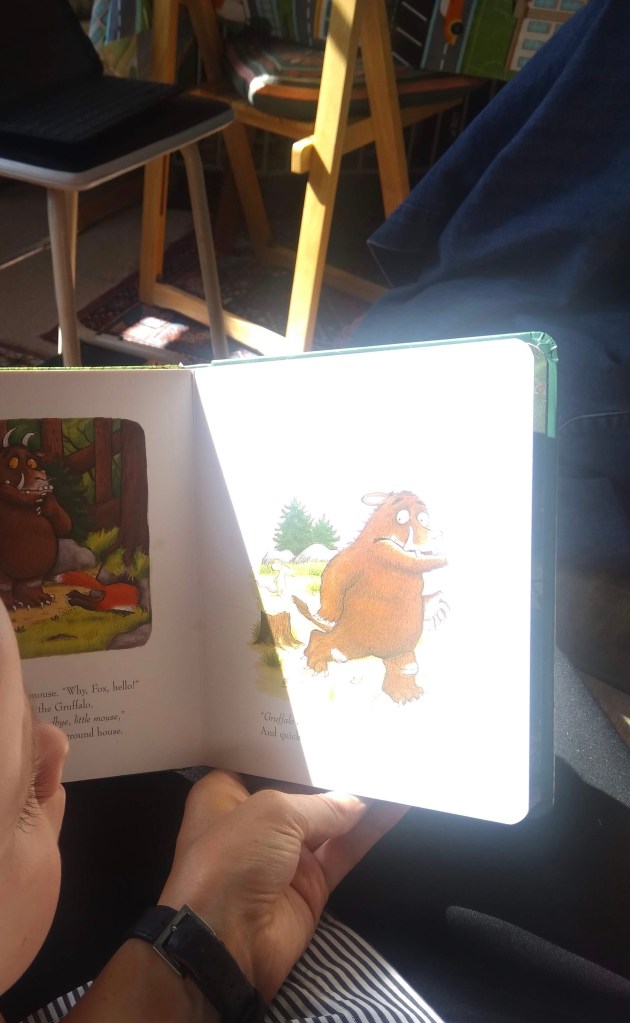
We read books together and looked at the pictures (me reading, both of us looking). Illustration is amazing, and I think a severely underrated form of art. I’m extremely lucky that in my day job, I interact with children’s books on a regular basis. Children’s books are some of the most accessible, universally loved and widely appreciated ways we experience art. The stories fascinate us, but the images are what portray and communicate the joy and terror of the narratives to young minds who cannot yet read or form sentences themselves. Fearfully gazing at the Gruffalo’s long black tongue and terrible teeth, or admiring the crisp and clear (read Scandi) aesthetic in Jon Klassen’s I Want My Hat Back, we carry the pictures with us long after the words have faded from memory.
Some of the most memorable books from my childhood were about looking at details. I was raised on books by Janet and Allan Ahlberg, searching for the characters and minuscule, meticulously written lost letters in The Jolly Postman was my delight. Later, The Most Amazing Night Book by Robert Crowther was my favourite. My nephew is also seemingly enthralled by the details. His favourite thing to do is to ask “Who’s dat?”, pointing excitedly at tiny ladybirds, trees, rocks, main characters, random piles of hay, clothes and anything else that catches his eye. Anyone who has interacted with children regularly will tell you they are incredibly perceptive and observant. Sometimes surprisingly so. They can see and sense things adults can’t.
A household favourite: The Gruffalo by Julia Donaldson, illustrated by Axel Scheffler
Last week, along with hanging out with my family I also went to a gallery for the first time in six months. After trawling the internet and realising most places in London had been booked out long before by far better-organised art lovers, I managed to get a midday slot at the Wallace Collection, one of my favourite places to see art, as well as admire luxurious furnishing (and pretend I’m part of eighteenth century aristocracy). I would probably go to see the silk wall hangings alone.
Blue wall silks and golden frames in a dense salon hang
I was so happy to have a slot, but despite really friendly staff and the safety measures that had been introduced, it wasn’t the most relaxing experience. It was a pressing reminder that we’re all still working through the anxieties this pandemic has produced. That the new normal isn’t going to be as good as the old normal for quite a while.
A one way system was in place and there were capacity limits on all of the rooms on the route, which created the slightly unpleasant feeling of being on a conveyor belt. Somewhat obliged to wait for those in front without pressuring them, but not wanting to take too long, disrupt the flow or be left behind, stuck in a swirling eddy without being able to rejoin the main current of my fellow gallery-goers. Not the best atmosphere for being absorbed by and for absorbing art.
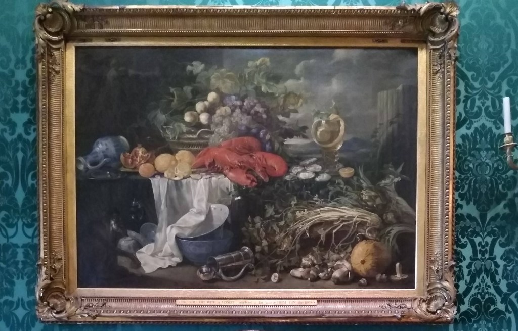
I spent the first part of my visit worrying about the choreography of my movements between my fellow observers, concerned I was getting too close, getting mildly annoyed with pushy people behind me. But then I saw an oil painting, Still Life With A Monkey, attributed to Jan Jansz de Heem (c.1670-95), that made me stop in my tracks. I thought about my nephew, how much he would love looking at the cornucopia of riches in the painting and examining all the elements, individually interrogating their form and purpose. I stepped off the conveyor belt and just looked.
Still Life With A Monkey, attributed to Jan Jansz de Heem (1670-95)
The spiral of lemon peel, the oysters, the mushrooms scattered on the table, the oozing pomegranate, the jug on its side, the tankard on its side, the bright white cloth, the monkey?! This kind of artwork demands your time, forces your eye to wander. We understand that still life paintings are often laced with double or even triple meanings (broken column = transitory nature of human life), but just looking at the surface level composition of what is there, without any further knowledge of iconography or semantics, is a pleasure in itself. The brightness of the lobster, the chaos and excess of it all, the way the food packs 7/8ths of the entire canvas, the needlessly dramatic sky behind. The above is my photo taken on the day, but there’s a brighter, slightly yellowy version of the painting here if you want to look more closely at the details.
Much of what drives my blog and my Instagram is a need and a wish to celebrate the everyday, to encourage others to read the notes in the margins, to slow down and enjoy colours and contrasts, patterns, eccentricities, particularly of city life. We can apply this attitude to great paintings in grand houses too. We think we know still life paintings. I imagine they’re the paintings most readily walked past without so much as a second glance because they are rarely super-famous showstoppers — but let’s take this opportunity to recognise how very bizarre and beautiful they are.
When we return to art galleries, they might not be the same as they were. But if we remember to approach art with curiosity, to take time, and notice the details, even if we haven’t got the brain space to work out what they mean, they can bring us both joy and a little peace. As from now, I’ll be adopting the “Who’s dat?” philosophy of close looking. That’s how I want to return to engaging with art as lockdown lifts. I’ll encourage you to do the same, but if you’re not feeling ready just yet, you can always start with The Gruffalo.